On Jun 13, 2016, at 2:06 PM, Lya Batlle-Rafferty <[email protected]> wrote:
Bryan,
I have looked at that before. But the issue is that then I have to use the bokeh.plotting way of creating a stacked bar chart, and I've been searching all over for an example of that. I am having trouble finding even a basic bar chart using figure(), let alone a stacked one.
Maybe if you could point me to an example like that, then I could do the rest with the legend documentation.
Thanks,
Lya
On Mon, Jun 13, 2016 at 2:53 PM Bryan Van de Ven <[email protected]> wrote:
Lya,
As of the latest release, all of the configurable legend properties are described here:
Bokeh Docs
We are working towards a freeze for 0.12 which will have the ability to put legends outside the central plot region, as well as array legends horizontally (no support yet for multiple columns but you could split up and create two legends "by hand" if necessary). It's possible you might be able to use one of the "dev builds" to get this capability earlier:
Bokeh Docs
But please know that the dev builds are not tested to the same standards are regular releases (but it may work perfectly well for your specific use case).
Bryan
> On Jun 13, 2016, at 1:44 PM, Lya Batlle <[email protected]> wrote:
>
> Hi,
>
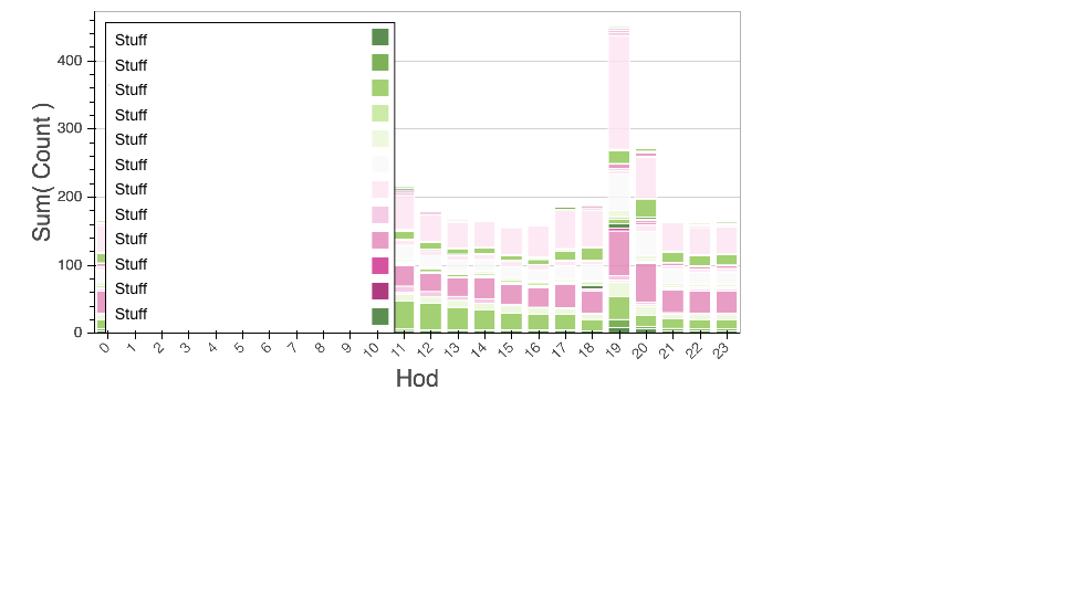
> I have a bar chart with numerous values and as a result, the legend is come out large enough to obscure the data. I'd love to tweak the legend to be smaller text, and maybe multiple columns, but I have no idea how to do it. I used the Bar code in my previous post. And the result is below (I messed with the palette).
>
> bp = Bar(df_stations, values='count', label='hod', stack='stations', tools=["hover", "crosshair", "pan",
> "box_zoom", "wheel_zoom", "reset", "resize", "save"], legend=True,
> plot_height=400, plot_width=700, color=PiYG11)
>
> I've included the image, but I had to anonymize the data on the legend to share. The size of the font might be off because of it, but everything else is the exact captured image.
>
>
>
> --
> You received this message because you are subscribed to the Google Groups "Bokeh Discussion - Public" group.
> To unsubscribe from this group and stop receiving emails from it, send an email to [email protected].
> To post to this group, send email to [email protected].
> To view this discussion on the web visit https://groups.google.com/a/continuum.io/d/msgid/bokeh/484f850f-3587-4c02-8349-9fe08cd9dbe9%40continuum.io\.
> For more options, visit https://groups.google.com/a/continuum.io/d/optout\.
> <Despecified.png>
--
You received this message because you are subscribed to the Google Groups "Bokeh Discussion - Public" group.
To unsubscribe from this group and stop receiving emails from it, send an email to [email protected].
To post to this group, send email to [email protected].
To view this discussion on the web visit https://groups.google.com/a/continuum.io/d/msgid/bokeh/BD7F7E42-441B-4081-99D7-34979B752805%40continuum.io\.
For more options, visit https://groups.google.com/a/continuum.io/d/optout\.
--
You received this message because you are subscribed to the Google Groups "Bokeh Discussion - Public" group.
To unsubscribe from this group and stop receiving emails from it, send an email to [email protected].
To post to this group, send email to [email protected].
To view this discussion on the web visit https://groups.google.com/a/continuum.io/d/msgid/bokeh/CAPLE76MZUOatSDcftQfQCzZ0T0M-evmoYjoU2%3D1jdUo2O2-ffQ%40mail.gmail.com\.
For more options, visit https://groups.google.com/a/continuum.io/d/optout\.