Hello,
Can anyone help me out here? Am I doing something wrong? I believe ColumnDataSource behaves differently if plotting multiple plots in one plot, correct?
source = ColumnDataSource(data=dict(Dt=,Census=,CountAtStart=))
plot = figure(plot_width=1100, plot_height=600, x_axis_type = ‘datetime’)
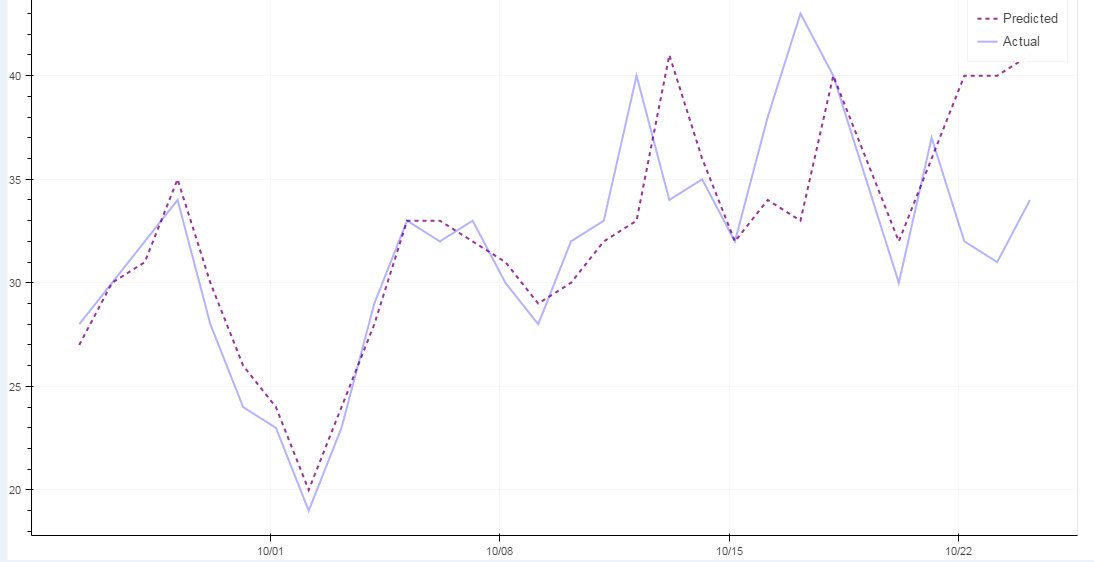
CAHplot.line(x=‘Dt’, y=‘Census’, source=source, line_dash=[4, 4], line_color=‘purple’, alpha = 0.8, line_width=2, legend=‘Predicted’)
CAHplot.line(x=‘Dt’, y=‘CountAtStart’, source=source, line_color=‘blue’, alpha = 0.3, line_width=2, legend=‘Actual’)
Thank you,
Pratik