
Hello everyone,
I’m working on a web application that displays Bokeh plots inside movable cards on a dashboard. Each card contains a Bokeh plot generated from Python code. When the view is resized—such as when the browser window size changes or side menus are toggled—the layout adjusts, and the cards are resized accordingly. Initially, my approach was to send the new height and width values to the Python backend whenever the cards were resized, regenerate the Bokeh plots with these fixed dimensions, and reprocess the elements to display the updated plots. However, this method proved inefficient and caused performance issues when many cards are present.
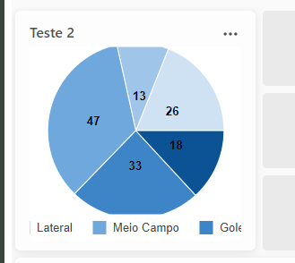
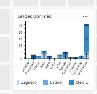
I’m seeking a way to adjust the dimensions of the Bokeh plots inside the cards when they are resized due to view changes, without having to regenerate the plots via Python. I’ve tried setting sizing_mode='stretch_both' when creating the Bokeh figures and adjusting CSS properties to ensure the plots occupy the full available space. This works in many cases but not in all—especially with pie charts. Additionally, it’s important that the legends of the plots also adapt to the sizes of their parent divs. I also attempted to force the plots to resize or re-render using JavaScript but couldn’t find suitable methods in the BokehJS documentation. Triggering a window resize event affects all plots on the page and isn’t efficient.
My question is: How can I adjust the dimensions of the Bokeh plots inside the cards when the cards are resized due to view changes, without regenerating the plots via Python? Is there a recommended way to have the plots resize themselves to fit their containers automatically, including ensuring that legends and elements like pie charts adjust correctly? Any guidance or suggestions would be greatly appreciated.
Thank you in advance for your help.