☰Read-only archive⌕
Looking for help with Bokeh?

This is a read-only archive. Ask questions and join the conversation on GitHub.

Visit Community Support on GitHub →
Archived discussions · Captured October 28, 2026

Bar chart, side by side rather than overlap

Community Support
nogi
nogi

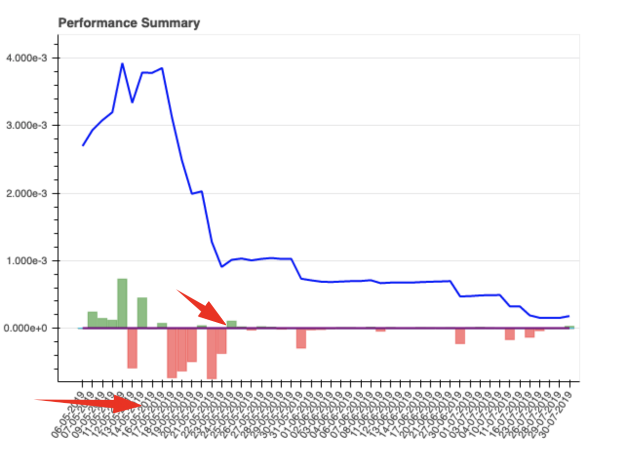
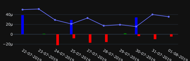
Hi guys, got sick of trying to get plotly to play nice and ended up here. Trying Bokeh for the first time and need a little guidance please. I’ve manage to do a bar chart with a line graph but can’t work out how to not have the bars overlap. I want them side by side for each day.

Also, how can I put like a dark theme on the chart and force x axis value to be at 90 degrees so looks a little neater when there are a lot of them

?

⌁   Link to post
Bryan
Bryan

It looks like you are using date strings as categorical factors? (It’s always good to include some real code to focus questions). If so, you can make the bars narrower by adjusting their width A width of 1 means “span the entire category” so you can adjust that up or down to take up more or less space within each category. Or if you just want to highlight a narrow to border, have the smallest visual indication of separation, you can set, e.g line_color="white". Maybe this is actually the most appropriate, as all that is overlapping in this case is the border/outline of the bars.

There are examples of both in the Handling Categorical Data section.

There is a property to control tick label orientation:

Styling Visual Attributes — Bokeh 1.3.1 documentation

“Setting a theme” is a matter of just setting all the properties you want, to be how they want. There is a bokeh.theme module that can bundle up a bunch of property settings to make them easily re-usable. There are also a couple of built-int themes, including DARK_MINIMAL

⌁   Link to post
nogi
nogi

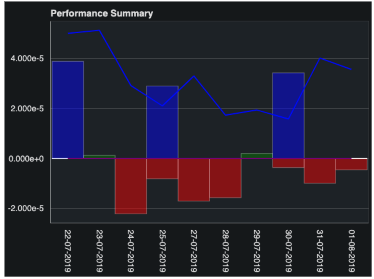
Great thank you so much. Was able to get most of that working except, bars are still on top of each other?

# Bokeh Chart
output_file("bar_mixed.html")
curdoc().theme = 'dark_minimal'
p = figure(x_range=report01data.xcords, plot_height=450, toolbar_location=None, title="Performance Summary")
# Draw bar graph
p.vbar(x=report01data.xcords, top=report01data.bar1, width=1, color="green", line_color="white", alpha=0.5)
p.vbar(x=report01data.xcords, top=report01data.bar2, width=1, color='red', line_color="white", alpha=0.5)
p.vbar(x=report01data.xcords, top=report01data.bar3, width=1, color="yellow", line_color="white", alpha=0.5)
p.vbar(x=report01data.xcords, top=report01data.bar4, width=1, color="blue", line_color="white", alpha=0.5)
p.vbar(x=report01data.xcords, top=report01data.bar5, width=1, color="cyan", line_color="white", alpha=0.5)
# Draw line graph
p.line(x=report01data.xcords, y=report01data.line1, color="blue", line_width=2)
p.line(x=report01data.xcords, y=report01data.line2, color="purple", line_width=2)

#p.y_range.start = 0
p.x_range.range_padding = 0.01
p.xaxis.major_label_orientation = "vertical"
p.xgrid.grid_line_color = None

show(p)
⌁   Link to post
Bryan
Bryan

Ah, I misunderstood your question, I did not realize you meant literally in the vertical direction, I thought you meant adjacent bars were overlapping their areas. You will either need to apply explicit categorical offsets:

https://bokeh.pydata.org/en/latest/docs/user_guide/categorical.html#categorical-offsets

or (probably less work), use the dodge transform to shift some bars to the left, and others to the right:

https://bokeh.pydata.org/en/latest/docs/user_guide/categorical.html#visual-dodge

Either way it seems like you will also want to reduce the width of the bars by half, to accommodate two non-overlapping bars inside each category.

⌁   Link to post
nogi
nogi

ooops

ValueError: expected an element of either String, Dict(Enum('expr', 'field', 'value', 'transform'), Either(String, Instance(Transform), Instance(Expression), Float)) or Float, got {'field': ['21-07-2019', '22-07-2019', '23-07-2019', '24-07-2019', '25-07-2019', '26-07-2019', '27-07-2019', '28-07-2019', '29-07-2019', '30-07-2019', '31-07-2019'], 'transform': Dodge(id='1034', ...)}

I was trying:

p.vbar(x=dodge(report01data.xcords, -0.25, range=p.x_range), top=report01data.bar1, width=1, color="#99F761", line_color="white", alpha=0.5)
p.vbar(x=dodge(report01data.xcords, -0.5, range=p.x_range), top=report01data.basr2, width=1, color="#F77461", line_color="white", alpha=0.5)
⌁   Link to post
Bryan
Bryan

Or can a columndatasource handle multiple Y cols?

Yes, a CDS can have as many columns as you like, as long as they are the exact same length. I generally would recommend putting all columns of the same length in to one CDS (with a unique column name for each).

⌁   Link to post
nogi
nogi

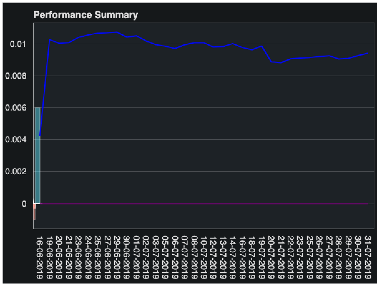
Thanks, they are all the same length. I feel like I am so close now:

I think i have the side by side working now except, i’ve now lost the bars on the rest of the days.

# Bokeh Chart
output_file("bar_mixed.html")
curdoc().theme = 'dark_minimal'
bardata = {
    'x_values': report01data.xcords,
    'bar1': report01data.bar1,
    'bar2': report01data.bar2,
    'bar3': report01data.bar3,
    'bar4': report01data.bar4,
    'bar5': report01data.bar5
}
source = ColumnDataSource(data=bardata)
logger.info(bardata)
logger.info(source)

p = figure(x_range=report01data.xcords, plot_height=450, toolbar_location=None, title="Performance Summary")

# Draw bar graph
p.vbar(x=dodge('bar1', -0.5, range=p.x_range), top='bar1', width=0.5, color="#99F761", line_color="white", alpha=0.5, source=source)
p.vbar(x=dodge('bar2', -0.25, range=p.x_range), top='bar2', width=0.5, color="#F77461", line_color="white", alpha=0.5, source=source)
p.vbar(x=dodge('bar3', 0, range=p.x_range), top='bar3', width=0.5, color="#F4F761", line_color="white", alpha=0.5, source=source)
p.vbar(x=dodge('bar4', 0.25, range=p.x_range), top='bar4', width=0.5, color="#61E4F7", line_color="white", alpha=0.5, source=source)
p.vbar(x=dodge('bar5', 0.5, range=p.x_range), top='bar5', width=0.5, color="#BF61F7", line_color="white", alpha=0.5, source=source)
# Draw line graph
p.line(x=report01data.xcords, y=report01data.line1, color="blue", line_width=2)
p.line(x=report01data.xcords, y=report01data.line2, color="purple", line_width=2)

#p.y_range.start = 0
p.x_range.range_padding = 0.01
p.xaxis.major_label_orientation = "vertical"
p.xgrid.grid_line_color = None

show(p)

I should probably add those lines to the CDS too

⌁   Link to post
Bryan
Bryan

There are not many configurable properties for DataTable visuals at the moment. I think the only option for changing DataTable appearance is to apply CSS rules. You can add custom CSS classes to Bokeh objects by passing/setting a css_classes = [...] attribute, but you will need to have defined CSS stylesheets that target those classes, i.e. in a Jinja2 template. This is an area where the library can still use improvement.

⌁   Link to post
Bryan
Bryan

Will that still work if all i am doing is creating/exporting the charts to PNG?

It should. Bokeh’s PNG export works by rendering the page in a headless browser and programmatically taking a “screenshot”.

⌁   Link to post

End of archived discussion · Replies are disabled