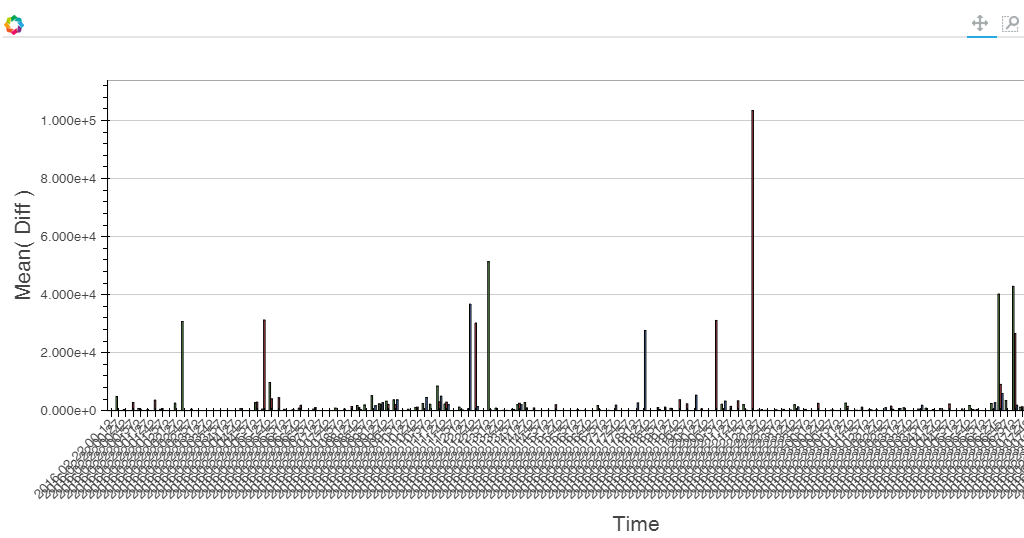
I am trying to create Bar plot with grouping by some specific values. After few tries i finally created that plot based on a large amount of data. And I want to narrow view to latest i.e. 24 samples ( i’ve already done it in standard figure with drawing lines) because currently graph is not readable (see screenshot in attachments).
I also wondering why i can set a lot of params regarding axis for figure object (formatting, colors, ticks, etc) while for Bar plot not.
One more question is there any possibility to change Yscale as my bar plot contains also negative values as well as positive?
small update from my side. I realized that problem with negative values is resolved in current version 0.11.1.
But the main problem to change x_range for view is still present. I tried to manually add FactoryRange as my x tickers are represented by strings, but I am not able to change view frame as it is possible for figure object.
Has anyone know how to change view frame based on string categories as x tickers?
Adam
···
On Thursday, February 25, 2016 at 1:35:51 PM UTC+1, adam.p…@onet.eu wrote:
Hi all,
I am trying to create Bar plot with grouping by some specific values. After few tries i finally created that plot based on a large amount of data. And I want to narrow view to latest i.e. 24 samples ( i’ve already done it in standard figure with drawing lines) because currently graph is not readable (see screenshot in attachments).
I also wondering why i can set a lot of params regarding axis for figure object (formatting, colors, ticks, etc) while for Bar plot not.
One more question is there any possibility to change Yscale as my bar plot contains also negative values as well as positive?
Could you provide a brief piece of code to reproduce what you have and your needs? Also, currently there are discussions to make Charts inherit from Figure so you’d basically have the same comon ground interface. For now it share “some” of the interface but for a few things it’s less straightforward. So the answer could vary depending on what you really need.
As for ranges. You should be able to set them accessing x_range/y_range (for instance: yourchart.x_range = Range1d(-10, 10) )
In order to access your axis instead you should use _xaxis/_yaxis.
Also, I highly recommend using > 0.11 version since there were several improvements from that version.
small update from my side. I realized that problem with negative values is resolved in current version 0.11.1.
But the main problem to change x_range for view is still present. I tried to manually add FactoryRange as my x tickers are represented by strings, but I am not able to change view frame as it is possible for figure object.
Has anyone know how to change view frame based on string categories as x tickers?
Adam
On Thursday, February 25, 2016 at 1:35:51 PM UTC+1, adam.p…@onet.eu wrote:
Hi all,
I am trying to create Bar plot with grouping by some specific values. After few tries i finally created that plot based on a large amount of data. And I want to narrow view to latest i.e. 24 samples ( i’ve already done it in standard figure with drawing lines) because currently graph is not readable (see screenshot in attachments).
I also wondering why i can set a lot of params regarding axis for figure object (formatting, colors, ticks, etc) while for Bar plot not.
One more question is there any possibility to change Yscale as my bar plot contains also negative values as well as positive?
Thanks in advance,
Adam
–
You received this message because you are subscribed to the Google Groups “Bokeh Discussion - Public” group.
To unsubscribe from this group and stop receiving emails from it, send an email to [email protected].
Of course I upgraded my bokeh library to the newest 0.11.1. As I wrote one problem related to negative values has been resolved by upgrade - bar plot automatically align view in order to show properly positve and also negative values.
In order to clarify my second problem I will post my code below.
def generateGenericBarPlot(self,transaction, outputPath, period=1, date=dt.datetime.today().strftime('%Y-%m-%d')):
   """Not implemented yet"""
   #data source for Bar plot
   cursor = self.com.establishDbConnection().cursor()
   innerSource = {
      'location' : [],
      'diff': [],
      'date': []
   }

   for location in self.com.getLocations(period):
      output = # getting data from database where row contains 2 values - date, integer
      for entry in output:
         innerSource['location'].append(location) # location is a String like 'Madrid'
         innerSource['diff'].append(entry[1])
         innerSource['date'].append(entry[0].strftime('%Y-%m-%d %H-%M'))

   plot = Bar(innerSource,values='diff',label='date',group='location', legend='top_right',title='Difference between QA_Commit and QA_Check times',
            xlabel='Time',ylabel='Difference [ms]',width=1200,height=500)
   output_file(outputPath+'/bar.html', title='Statistics generated')
   save(plot)
Well now i grouping per 3 locations and for example i have 2000 dates (ticks on X axis). When i am generating plot view frame contains whole range. Bokeh is trying to draw whole range of dates. I tried to narrow view frame to latest 24 samples (dates) by overriding xrange by FactoryRange but it is not working. Range1d is not a solution as my x ticks are represented by strings.
Of course I want to still have possibility to move left/right zoom in/out on a plot.
Is it clear?
···
On Friday, February 26, 2016 at 5:15:14 PM UTC+1, Fabio Pliger wrote:
Hi,
Could you provide a brief piece of code to reproduce what you have and your needs? Also, currently there are discussions to make Charts inherit from Figure so you’d basically have the same comon ground interface. For now it share “some” of the interface but for a few things it’s less straightforward. So the answer could vary depending on what you really need.
As for ranges. You should be able to set them accessing x_range/y_range (for instance: yourchart.x_range = Range1d(-10, 10) )
In order to access your axis instead you should use _xaxis/_yaxis.
Also, I highly recommend using > 0.11 version since there were several improvements from that version.
small update from my side. I realized that problem with negative values is resolved in current version 0.11.1.
But the main problem to change x_range for view is still present. I tried to manually add FactoryRange as my x tickers are represented by strings, but I am not able to change view frame as it is possible for figure object.
Has anyone know how to change view frame based on string categories as x tickers?
Adam
On Thursday, February 25, 2016 at 1:35:51 PM UTC+1, adam.p…@onet.eu wrote:
Hi all,
I am trying to create Bar plot with grouping by some specific values. After few tries i finally created that plot based on a large amount of data. And I want to narrow view to latest i.e. 24 samples ( i’ve already done it in standard figure with drawing lines) because currently graph is not readable (see screenshot in attachments).
I also wondering why i can set a lot of params regarding axis for figure object (formatting, colors, ticks, etc) while for Bar plot not.
One more question is there any possibility to change Yscale as my bar plot contains also negative values as well as positive?
Thanks in advance,
Adam
–
You received this message because you are subscribed to the Google Groups “Bokeh Discussion - Public” group.
To unsubscribe from this group and stop receiving emails from it, send an email to [email protected].
On Friday, February 26, 2016 at 11:39:01 PM UTC+1, adam.p…@onet.eu wrote:
Hi Fabio,
Thank you for your reply.
Of course I upgraded my bokeh library to the newest 0.11.1. As I wrote one problem related to negative values has been resolved by upgrade - bar plot automatically align view in order to show properly positve and also negative values.
In order to clarify my second problem I will post my code below.
def generateGenericBarPlot(self,transaction, outputPath, period=1, date=dt.datetime.today().strftime('%Y-%m-%d')):
   """Not implemented yet"""
   #data source for Bar plot
   cursor = self.com.establishDbConnection().cursor()
   innerSource = {
      'location' : [],
      'diff': [],
      'date': []
   }

   for location in self.com.getLocations(period):
      output = # getting data from database where row contains 2 values - date, integer
      for entry in output:
         innerSource['location'].append(location) # location is a String like 'Madrid'
         innerSource['diff'].append(entry[1])
         innerSource['date'].append(entry[0].strftime('%Y-%m-%d %H-%M'))


   plot = Bar(innerSource,values='diff',label='date',group='location', legend='top_right',title='Difference between QA_Commit and QA_Check times',
            xlabel='Time',ylabel='Difference [ms]',width=1200,height=500)
   output_file(outputPath+'/bar.html', title='Statistics generated')
   save(plot)
Well now i grouping per 3 locations and for example i have 2000 dates (ticks on X axis). When i am generating plot view frame contains whole range. Bokeh is trying to draw whole range of dates. I tried to narrow view frame to latest 24 samples (dates) by overriding xrange by FactoryRange but it is not working. Range1d is not a solution as my x ticks are represented by strings.
Of course I want to still have possibility to move left/right zoom in/out on a plot.
Is it clear?
On Friday, February 26, 2016 at 5:15:14 PM UTC+1, Fabio Pliger wrote:
Hi,
Could you provide a brief piece of code to reproduce what you have and your needs? Also, currently there are discussions to make Charts inherit from Figure so you’d basically have the same comon ground interface. For now it share “some” of the interface but for a few things it’s less straightforward. So the answer could vary depending on what you really need.
As for ranges. You should be able to set them accessing x_range/y_range (for instance: yourchart.x_range = Range1d(-10, 10) )
In order to access your axis instead you should use _xaxis/_yaxis.
Also, I highly recommend using > 0.11 version since there were several improvements from that version.
small update from my side. I realized that problem with negative values is resolved in current version 0.11.1.
But the main problem to change x_range for view is still present. I tried to manually add FactoryRange as my x tickers are represented by strings, but I am not able to change view frame as it is possible for figure object.
Has anyone know how to change view frame based on string categories as x tickers?
Adam
On Thursday, February 25, 2016 at 1:35:51 PM UTC+1, adam.p…@onet.eu wrote:
Hi all,
I am trying to create Bar plot with grouping by some specific values. After few tries i finally created that plot based on a large amount of data. And I want to narrow view to latest i.e. 24 samples ( i’ve already done it in standard figure with drawing lines) because currently graph is not readable (see screenshot in attachments).
I also wondering why i can set a lot of params regarding axis for figure object (formatting, colors, ticks, etc) while for Bar plot not.
One more question is there any possibility to change Yscale as my bar plot contains also negative values as well as positive?
Thanks in advance,
Adam
–
You received this message because you are subscribed to the Google Groups “Bokeh Discussion - Public” group.
To unsubscribe from this group and stop receiving emails from it, send an email to [email protected].
Yes, sorry for the slow follow up, I’ve been caught on other tasks…
As you have a categorical range in your case you can just reset the range factors after you’ve created your chart. In the example you’ve posted you could add the following line:
plot.x_range.factors = plot.x_range.factors[:24] # 24 or whatever limit you want…
``
Hope this helps.
Fabio
···
On Monday, February 29, 2016 at 11:44:17 AM UTC-6, [email protected] wrote:
Hi Fabio,
May I expect some guidance from your side?
Adam
On Friday, February 26, 2016 at 11:39:01 PM UTC+1, adam.p…@onet.eu wrote:
Hi Fabio,
Thank you for your reply.
Of course I upgraded my bokeh library to the newest 0.11.1. As I wrote one problem related to negative values has been resolved by upgrade - bar plot automatically align view in order to show properly positve and also negative values.
In order to clarify my second problem I will post my code below.
def generateGenericBarPlot(self,transaction, outputPath, period=1, date=dt.datetime.today().strftime('%Y-%m-%d')):
   """Not implemented yet"""
   #data source for Bar plot
   cursor = self.com.establishDbConnection().cursor()
   innerSource = {
      'location' : [],
      'diff': [],
      'date': []
   }

   for location in self.com.getLocations(period):
      output = # getting data from database where row contains 2 values - date, integer
      for entry in output:
         innerSource['location'].append(location) # location is a String like 'Madrid'
         innerSource['diff'].append(entry[1])
         innerSource['date'].append(entry[0].strftime('%Y-%m-%d %H-%M'))


   plot = Bar(innerSource,values='diff',label='date',group='location', legend='top_right',title='Difference between QA_Commit and QA_Check times',
            xlabel='Time',ylabel='Difference [ms]',width=1200,height=500)
   output_file(outputPath+'/bar.html', title='Statistics generated')
   save(plot)
Well now i grouping per 3 locations and for example i have 2000 dates (ticks on X axis). When i am generating plot view frame contains whole range. Bokeh is trying to draw whole range of dates. I tried to narrow view frame to latest 24 samples (dates) by overriding xrange by FactoryRange but it is not working. Range1d is not a solution as my x ticks are represented by strings.
Of course I want to still have possibility to move left/right zoom in/out on a plot.
Is it clear?
On Friday, February 26, 2016 at 5:15:14 PM UTC+1, Fabio Pliger wrote:
Hi,
Could you provide a brief piece of code to reproduce what you have and your needs? Also, currently there are discussions to make Charts inherit from Figure so you’d basically have the same comon ground interface. For now it share “some” of the interface but for a few things it’s less straightforward. So the answer could vary depending on what you really need.
As for ranges. You should be able to set them accessing x_range/y_range (for instance: yourchart.x_range = Range1d(-10, 10) )
In order to access your axis instead you should use _xaxis/_yaxis.
Also, I highly recommend using > 0.11 version since there were several improvements from that version.
small update from my side. I realized that problem with negative values is resolved in current version 0.11.1.
But the main problem to change x_range for view is still present. I tried to manually add FactoryRange as my x tickers are represented by strings, but I am not able to change view frame as it is possible for figure object.
Has anyone know how to change view frame based on string categories as x tickers?
Adam
On Thursday, February 25, 2016 at 1:35:51 PM UTC+1, adam.p…@onet.eu wrote:
Hi all,
I am trying to create Bar plot with grouping by some specific values. After few tries i finally created that plot based on a large amount of data. And I want to narrow view to latest i.e. 24 samples ( i’ve already done it in standard figure with drawing lines) because currently graph is not readable (see screenshot in attachments).
I also wondering why i can set a lot of params regarding axis for figure object (formatting, colors, ticks, etc) while for Bar plot not.
One more question is there any possibility to change Yscale as my bar plot contains also negative values as well as positive?
Thanks in advance,
Adam
–
You received this message because you are subscribed to the Google Groups “Bokeh Discussion - Public” group.
To unsubscribe from this group and stop receiving emails from it, send an email to [email protected].
Also… it’s worth mentioning that you should not have “:” on your categories text (in that case you should see a validation warning on your console).
Best
Fabio
···
On Wednesday, March 2, 2016 at 4:33:05 PM UTC-6, Fabio Pliger wrote:
Hi Adam,
Yes, sorry for the slow follow up, I’ve been caught on other tasks…
As you have a categorical range in your case you can just reset the range factors after you’ve created your chart. In the example you’ve posted you could add the following line:
plot.x_range.factors = plot.x_range.factors[:24] # 24 or whatever limit you want…
``
Hope this helps.
Fabio
On Monday, February 29, 2016 at 11:44:17 AM UTC-6, [email protected] wrote:
Hi Fabio,
May I expect some guidance from your side?
Adam
On Friday, February 26, 2016 at 11:39:01 PM UTC+1, adam.p…@onet.eu wrote:
Hi Fabio,
Thank you for your reply.
Of course I upgraded my bokeh library to the newest 0.11.1. As I wrote one problem related to negative values has been resolved by upgrade - bar plot automatically align view in order to show properly positve and also negative values.
In order to clarify my second problem I will post my code below.
def generateGenericBarPlot(self,transaction, outputPath, period=1, date=dt.datetime.today().strftime('%Y-%m-%d')):
   """Not implemented yet"""
   #data source for Bar plot
   cursor = self.com.establishDbConnection().cursor()
   innerSource = {
      'location' : [],
      'diff': [],
      'date': []
   }

   for location in self.com.getLocations(period):
      output = # getting data from database where row contains 2 values - date, integer
      for entry in output:
         innerSource['location'].append(location) # location is a String like 'Madrid'
         innerSource['diff'].append(entry[1])
         innerSource['date'].append(entry[0].strftime('%Y-%m-%d %H-%M'))


   plot = Bar(innerSource,values='diff',label='date',group='location', legend='top_right',title='Difference between QA_Commit and QA_Check times',
            xlabel='Time',ylabel='Difference [ms]',width=1200,height=500)
   output_file(outputPath+'/bar.html', title='Statistics generated')
   save(plot)
Well now i grouping per 3 locations and for example i have 2000 dates (ticks on X axis). When i am generating plot view frame contains whole range. Bokeh is trying to draw whole range of dates. I tried to narrow view frame to latest 24 samples (dates) by overriding xrange by FactoryRange but it is not working. Range1d is not a solution as my x ticks are represented by strings.
Of course I want to still have possibility to move left/right zoom in/out on a plot.
Is it clear?
On Friday, February 26, 2016 at 5:15:14 PM UTC+1, Fabio Pliger wrote:
Hi,
Could you provide a brief piece of code to reproduce what you have and your needs? Also, currently there are discussions to make Charts inherit from Figure so you’d basically have the same comon ground interface. For now it share “some” of the interface but for a few things it’s less straightforward. So the answer could vary depending on what you really need.
As for ranges. You should be able to set them accessing x_range/y_range (for instance: yourchart.x_range = Range1d(-10, 10) )
In order to access your axis instead you should use _xaxis/_yaxis.
Also, I highly recommend using > 0.11 version since there were several improvements from that version.
small update from my side. I realized that problem with negative values is resolved in current version 0.11.1.
But the main problem to change x_range for view is still present. I tried to manually add FactoryRange as my x tickers are represented by strings, but I am not able to change view frame as it is possible for figure object.
Has anyone know how to change view frame based on string categories as x tickers?
Adam
On Thursday, February 25, 2016 at 1:35:51 PM UTC+1, adam.p…@onet.eu wrote:
Hi all,
I am trying to create Bar plot with grouping by some specific values. After few tries i finally created that plot based on a large amount of data. And I want to narrow view to latest i.e. 24 samples ( i’ve already done it in standard figure with drawing lines) because currently graph is not readable (see screenshot in attachments).
I also wondering why i can set a lot of params regarding axis for figure object (formatting, colors, ticks, etc) while for Bar plot not.
One more question is there any possibility to change Yscale as my bar plot contains also negative values as well as positive?
Thanks in advance,
Adam
–
You received this message because you are subscribed to the Google Groups “Bokeh Discussion - Public” group.
To unsubscribe from this group and stop receiving emails from it, send an email to [email protected].
Thank you for your answers. I am aware that currently there is a problem with ‘:’ character, thus i am using ‘-’ instead. About the range your answer is not helping me at all. Of course now i see in view frame last 24 samples but when i move to the left (to the past i see bars with aggregated information (see attached image). I want to achieve point where default view frame presents last 24 samples but whole plot contains more than 24 which are, lets say, hidden on the left/right. To be honest that functionality is available for default figure class.
Adam
···
On Wednesday, March 2, 2016 at 11:41:11 PM UTC+1, Fabio Pliger wrote:
Also… it’s worth mentioning that you should not have “:” on your categories text (in that case you should see a validation warning on your console).
Best
Fabio
On Wednesday, March 2, 2016 at 4:33:05 PM UTC-6, Fabio Pliger wrote:
Hi Adam,
Yes, sorry for the slow follow up, I’ve been caught on other tasks…
As you have a categorical range in your case you can just reset the range factors after you’ve created your chart. In the example you’ve posted you could add the following line:
plot.x_range.factors = plot.x_range.factors[:24] # 24 or whatever limit you want…
``
Hope this helps.
Fabio
On Monday, February 29, 2016 at 11:44:17 AM UTC-6, adam.p…@onet.eu wrote:
Hi Fabio,
May I expect some guidance from your side?
Adam
On Friday, February 26, 2016 at 11:39:01 PM UTC+1, adam.p…@onet.eu wrote:
Hi Fabio,
Thank you for your reply.
Of course I upgraded my bokeh library to the newest 0.11.1. As I wrote one problem related to negative values has been resolved by upgrade - bar plot automatically align view in order to show properly positve and also negative values.
In order to clarify my second problem I will post my code below.
def generateGenericBarPlot(self,transaction, outputPath, period=1, date=dt.datetime.today().strftime('%Y-%m-%d')):
   """Not implemented yet"""
   #data source for Bar plot
   cursor = self.com.establishDbConnection().cursor()
   innerSource = {
      'location' : [],
      'diff': [],
      'date': []
   }

   for location in self.com.getLocations(period):
      output = # getting data from database where row contains 2 values - date, integer
      for entry in output:
         innerSource['location'].append(location) # location is a String like 'Madrid'
         innerSource['diff'].append(entry[1])
         innerSource['date'].append(entry[0].strftime('%Y-%m-%d %H-%M'))


   plot = Bar(innerSource,values='diff',label='date',group='location', legend='top_right',title='Difference between QA_Commit and QA_Check times',
            xlabel='Time',ylabel='Difference [ms]',width=1200,height=500)
   output_file(outputPath+'/bar.html', title='Statistics generated')
   save(plot)
Well now i grouping per 3 locations and for example i have 2000 dates (ticks on X axis). When i am generating plot view frame contains whole range. Bokeh is trying to draw whole range of dates. I tried to narrow view frame to latest 24 samples (dates) by overriding xrange by FactoryRange but it is not working. Range1d is not a solution as my x ticks are represented by strings.
Of course I want to still have possibility to move left/right zoom in/out on a plot.
Is it clear?
On Friday, February 26, 2016 at 5:15:14 PM UTC+1, Fabio Pliger wrote:
Hi,
Could you provide a brief piece of code to reproduce what you have and your needs? Also, currently there are discussions to make Charts inherit from Figure so you’d basically have the same comon ground interface. For now it share “some” of the interface but for a few things it’s less straightforward. So the answer could vary depending on what you really need.
As for ranges. You should be able to set them accessing x_range/y_range (for instance: yourchart.x_range = Range1d(-10, 10) )
In order to access your axis instead you should use _xaxis/_yaxis.
Also, I highly recommend using > 0.11 version since there were several improvements from that version.
small update from my side. I realized that problem with negative values is resolved in current version 0.11.1.
But the main problem to change x_range for view is still present. I tried to manually add FactoryRange as my x tickers are represented by strings, but I am not able to change view frame as it is possible for figure object.
Has anyone know how to change view frame based on string categories as x tickers?
Adam
On Thursday, February 25, 2016 at 1:35:51 PM UTC+1, adam.p…@onet.eu wrote:
Hi all,
I am trying to create Bar plot with grouping by some specific values. After few tries i finally created that plot based on a large amount of data. And I want to narrow view to latest i.e. 24 samples ( i’ve already done it in standard figure with drawing lines) because currently graph is not readable (see screenshot in attachments).
I also wondering why i can set a lot of params regarding axis for figure object (formatting, colors, ticks, etc) while for Bar plot not.
One more question is there any possibility to change Yscale as my bar plot contains also negative values as well as positive?
Thanks in advance,
Adam
–
You received this message because you are subscribed to the Google Groups “Bokeh Discussion - Public” group.
To unsubscribe from this group and stop receiving emails from it, send an email to [email protected].
Sorry but I’m a bit confused at this point. Can you show the code using Figure that let’s you accomplish what you need? It would be extremely helpful to understand what you need and the elements involved. So we can hopefully come with a better suggestion for your use case.
Thank you
Fabio
···
On Thursday, March 3, 2016 at 1:15:18 AM UTC-6, [email protected] wrote:
Hi Fabio,
Thank you for your answers. I am aware that currently there is a problem with ‘:’ character, thus i am using ‘-’ instead. About the range your answer is not helping me at all. Of course now i see in view frame last 24 samples but when i move to the left (to the past i see bars with aggregated information (see attached image). I want to achieve point where default view frame presents last 24 samples but whole plot contains more than 24 which are, lets say, hidden on the left/right. To be honest that functionality is available for default figure class.
Adam
On Wednesday, March 2, 2016 at 11:41:11 PM UTC+1, Fabio Pliger wrote:
Also… it’s worth mentioning that you should not have “:” on your categories text (in that case you should see a validation warning on your console).
Best
Fabio
On Wednesday, March 2, 2016 at 4:33:05 PM UTC-6, Fabio Pliger wrote:
Hi Adam,
Yes, sorry for the slow follow up, I’ve been caught on other tasks…
As you have a categorical range in your case you can just reset the range factors after you’ve created your chart. In the example you’ve posted you could add the following line:
plot.x_range.factors = plot.x_range.factors[:24] # 24 or whatever limit you want…
``
Hope this helps.
Fabio
On Monday, February 29, 2016 at 11:44:17 AM UTC-6, adam.p…@onet.eu wrote:
Hi Fabio,
May I expect some guidance from your side?
Adam
On Friday, February 26, 2016 at 11:39:01 PM UTC+1, adam.p…@onet.eu wrote:
Hi Fabio,
Thank you for your reply.
Of course I upgraded my bokeh library to the newest 0.11.1. As I wrote one problem related to negative values has been resolved by upgrade - bar plot automatically align view in order to show properly positve and also negative values.
In order to clarify my second problem I will post my code below.
def generateGenericBarPlot(self,transaction, outputPath, period=1, date=dt.datetime.today().strftime('%Y-%m-%d')):
   """Not implemented yet"""
   #data source for Bar plot
   cursor = self.com.establishDbConnection().cursor()
   innerSource = {
      'location' : [],
      'diff': [],
      'date': []
   }

   for location in self.com.getLocations(period):
      output = # getting data from database where row contains 2 values - date, integer
      for entry in output:
         innerSource['location'].append(location) # location is a String like 'Madrid'
         innerSource['diff'].append(entry[1])
         innerSource['date'].append(entry[0].strftime('%Y-%m-%d %H-%M'))


   plot = Bar(innerSource,values='diff',label='date',group='location', legend='top_right',title='Difference between QA_Commit and QA_Check times',
            xlabel='Time',ylabel='Difference [ms]',width=1200,height=500)
   output_file(outputPath+'/bar.html', title='Statistics generated')
   save(plot)
Well now i grouping per 3 locations and for example i have 2000 dates (ticks on X axis). When i am generating plot view frame contains whole range. Bokeh is trying to draw whole range of dates. I tried to narrow view frame to latest 24 samples (dates) by overriding xrange by FactoryRange but it is not working. Range1d is not a solution as my x ticks are represented by strings.
Of course I want to still have possibility to move left/right zoom in/out on a plot.
Is it clear?
On Friday, February 26, 2016 at 5:15:14 PM UTC+1, Fabio Pliger wrote:
Hi,
Could you provide a brief piece of code to reproduce what you have and your needs? Also, currently there are discussions to make Charts inherit from Figure so you’d basically have the same comon ground interface. For now it share “some” of the interface but for a few things it’s less straightforward. So the answer could vary depending on what you really need.
As for ranges. You should be able to set them accessing x_range/y_range (for instance: yourchart.x_range = Range1d(-10, 10) )
In order to access your axis instead you should use _xaxis/_yaxis.
Also, I highly recommend using > 0.11 version since there were several improvements from that version.
small update from my side. I realized that problem with negative values is resolved in current version 0.11.1.
But the main problem to change x_range for view is still present. I tried to manually add FactoryRange as my x tickers are represented by strings, but I am not able to change view frame as it is possible for figure object.
Has anyone know how to change view frame based on string categories as x tickers?
Adam
On Thursday, February 25, 2016 at 1:35:51 PM UTC+1, adam.p…@onet.eu wrote:
Hi all,
I am trying to create Bar plot with grouping by some specific values. After few tries i finally created that plot based on a large amount of data. And I want to narrow view to latest i.e. 24 samples ( i’ve already done it in standard figure with drawing lines) because currently graph is not readable (see screenshot in attachments).
I also wondering why i can set a lot of params regarding axis for figure object (formatting, colors, ticks, etc) while for Bar plot not.
One more question is there any possibility to change Yscale as my bar plot contains also negative values as well as positive?
Thanks in advance,
Adam
–
You received this message because you are subscribed to the Google Groups “Bokeh Discussion - Public” group.
To unsubscribe from this group and stop receiving emails from it, send an email to [email protected].
#after setting range I am filling ColumnDataSources and draw lines on my plot.
plot.line()
How it looks by default, when i just generated plot is:
When I moved to the left i can see other data (which was provided to ColumnDataSource)
The same I want to achieve for my Bar plot. I want to have default view (after generation) for current day (whole 24 hours) and have possibility to move to left and check historic data from previous days (of course data for that are passed as source)/
Thanks,
Adam
···
On Thursday, March 3, 2016 at 5:55:05 PM UTC+1, Fabio Pliger wrote:
Hi Adam,
Sorry but I’m a bit confused at this point. Can you show the code using Figure that let’s you accomplish what you need? It would be extremely helpful to understand what you need and the elements involved. So we can hopefully come with a better suggestion for your use case.
Thank you
Fabio
On Thursday, March 3, 2016 at 1:15:18 AM UTC-6, adam.p…@onet.eu wrote:
Hi Fabio,
Thank you for your answers. I am aware that currently there is a problem with ‘:’ character, thus i am using ‘-’ instead. About the range your answer is not helping me at all. Of course now i see in view frame last 24 samples but when i move to the left (to the past i see bars with aggregated information (see attached image). I want to achieve point where default view frame presents last 24 samples but whole plot contains more than 24 which are, lets say, hidden on the left/right. To be honest that functionality is available for default figure class.
Adam
On Wednesday, March 2, 2016 at 11:41:11 PM UTC+1, Fabio Pliger wrote:
Also… it’s worth mentioning that you should not have “:” on your categories text (in that case you should see a validation warning on your console).
Best
Fabio
On Wednesday, March 2, 2016 at 4:33:05 PM UTC-6, Fabio Pliger wrote:
Hi Adam,
Yes, sorry for the slow follow up, I’ve been caught on other tasks…
As you have a categorical range in your case you can just reset the range factors after you’ve created your chart. In the example you’ve posted you could add the following line:
plot.x_range.factors = plot.x_range.factors[:24] # 24 or whatever limit you want…
``
Hope this helps.
Fabio
On Monday, February 29, 2016 at 11:44:17 AM UTC-6, adam.p…@onet.eu wrote:
Hi Fabio,
May I expect some guidance from your side?
Adam
On Friday, February 26, 2016 at 11:39:01 PM UTC+1, adam.p…@onet.eu wrote:
Hi Fabio,
Thank you for your reply.
Of course I upgraded my bokeh library to the newest 0.11.1. As I wrote one problem related to negative values has been resolved by upgrade - bar plot automatically align view in order to show properly positve and also negative values.
In order to clarify my second problem I will post my code below.
def generateGenericBarPlot(self,transaction, outputPath, period=1, date=dt.datetime.today().strftime('%Y-%m-%d')):
   """Not implemented yet"""
   #data source for Bar plot
   cursor = self.com.establishDbConnection().cursor()
   innerSource = {
      'location' : [],
      'diff': [],
      'date': []
   }

   for location in self.com.getLocations(period):
      output = # getting data from database where row contains 2 values - date, integer
      for entry in output:
         innerSource['location'].append(location) # location is a String like 'Madrid'
         innerSource['diff'].append(entry[1])
         innerSource['date'].append(entry[0].strftime('%Y-%m-%d %H-%M'))


   plot = Bar(innerSource,values='diff',label='date',group='location', legend='top_right',title='Difference between QA_Commit and QA_Check times',
            xlabel='Time',ylabel='Difference [ms]',width=1200,height=500)
   output_file(outputPath+'/bar.html', title='Statistics generated')
   save(plot)
Well now i grouping per 3 locations and for example i have 2000 dates (ticks on X axis). When i am generating plot view frame contains whole range. Bokeh is trying to draw whole range of dates. I tried to narrow view frame to latest 24 samples (dates) by overriding xrange by FactoryRange but it is not working. Range1d is not a solution as my x ticks are represented by strings.
Of course I want to still have possibility to move left/right zoom in/out on a plot.
Is it clear?
On Friday, February 26, 2016 at 5:15:14 PM UTC+1, Fabio Pliger wrote:
Hi,
Could you provide a brief piece of code to reproduce what you have and your needs? Also, currently there are discussions to make Charts inherit from Figure so you’d basically have the same comon ground interface. For now it share “some” of the interface but for a few things it’s less straightforward. So the answer could vary depending on what you really need.
As for ranges. You should be able to set them accessing x_range/y_range (for instance: yourchart.x_range = Range1d(-10, 10) )
In order to access your axis instead you should use _xaxis/_yaxis.
Also, I highly recommend using > 0.11 version since there were several improvements from that version.
small update from my side. I realized that problem with negative values is resolved in current version 0.11.1.
But the main problem to change x_range for view is still present. I tried to manually add FactoryRange as my x tickers are represented by strings, but I am not able to change view frame as it is possible for figure object.
Has anyone know how to change view frame based on string categories as x tickers?
Adam
On Thursday, February 25, 2016 at 1:35:51 PM UTC+1, adam.p…@onet.eu wrote:
Hi all,
I am trying to create Bar plot with grouping by some specific values. After few tries i finally created that plot based on a large amount of data. And I want to narrow view to latest i.e. 24 samples ( i’ve already done it in standard figure with drawing lines) because currently graph is not readable (see screenshot in attachments).
I also wondering why i can set a lot of params regarding axis for figure object (formatting, colors, ticks, etc) while for Bar plot not.
One more question is there any possibility to change Yscale as my bar plot contains also negative values as well as positive?
Thanks in advance,
Adam
–
You received this message because you are subscribed to the Google Groups “Bokeh Discussion - Public” group.
To unsubscribe from this group and stop receiving emails from it, send an email to [email protected].
The problem here is that when working with the plot interface you are using dates while with the charts interface you are using Factors. The first has start/end while the later doesn’t since it’s there no real “sorting” and no definition start/end. This excludes the possibility to limit the categorical axis as you’d like. Have you tried to use the dates objects on the Bar Chart label? If so you should have the same type of range and axis and you can apply the same tweaks.
Fabio
···
On Thursday, March 3, 2016 at 12:13:07 PM UTC-6, [email protected] wrote:
Hi Fabio,
Sorry for that, but I forgot add that part of code. I know that is much better to understand when you have a piece of code.
#after setting range I am filling ColumnDataSources and draw lines on my plot.
plot.line()
How it looks by default, when i just generated plot is:
When I moved to the left i can see other data (which was provided to ColumnDataSource)
The same I want to achieve for my Bar plot. I want to have default view (after generation) for current day (whole 24 hours) and have possibility to move to left and check historic data from previous days (of course data for that are passed as source)/
Thanks,
Adam
On Thursday, March 3, 2016 at 5:55:05 PM UTC+1, Fabio Pliger wrote:
Hi Adam,
Sorry but I’m a bit confused at this point. Can you show the code using Figure that let’s you accomplish what you need? It would be extremely helpful to understand what you need and the elements involved. So we can hopefully come with a better suggestion for your use case.
Thank you
Fabio
On Thursday, March 3, 2016 at 1:15:18 AM UTC-6, adam.p…@onet.eu wrote:
Hi Fabio,
Thank you for your answers. I am aware that currently there is a problem with ‘:’ character, thus i am using ‘-’ instead. About the range your answer is not helping me at all. Of course now i see in view frame last 24 samples but when i move to the left (to the past i see bars with aggregated information (see attached image). I want to achieve point where default view frame presents last 24 samples but whole plot contains more than 24 which are, lets say, hidden on the left/right. To be honest that functionality is available for default figure class.
Adam
On Wednesday, March 2, 2016 at 11:41:11 PM UTC+1, Fabio Pliger wrote:
Also… it’s worth mentioning that you should not have “:” on your categories text (in that case you should see a validation warning on your console).
Best
Fabio
On Wednesday, March 2, 2016 at 4:33:05 PM UTC-6, Fabio Pliger wrote:
Hi Adam,
Yes, sorry for the slow follow up, I’ve been caught on other tasks…
As you have a categorical range in your case you can just reset the range factors after you’ve created your chart. In the example you’ve posted you could add the following line:
plot.x_range.factors = plot.x_range.factors[:24] # 24 or whatever limit you want…
``
Hope this helps.
Fabio
On Monday, February 29, 2016 at 11:44:17 AM UTC-6, adam.p…@onet.eu wrote:
Hi Fabio,
May I expect some guidance from your side?
Adam
On Friday, February 26, 2016 at 11:39:01 PM UTC+1, adam.p…@onet.eu wrote:
Hi Fabio,
Thank you for your reply.
Of course I upgraded my bokeh library to the newest 0.11.1. As I wrote one problem related to negative values has been resolved by upgrade - bar plot automatically align view in order to show properly positve and also negative values.
In order to clarify my second problem I will post my code below.
def generateGenericBarPlot(self,transaction, outputPath, period=1, date=dt.datetime.today().strftime('%Y-%m-%d')):
   """Not implemented yet"""
   #data source for Bar plot
   cursor = self.com.establishDbConnection().cursor()
   innerSource = {
      'location' : [],
      'diff': [],
      'date': []
   }

   for location in self.com.getLocations(period):
      output = # getting data from database where row contains 2 values - date, integer
      for entry in output:
         innerSource['location'].append(location) # location is a String like 'Madrid'
         innerSource['diff'].append(entry[1])
         innerSource['date'].append(entry[0].strftime('%Y-%m-%d %H-%M'))


   plot = Bar(innerSource,values='diff',label='date',group='location', legend='top_right',title='Difference between QA_Commit and QA_Check times',
            xlabel='Time',ylabel='Difference [ms]',width=1200,height=500)
   output_file(outputPath+'/bar.html', title='Statistics generated')
   save(plot)
Well now i grouping per 3 locations and for example i have 2000 dates (ticks on X axis). When i am generating plot view frame contains whole range. Bokeh is trying to draw whole range of dates. I tried to narrow view frame to latest 24 samples (dates) by overriding xrange by FactoryRange but it is not working. Range1d is not a solution as my x ticks are represented by strings.
Of course I want to still have possibility to move left/right zoom in/out on a plot.
Is it clear?
On Friday, February 26, 2016 at 5:15:14 PM UTC+1, Fabio Pliger wrote:
Hi,
Could you provide a brief piece of code to reproduce what you have and your needs? Also, currently there are discussions to make Charts inherit from Figure so you’d basically have the same comon ground interface. For now it share “some” of the interface but for a few things it’s less straightforward. So the answer could vary depending on what you really need.
As for ranges. You should be able to set them accessing x_range/y_range (for instance: yourchart.x_range = Range1d(-10, 10) )
In order to access your axis instead you should use _xaxis/_yaxis.
Also, I highly recommend using > 0.11 version since there were several improvements from that version.
small update from my side. I realized that problem with negative values is resolved in current version 0.11.1.
But the main problem to change x_range for view is still present. I tried to manually add FactoryRange as my x tickers are represented by strings, but I am not able to change view frame as it is possible for figure object.
Has anyone know how to change view frame based on string categories as x tickers?
Adam
On Thursday, February 25, 2016 at 1:35:51 PM UTC+1, adam.p…@onet.eu wrote:
Hi all,
I am trying to create Bar plot with grouping by some specific values. After few tries i finally created that plot based on a large amount of data. And I want to narrow view to latest i.e. 24 samples ( i’ve already done it in standard figure with drawing lines) because currently graph is not readable (see screenshot in attachments).
I also wondering why i can set a lot of params regarding axis for figure object (formatting, colors, ticks, etc) while for Bar plot not.
One more question is there any possibility to change Yscale as my bar plot contains also negative values as well as positive?
Thanks in advance,
Adam
–
You received this message because you are subscribed to the Google Groups “Bokeh Discussion - Public” group.
To unsubscribe from this group and stop receiving emails from it, send an email to [email protected].
It seems it is not possible to handle datetime in xaxis.
File “C:\Python27\lib\site-packages\bokeh\charts\builder\bar_builder.py”, line 99, in Bar
return create_and_build(BarBuilder, data, **kw)
File “C:\Python27\lib\site-packages\bokeh\charts_builder.py”, line 64, in create_and_build
chart.add_builder(builder)
File “C:\Python27\lib\site-packages\bokeh\charts_chart.py”, line 134, in add_builder
builder.create(self)
File “C:\Python27\lib\site-packages\bokeh\charts_builder.py”, line 303, in create
chart.add_renderers(self, renderers)
File “C:\Python27\lib\site-packages\bokeh\charts_chart.py”, line 129, in add_renderers
self.renderers += renderers
File “C:\Python27\lib\site-packages\bokeh\charts\builder\bar_builder.py”, line 215, in _yield_renderers
for group in self._data.groupby(**self.attributes):
File “C:\Python27\lib\site-packages\bokeh\charts_data_source.py”, line 134, in groupby
attrs[spec_name] = spec[label]
File “C:\Python27\lib\site-packages\bokeh\charts_attributes.py”, line 124, in getitem
return self.attr_map[self._ensure_tuple(item)]
KeyError: (Timestamp(‘2016-02-29 14:00:00’),)
···
On Friday, March 4, 2016 at 6:45:08 PM UTC+1, Fabio Pliger wrote:
Hi Adam,
The problem here is that when working with the plot interface you are using dates while with the charts interface you are using Factors. The first has start/end while the later doesn’t since it’s there no real “sorting” and no definition start/end. This excludes the possibility to limit the categorical axis as you’d like. Have you tried to use the dates objects on the Bar Chart label? If so you should have the same type of range and axis and you can apply the same tweaks.
Fabio
On Thursday, March 3, 2016 at 12:13:07 PM UTC-6, adam.p…@onet.eu wrote:
Hi Fabio,
Sorry for that, but I forgot add that part of code. I know that is much better to understand when you have a piece of code.
#after setting range I am filling ColumnDataSources and draw lines on my plot.
plot.line()
How it looks by default, when i just generated plot is:
When I moved to the left i can see other data (which was provided to ColumnDataSource)
The same I want to achieve for my Bar plot. I want to have default view (after generation) for current day (whole 24 hours) and have possibility to move to left and check historic data from previous days (of course data for that are passed as source)/
Thanks,
Adam
On Thursday, March 3, 2016 at 5:55:05 PM UTC+1, Fabio Pliger wrote:
Hi Adam,
Sorry but I’m a bit confused at this point. Can you show the code using Figure that let’s you accomplish what you need? It would be extremely helpful to understand what you need and the elements involved. So we can hopefully come with a better suggestion for your use case.
Thank you
Fabio
On Thursday, March 3, 2016 at 1:15:18 AM UTC-6, adam.p…@onet.eu wrote:
Hi Fabio,
Thank you for your answers. I am aware that currently there is a problem with ‘:’ character, thus i am using ‘-’ instead. About the range your answer is not helping me at all. Of course now i see in view frame last 24 samples but when i move to the left (to the past i see bars with aggregated information (see attached image). I want to achieve point where default view frame presents last 24 samples but whole plot contains more than 24 which are, lets say, hidden on the left/right. To be honest that functionality is available for default figure class.
Adam
On Wednesday, March 2, 2016 at 11:41:11 PM UTC+1, Fabio Pliger wrote:
Also… it’s worth mentioning that you should not have “:” on your categories text (in that case you should see a validation warning on your console).
Best
Fabio
On Wednesday, March 2, 2016 at 4:33:05 PM UTC-6, Fabio Pliger wrote:
Hi Adam,
Yes, sorry for the slow follow up, I’ve been caught on other tasks…
As you have a categorical range in your case you can just reset the range factors after you’ve created your chart. In the example you’ve posted you could add the following line:
plot.x_range.factors = plot.x_range.factors[:24] # 24 or whatever limit you want…
``
Hope this helps.
Fabio
On Monday, February 29, 2016 at 11:44:17 AM UTC-6, adam.p…@onet.eu wrote:
Hi Fabio,
May I expect some guidance from your side?
Adam
On Friday, February 26, 2016 at 11:39:01 PM UTC+1, adam.p…@onet.eu wrote:
Hi Fabio,
Thank you for your reply.
Of course I upgraded my bokeh library to the newest 0.11.1. As I wrote one problem related to negative values has been resolved by upgrade - bar plot automatically align view in order to show properly positve and also negative values.
In order to clarify my second problem I will post my code below.
def generateGenericBarPlot(self,transaction, outputPath, period=1, date=dt.datetime.today().strftime('%Y-%m-%d')):
   """Not implemented yet"""
   #data source for Bar plot
   cursor = self.com.establishDbConnection().cursor()
   innerSource = {
      'location' : [],
      'diff': [],
      'date': []
   }

   for location in self.com.getLocations(period):
      output = # getting data from database where row contains 2 values - date, integer
      for entry in output:
         innerSource['location'].append(location) # location is a String like 'Madrid'
         innerSource['diff'].append(entry[1])
         innerSource['date'].append(entry[0].strftime('%Y-%m-%d %H-%M'))


   plot = Bar(innerSource,values='diff',label='date',group='location', legend='top_right',title='Difference between QA_Commit and QA_Check times',
            xlabel='Time',ylabel='Difference [ms]',width=1200,height=500)
   output_file(outputPath+'/bar.html', title='Statistics generated')
   save(plot)
Well now i grouping per 3 locations and for example i have 2000 dates (ticks on X axis). When i am generating plot view frame contains whole range. Bokeh is trying to draw whole range of dates. I tried to narrow view frame to latest 24 samples (dates) by overriding xrange by FactoryRange but it is not working. Range1d is not a solution as my x ticks are represented by strings.
Of course I want to still have possibility to move left/right zoom in/out on a plot.
Is it clear?
On Friday, February 26, 2016 at 5:15:14 PM UTC+1, Fabio Pliger wrote:
Hi,
Could you provide a brief piece of code to reproduce what you have and your needs? Also, currently there are discussions to make Charts inherit from Figure so you’d basically have the same comon ground interface. For now it share “some” of the interface but for a few things it’s less straightforward. So the answer could vary depending on what you really need.
As for ranges. You should be able to set them accessing x_range/y_range (for instance: yourchart.x_range = Range1d(-10, 10) )
In order to access your axis instead you should use _xaxis/_yaxis.
Also, I highly recommend using > 0.11 version since there were several improvements from that version.
small update from my side. I realized that problem with negative values is resolved in current version 0.11.1.
But the main problem to change x_range for view is still present. I tried to manually add FactoryRange as my x tickers are represented by strings, but I am not able to change view frame as it is possible for figure object.
Has anyone know how to change view frame based on string categories as x tickers?
Adam
On Thursday, February 25, 2016 at 1:35:51 PM UTC+1, adam.p…@onet.eu wrote:
Hi all,
I am trying to create Bar plot with grouping by some specific values. After few tries i finally created that plot based on a large amount of data. And I want to narrow view to latest i.e. 24 samples ( i’ve already done it in standard figure with drawing lines) because currently graph is not readable (see screenshot in attachments).
I also wondering why i can set a lot of params regarding axis for figure object (formatting, colors, ticks, etc) while for Bar plot not.
One more question is there any possibility to change Yscale as my bar plot contains also negative values as well as positive?
Thanks in advance,
Adam
–
You received this message because you are subscribed to the Google Groups “Bokeh Discussion - Public” group.
To unsubscribe from this group and stop receiving emails from it, send an email to [email protected].
Ok. This should be a bug. Could you open an issue with reproducible code so we can discuss/track it?
Unfortunately, with this bug I can’t think of a immediate way to do what you need (limit the first visible x range window when plot shows) using a Bar chart.
It seems it is not possible to handle datetime in xaxis.
File “C:\Python27\lib\site-packages\bokeh\charts\builder\bar_builder.py”, line 99, in Bar
return create_and_build(BarBuilder, data, **kw)
File “C:\Python27\lib\site-packages\bokeh\charts_builder.py”, line 64, in create_and_build
chart.add_builder(builder)
File “C:\Python27\lib\site-packages\bokeh\charts_chart.py”, line 134, in add_builder
builder.create(self)
File “C:\Python27\lib\site-packages\bokeh\charts_builder.py”, line 303, in create
chart.add_renderers(self, renderers)
File “C:\Python27\lib\site-packages\bokeh\charts_chart.py”, line 129, in add_renderers
self.renderers += renderers
File “C:\Python27\lib\site-packages\bokeh\charts\builder\bar_builder.py”, line 215, in _yield_renderers
for group in self._data.groupby(**self.attributes):
File “C:\Python27\lib\site-packages\bokeh\charts_data_source.py”, line 134, in groupby
attrs[spec_name] = spec[label]
File “C:\Python27\lib\site-packages\bokeh\charts_attributes.py”, line 124, in getitem
return self.attr_map[self._ensure_tuple(item)]
KeyError: (Timestamp(‘2016-02-29 14:00:00’),)
On Friday, March 4, 2016 at 6:45:08 PM UTC+1, Fabio Pliger wrote:
Hi Adam,
The problem here is that when working with the plot interface you are using dates while with the charts interface you are using Factors. The first has start/end while the later doesn’t since it’s there no real “sorting” and no definition start/end. This excludes the possibility to limit the categorical axis as you’d like. Have you tried to use the dates objects on the Bar Chart label? If so you should have the same type of range and axis and you can apply the same tweaks.
Fabio
On Thursday, March 3, 2016 at 12:13:07 PM UTC-6, adam.p…@onet.eu wrote:
Hi Fabio,
Sorry for that, but I forgot add that part of code. I know that is much better to understand when you have a piece of code.
#after setting range I am filling ColumnDataSources and draw lines on my plot.
plot.line()
How it looks by default, when i just generated plot is:
When I moved to the left i can see other data (which was provided to ColumnDataSource)
The same I want to achieve for my Bar plot. I want to have default view (after generation) for current day (whole 24 hours) and have possibility to move to left and check historic data from previous days (of course data for that are passed as source)/
Thanks,
Adam
On Thursday, March 3, 2016 at 5:55:05 PM UTC+1, Fabio Pliger wrote:
Hi Adam,
Sorry but I’m a bit confused at this point. Can you show the code using Figure that let’s you accomplish what you need? It would be extremely helpful to understand what you need and the elements involved. So we can hopefully come with a better suggestion for your use case.
Thank you
Fabio
On Thursday, March 3, 2016 at 1:15:18 AM UTC-6, adam.p…@onet.eu wrote:
Hi Fabio,
Thank you for your answers. I am aware that currently there is a problem with ‘:’ character, thus i am using ‘-’ instead. About the range your answer is not helping me at all. Of course now i see in view frame last 24 samples but when i move to the left (to the past i see bars with aggregated information (see attached image). I want to achieve point where default view frame presents last 24 samples but whole plot contains more than 24 which are, lets say, hidden on the left/right. To be honest that functionality is available for default figure class.
Adam
On Wednesday, March 2, 2016 at 11:41:11 PM UTC+1, Fabio Pliger wrote:
Also… it’s worth mentioning that you should not have “:” on your categories text (in that case you should see a validation warning on your console).
Best
Fabio
On Wednesday, March 2, 2016 at 4:33:05 PM UTC-6, Fabio Pliger wrote:
Hi Adam,
Yes, sorry for the slow follow up, I’ve been caught on other tasks…
As you have a categorical range in your case you can just reset the range factors after you’ve created your chart. In the example you’ve posted you could add the following line:
plot.x_range.factors = plot.x_range.factors[:24] # 24 or whatever limit you want…
``
Hope this helps.
Fabio
On Monday, February 29, 2016 at 11:44:17 AM UTC-6, adam.p…@onet.eu wrote:
Hi Fabio,
May I expect some guidance from your side?
Adam
On Friday, February 26, 2016 at 11:39:01 PM UTC+1, adam.p…@onet.eu wrote:
Hi Fabio,
Thank you for your reply.
Of course I upgraded my bokeh library to the newest 0.11.1. As I wrote one problem related to negative values has been resolved by upgrade - bar plot automatically align view in order to show properly positve and also negative values.
In order to clarify my second problem I will post my code below.
def generateGenericBarPlot(self,transaction, outputPath, period=1, date=dt.datetime.today().strftime('%Y-%m-%d')):
   """Not implemented yet"""
   #data source for Bar plot
   cursor = self.com.establishDbConnection().cursor()
   innerSource = {
      'location' : [],
      'diff': [],
      'date': []
   }

   for location in self.com.getLocations(period):
      output = # getting data from database where row contains 2 values - date, integer
      for entry in output:
         innerSource['location'].append(location) # location is a String like 'Madrid'
         innerSource['diff'].append(entry[1])
         innerSource['date'].append(entry[0].strftime('%Y-%m-%d %H-%M'))


   plot = Bar(innerSource,values='diff',label='date',group='location', legend='top_right',title='Difference between QA_Commit and QA_Check times',
            xlabel='Time',ylabel='Difference [ms]',width=1200,height=500)
   output_file(outputPath+'/bar.html', title='Statistics generated')
   save(plot)
Well now i grouping per 3 locations and for example i have 2000 dates (ticks on X axis). When i am generating plot view frame contains whole range. Bokeh is trying to draw whole range of dates. I tried to narrow view frame to latest 24 samples (dates) by overriding xrange by FactoryRange but it is not working. Range1d is not a solution as my x ticks are represented by strings.
Of course I want to still have possibility to move left/right zoom in/out on a plot.
Is it clear?
On Friday, February 26, 2016 at 5:15:14 PM UTC+1, Fabio Pliger wrote:
Hi,
Could you provide a brief piece of code to reproduce what you have and your needs? Also, currently there are discussions to make Charts inherit from Figure so you’d basically have the same comon ground interface. For now it share “some” of the interface but for a few things it’s less straightforward. So the answer could vary depending on what you really need.
As for ranges. You should be able to set them accessing x_range/y_range (for instance: yourchart.x_range = Range1d(-10, 10) )
In order to access your axis instead you should use _xaxis/_yaxis.
Also, I highly recommend using > 0.11 version since there were several improvements from that version.
small update from my side. I realized that problem with negative values is resolved in current version 0.11.1.
But the main problem to change x_range for view is still present. I tried to manually add FactoryRange as my x tickers are represented by strings, but I am not able to change view frame as it is possible for figure object.
Has anyone know how to change view frame based on string categories as x tickers?
Adam
On Thursday, February 25, 2016 at 1:35:51 PM UTC+1, adam.p…@onet.eu wrote:
Hi all,
I am trying to create Bar plot with grouping by some specific values. After few tries i finally created that plot based on a large amount of data. And I want to narrow view to latest i.e. 24 samples ( i’ve already done it in standard figure with drawing lines) because currently graph is not readable (see screenshot in attachments).
I also wondering why i can set a lot of params regarding axis for figure object (formatting, colors, ticks, etc) while for Bar plot not.
One more question is there any possibility to change Yscale as my bar plot contains also negative values as well as positive?
Thanks in advance,
Adam
–
You received this message because you are subscribed to the Google Groups “Bokeh Discussion - Public” group.
To unsubscribe from this group and stop receiving emails from it, send an email to [email protected].