@Bryan Thanks again for the input. I tried changing accordingly but looks like it still doesn’t update the x axis with aa and ab value as expected.
but then I added like below and it worked. Basically, I passed the plot parameter and updated x range on it.
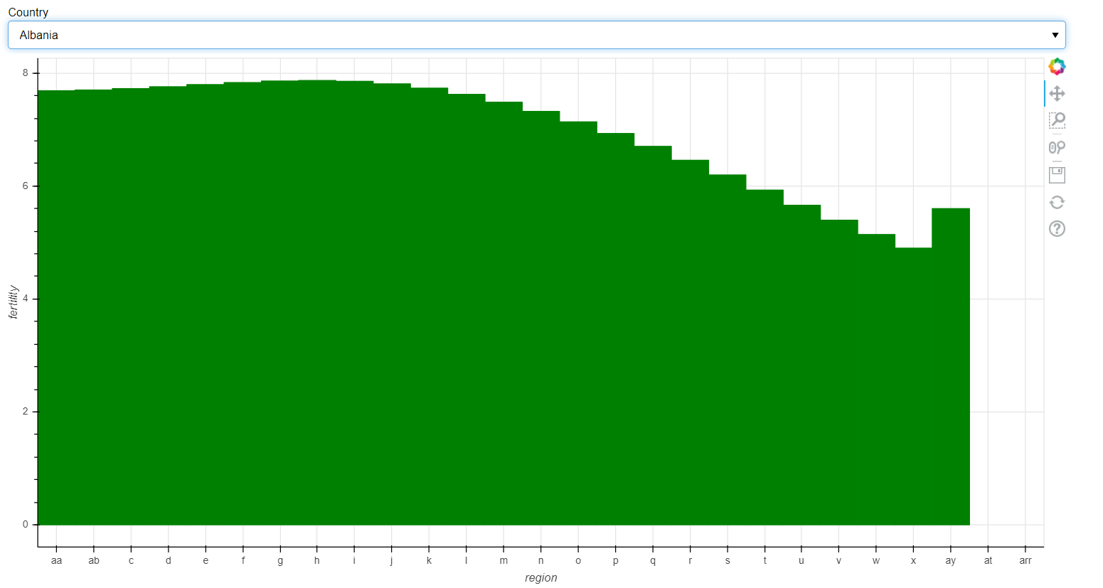
Still one last issue that I have is, it looks like the first selection sets the length of x axis values ie. if I have Albania to have more values for X axis, it does update the plot but plots only the amount of lines that Afghanistan has and leaves the rest empty even though that data exist in the csv file. Below is a snapshot where you can see plot got updated with aa and ab values but at the end of x axis it should have updated the at and arr values but as that’s more that the length of x axis values of Afghanistan, it didn’t update it. Any thought here? Highly appreciate your help throughout this problem.
There is no difference between passing plot and setting plot.x_range.factors and passing the range and setting range.factors so I don’t see how that could make any effect. I would have to see the exact code you tried (that didn’t work) to speculate. As I mentioned all I changed in your code was to set the range before calling emit (which is also what you have done above).
In any case I can’t really speculate about the other issue without data to reproduce and investigate. The sample data in the gist does not appear to have any entries for those categories.
@Bryan Thanks for all your help and sorry for the late reply. I was trying to get it all working. I think I have it working now. It did need 2 emit() calls and I also used source data to make sure it works for any selection. This is the code:
import pandas as pd
import bokeh
from bokeh.plotting import figure,output_file,show, save
from bokeh.io import output_notebook
from bokeh.models import NumeralTickFormatter,HoverTool,ColumnDataSource, CategoricalColorMapper,Select,FactorRange
from bokeh.transform import factor_cmap
from bokeh.palettes import Blues8
from bokeh.models.widgets import Tabs,Panel
from bokeh.models import Slider, CustomJS
from bokeh.layouts import row,column
from bokeh.client import push_session
output_file('index.html')
gap = pd.read_csv('C:/Users/ambhuiya/Downloads/gapminder_tidy1.csv')
gap1 = gap.loc[:, ['Country', 'Year', 'fertility', 'region']]
gap2 = gap1[gap1['Country'] == 'Afghanistan']
reason_code_range_BE = gap1['region'].unique().tolist()
print(reason_code_range_BE)
Overall = ColumnDataSource(data=gap1)
Curr = ColumnDataSource(data=gap2)
# reason_code_range_BE = Overall.data['region'].tolist().unique()
# print(reason_code_range_BE)
menu = Select(options=list(gap['Country'].unique()), value='Afghanistan', title='Country') # drop down menu
p = figure(plot_width=1200,x_axis_label='region', y_axis_label='fertility',x_range=reason_code_range_BE)
# plot and the menu is linked with each other by this callback function
callback = CustomJS(args=dict(plot=p,source=Overall, sc=Curr,x_range=reason_code_range_BE), code="""

var f = cb_obj.value
console.log(f);
sc.data['region']=[]
sc.data['fertility']=[]
for(var i = 0; i <= source.get_length(); i++){
	console.log(source.get_length());
	if (source.data['Country'][i] == f){

		sc.data['region'].push(source.data['region'][i])
		sc.data['fertility'].push(source.data['fertility'][i])

	 }
}
console.log(x_range);

sc.change.emit();

plot.x_range.factors = sc.data['region']
plot.change.emit();
console.log(x_range);


""")
# menu = Select(options=list(gap['Country'].unique()), value='Afghanistan', title='Country') # drop down menu
# p = figure(plot_width=1200,x_axis_label='region', y_axis_label='fertility',x_range=reason_code_range_BE) # creating figure object
p.vbar(x='region', top='fertility',bottom=0, color='green', source=Overall) # plotting the data using glyph circle
menu.js_on_change('value', callback) # calling the function on change of selection
layout = column(menu, p) # creating the layout
show(layout) # displaying the layout