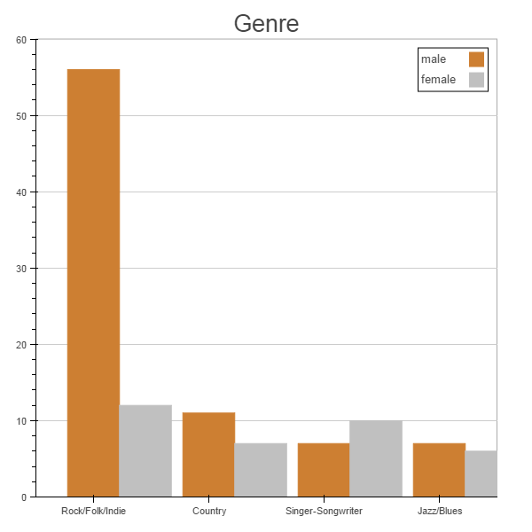
Is there any way to adjust the x_range “extent” when dealing with categorical ranges?
As you can see in the picture attached I would like to crate bar charts but instead of stacking I am interested in putting each bar side to side. However, if I tried to separate the x values (centers of rectangles) to create more space between the categories or if I try to make them wider, I always end with part of the plot missing (the part at the right).
Categorical axes are an area that can use improvement. Can you submit a GitHub issue with this image and problem description? In the mean time, you can use "categorical coordinates" and thinner bars to get a plot that fits. Note that the "categorical coordinate" syntax will probably change at some point, because it is extremely clunky (as you can see). Here is a short example:
On Dec 2, 2014, at 7:55 AM, Oscar Delgado <[email protected]> wrote:
Good morning,
Is there any way to adjust the x_range "extent" when dealing with categorical ranges?
As you can see in the picture attached I would like to crate bar charts but instead of stacking I am interested in putting each bar side to side. However, if I tried to separate the x values (centers of rectangles) to create more space between the categories or if I try to make them wider, I always end with part of the plot missing (the part at the right).
I submitted the GitHub issue with the graph as you suggested.
Thanks a lot for the example with the categorical coordinates.
regards,
Oj.
···
Le mardi 2 décembre 2014 11:10:58 UTC-5, Bryan Van de ven a écrit :
Categorical axes are an area that can use improvement. Can you submit a GitHub issue with this image and problem description? In the mean time, you can use “categorical coordinates” and thinner bars to get a plot that fits. Note that the “categorical coordinate” syntax will probably change at some point, because it is extremely clunky (as you can see). Here is a short example:
Is there any way to adjust the x_range “extent” when dealing with categorical ranges?
As you can see in the picture attached I would like to crate bar charts but instead of stacking I am interested in putting each bar side to side. However, if I tried to separate the x values (centers of rectangles) to create more space between the categories or if I try to make them wider, I always end with part of the plot missing (the part at the right).
I will appreciate any suggestion.
Thanks you very much ans best regards,
Oj.
–
You received this message because you are subscribed to the Google Groups “Bokeh Discussion - Public” group.
To unsubscribe from this group and stop receiving emails from it, send an email to [email protected].
On Tuesday, December 2, 2014 2:30:26 PM UTC-3, Oscar Delgado wrote:
hello Bryan,
I submitted the GitHub issue with the graph as you suggested.
Thanks a lot for the example with the categorical coordinates.
regards,
Oj.
Le mardi 2 décembre 2014 11:10:58 UTC-5, Bryan Van de ven a écrit :
Categorical axes are an area that can use improvement. Can you submit a GitHub issue with this image and problem description? In the mean time, you can use “categorical coordinates” and thinner bars to get a plot that fits. Note that the “categorical coordinate” syntax will probably change at some point, because it is extremely clunky (as you can see). Here is a short example:
Is there any way to adjust the x_range “extent” when dealing with categorical ranges?
As you can see in the picture attached I would like to crate bar charts but instead of stacking I am interested in putting each bar side to side. However, if I tried to separate the x values (centers of rectangles) to create more space between the categories or if I try to make them wider, I always end with part of the plot missing (the part at the right).
I will appreciate any suggestion.
Thanks you very much ans best regards,
Oj.
–
You received this message because you are subscribed to the Google Groups “Bokeh Discussion - Public” group.
To unsubscribe from this group and stop receiving emails from it, send an email to [email protected].