Awesome thanks, that gets me very close (and potentially close enough depending on how involved this next part is):
With the above sort of example, I’m able to write out different selectors for various values and adjust the label properties of individual checkbox items, e.g.
div.bk-input-group input[type='checkbox'][value="1"] ~ span { color: yellow; }
will target the middle checkbox in my example.
What I actually want to target is the color of the checkbox ICON when enabled/“on”…
Looking at the existing style, I THINK it’s the “#66afe9” assigned to border-color in .bk-input:focus →
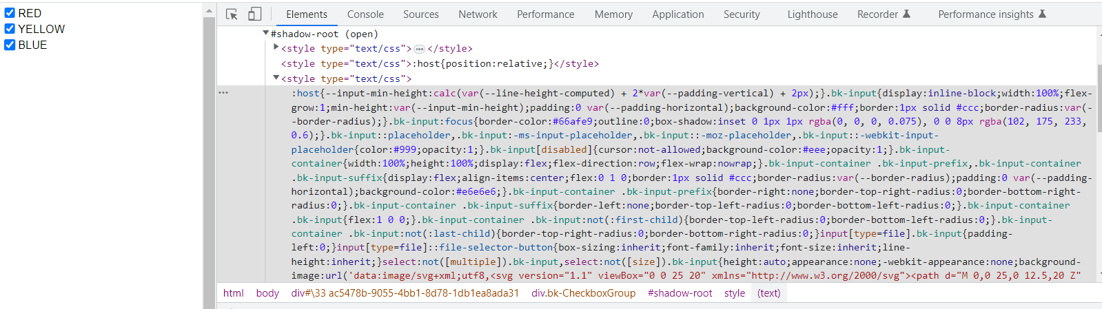
At least that’s the only hex code corresponding to that shade of blue i can find…
How to target that?
div.bk-input-group input[type='checkbox'][value="1"].bk-input:focus{
                                                        border-color: red;
                                                        }
Doesn’t work… but I did notice that:
div.bk-input-group input[type='checkbox'][value="1"]{
                                                        appearance: none;
                                                        }
can remove the icon entirely… and looking at it in the the browser editor:
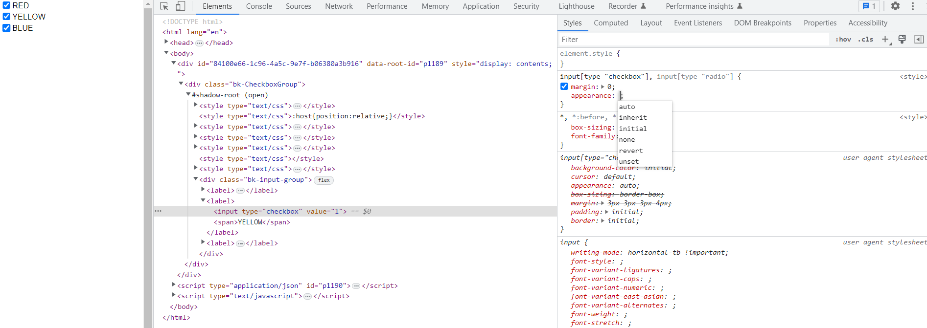
There are options like initial/revert/auto etc. By putting appearance: none in my stylesheet I am overriding the appearance attribute from the user agent stylesheet… but I’m not able (yet) to “break in” any further and edit said appearance…