Hi,
I have one old histogram (I did it a couple of weeks ago) and as per usual, I’ve re-used some of my code. Unfortunately, my new histogram looks very different. Any advice on what could have happened?
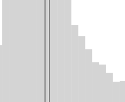
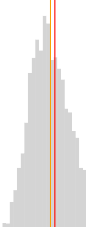
To be exact, I want the first look where I see two colors for the line and there are no boundaries for the different bars in the histogram.
my code:
p = Histogram(data, values='something', xlabel='label hidden', ylabel='count hidden', plot_width=450, plot_height=450,
        fill_alpha=0.3, outline_line_alpha=0, line_color='white',  notebook=True, tools=False, color='grey')

for r in p.renderers:
    try:
        r.glyph.line_color = None
        r.glyph.line_alpha = r.glyph.fill_alpha
    except:
        pass

p.xgrid.grid_line_color = None
p.ygrid.grid_line_color = None

x1 = df['something'].median()
x2 = df['something'].mean()
y = (0, 5000)
p.line(x1, y, legend='Median', line_width=1, color='#F8A800')
p.line(x2, y, color='red', legend='Mean', line_width=1)
p.title.text = 'Median AP CTR is 15%'
p.legend.location = 'top_right'
p.legend.border_line_color = 'white'

show(p)