Legend on top of Multi line plots

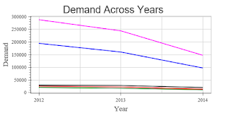
I am struggling hard to get legend on top of the multi line plot.

Here is my code and output. I tried many things however could not succeed. Please help me in resolving this issue.


import pandas as pd
import numpy as np
from bokeh.plotting import figure, show, output_file
from bokeh.models import FixedTicker
numlines=len(StateMktYear.columns)
p = figure(width=600, height=300) p.multi_line(xs=[StateMktYear.index.values]*numlines,
ys=[StateMktYear[name].values for name in StateMktYear],
color=['green','red','blue','magenta','black'],
line_width=2)
p.left[0].formatter.use_scientific = False
# p.legend='abc'
# p.legend.location='bottom_left'
p.axis.axis_label_text_font_size='14pt'
p.axis.axis_label_text_font='Times'
p.axis.major_label_text_font='Times'
p.xaxis.ticker=FixedTicker(ticks=[2012,2013,2014])
p.title='Demand Across Years'
p.axis.major_label_text_color='Black'
p.xaxis.axis_label='Year'
p.yaxis.axis_label='Demand'
show(p)

``

Failing an “official” way of providing a collection of legend-labels (which I don’t see from a quick scan of the docs), you could just plot the lines individually. In what follows, I’m assuming that iterating over StateMktYear produces the (string) names, since that’s how you’re using it. If not, you may want to zip over the column-names or whatever else is appropriate depending on the type of StateMktYear.

Code is untested, but should be in the ballpark.


p = figure(width=600, height=300)

# This replaces the call to p.multi_line()...

colors = ['green','red','blue','magenta','black']

for color, name in zip(colors, StateMktYear):

p.line(x=StateMktYear.index.values,

y=StateMktYear[name].values,

legend=name, color=color, line_width=2)

p.left[0].formatter.use_scientific = False

# p.legend='abc'

# p.legend.location='bottom_left'

p.axis.axis_label_text_font_size='14pt'

p.axis.axis_label_text_font='Times'

p.axis.major_label_text_font='Times'

p.xaxis.ticker=FixedTicker(ticks=[2012,2013,2014])

p.title='Demand Across Years'

p.axis.major_label_text_color='Black'

p.xaxis.axis_label='Year'

p.yaxis.axis_label='Demand'

show(p)

-mt

···

On Fri, Oct 7, 2016 at 8:14 AM, [email protected] wrote:

I am struggling hard to get legend on top of the multi line plot.

Here is my code and output. I tried many things however could not succeed. Please help me in resolving this issue.


import pandas as pd
import numpy as np
from bokeh.plotting import figure, show, output_file
from bokeh.models import FixedTicker
numlines=len(StateMktYear.
columns)
p = figure(width=600, height=300) p.multi_line(xs=[StateMktYear.                index.values]*numlines,
ys=[StateMktYear[name].values for name in StateMktYear],
color=['green','red','blue','                magenta','black'],
line_width=2)
p.left[0].formatter.use_scientific = False
# p.legend='abc'
# p.legend.location='bottom_left'
p.axis.axis_label_text_font_size='14pt'
p.axis.axis_label_text_font='Times'
p.axis.major_label_text_font='Times'
p.xaxis.ticker=FixedTicker(ticks=[2012,2013,2014])
p.title='Demand Across Years'
p.axis.major_label_text_color=
'Black'
p.xaxis.axis_label='Year'
p.yaxis.axis_label='Demand'
show(p)

``

You received this message because you are subscribed to the Google Groups “Bokeh Discussion - Public” group.

To unsubscribe from this group and stop receiving emails from it, send an email to [email protected].

To post to this group, send email to [email protected].

To view this discussion on the web visit https://groups.google.com/a/continuum.io/d/msgid/bokeh/010b2e60-3a03-4be4-8b38-27aab9cf5e8c%40continuum.io.

For more options, visit https://groups.google.com/a/continuum.io/d/optout.

There is a way to do this in new releases. See the plotting/file/multi_line.py example. We are in the middle of a troublesome release, I apologizeI cannot elaborate futher at the moment.

Thanks,

Bryan

···

On Oct 7, 2016, at 12:22 PM, Matt Tenenbaum <[email protected]> wrote:

Failing an "official" way of providing a collection of legend-labels (which I don't see from a quick scan of the docs), you could just plot the lines individually. In what follows, I'm assuming that iterating over `StateMktYear` produces the (string) names, since that's how you're using it. If not, you may want to zip over the column-names or whatever else is appropriate depending on the type of `StateMktYear`.

Code is untested, but should be in the ballpark.

p = figure(width=600, height=300) 

# This replaces the call to p.multi_line()...
colors = ['green','red','blue','magenta','black']
for color, name in zip(colors, StateMktYear):
    p.line(x=StateMktYear.index.values,
           y=StateMktYear[name].values,
           legend=name, color=color, line_width=2)

p.left[0].formatter.use_scientific = False
# p.legend='abc'
# p.legend.location='bottom_left'
p.axis.axis_label_text_font_size='14pt'
p.axis.axis_label_text_font='Times'
p.axis.major_label_text_font='Times'
p.xaxis.ticker=FixedTicker(ticks=[2012,2013,2014])
p.title='Demand Across Years'
p.axis.major_label_text_color='Black'
p.xaxis.axis_label='Year'
p.yaxis.axis_label='Demand'

show(p)

-mt

On Fri, Oct 7, 2016 at 8:14 AM, <[email protected]> wrote:
I am struggling hard to get legend on top of the multi line plot.

Here is my code and output. I tried many things however could not succeed. Please help me in resolving this issue.

import pandas as pd
import numpy as np
from bokeh.plotting import figure, show, output_file
from bokeh.models import FixedTicker

numlines=len(StateMktYear.
columns)

p = figure(width=600, height=300)

p.multi_line(xs=[StateMktYear.
index.values]*numlines,
                ys=[StateMktYear[name].values for name in StateMktYear],
                 color=['green','red','blue','
magenta','black'],
                line_width=2)

p.left[0].formatter.use_
scientific = False
# p.legend='abc'
# p.legend.location='bottom_
left'
p.axis.axis_label_text_font_
size='14pt'
p.axis.axis_label_text_font='
Times'
p.axis.major_label_text_font='
Times'
p.xaxis.ticker=FixedTicker(
ticks=[2012,2013,2014])
p.title='Demand Across Years'
p.axis.major_label_text_color=
'Black'
p.xaxis.axis_label='Year'
p.yaxis.axis_label='Demand'

show(p)

--
You received this message because you are subscribed to the Google Groups "Bokeh Discussion - Public" group.
To unsubscribe from this group and stop receiving emails from it, send an email to [email protected].
To post to this group, send email to [email protected].
To view this discussion on the web visit https://groups.google.com/a/continuum.io/d/msgid/bokeh/010b2e60-3a03-4be4-8b38-27aab9cf5e8c%40continuum.io\.
For more options, visit https://groups.google.com/a/continuum.io/d/optout\.

--
You received this message because you are subscribed to the Google Groups "Bokeh Discussion - Public" group.
To unsubscribe from this group and stop receiving emails from it, send an email to [email protected].
To post to this group, send email to [email protected].
To view this discussion on the web visit https://groups.google.com/a/continuum.io/d/msgid/bokeh/CA%2BZuXfOCkFAGU9dj1p_d_K4DDdSHS7qPQHZgGTmgHhmkAF1WiQ%40mail.gmail.com\.
For more options, visit https://groups.google.com/a/continuum.io/d/optout\.
Glancing at this example (https://github.com/bokeh/bokeh/blob/master/examples/plotting/file/multi_line.py), it looks like it boils down to:

Put your data in a ColumnDataSource with at least columns for xs, ys, and labels, and then specify the source and appropriate columns in the call to p.multi_line. For example:


data = {'xs': [np.arange(5) * 1, np.arange(5) * 2],

'ys': [np.ones(5) * 3, np.ones(5) * 4],

'labels': ['one', 'two']}

source = ColumnDataSource(data)

p = figure(width=600, height=300)

p.multi_line(xs='xs', ys='ys', legend='labels', source=source)

This certainly lines up with my other experiences creating glyphs from a ColumnDataSource. So, that might be a cleaner way to solve your problem that plotting each line separately within a loop.

-mt

···

On Fri, Oct 7, 2016 at 10:33 AM, Bryan Van de Ven [email protected] wrote:

There is a way to do this in new releases. See the plotting/file/multi_line.py example. We are in the middle of a troublesome release, I apologizeI cannot elaborate futher at the moment.

Thanks,

Bryan

On Oct 7, 2016, at 12:22 PM, Matt Tenenbaum [email protected] wrote:

Failing an “official” way of providing a collection of legend-labels (which I don’t see from a quick scan of the docs), you could just plot the lines individually. In what follows, I’m assuming that iterating over StateMktYear produces the (string) names, since that’s how you’re using it. If not, you may want to zip over the column-names or whatever else is appropriate depending on the type of StateMktYear.

Code is untested, but should be in the ballpark.

p = figure(width=600, height=300)

This replaces the call to p.multi_line()…

colors = [‘green’,‘red’,‘blue’,‘magenta’,‘black’]

for color, name in zip(colors, StateMktYear):

p.line(x=StateMktYear.index.values,
       y=StateMktYear[name].values,
       legend=name, color=color, line_width=2)

p.left[0].formatter.use_scientific = False

p.legend=‘abc’

p.legend.location=‘bottom_left’

p.axis.axis_label_text_font_size=‘14pt’

p.axis.axis_label_text_font=‘Times’

p.axis.major_label_text_font=‘Times’

p.xaxis.ticker=FixedTicker(ticks=[2012,2013,2014])

p.title=‘Demand Across Years’

p.axis.major_label_text_color=‘Black’

p.xaxis.axis_label=‘Year’

p.yaxis.axis_label=‘Demand’

show(p)

-mt

On Fri, Oct 7, 2016 at 8:14 AM, [email protected] wrote:

I am struggling hard to get legend on top of the multi line plot.

Here is my code and output. I tried many things however could not succeed. Please help me in resolving this issue.

import pandas as pd

import numpy as np

from bokeh.plotting import figure, show, output_file

from bokeh.models import FixedTicker

numlines=len(StateMktYear.

columns)

p = figure(width=600, height=300)

p.multi_line(xs=[StateMktYear.

index.values]*numlines,

            ys=[StateMktYear[name].values for name in StateMktYear],
             color=['green','red','blue','

magenta’,‘black’],

            line_width=2)

p.left[0].formatter.use_

scientific = False

p.legend=‘abc’

p.legend.location='bottom_

left’

p.axis.axis_label_text_font_

size=‘14pt’

p.axis.axis_label_text_font=’

Times’

p.axis.major_label_text_font=’

Times’

p.xaxis.ticker=FixedTicker(

ticks=[2012,2013,2014])

p.title=‘Demand Across Years’

p.axis.major_label_text_color=

‘Black’

p.xaxis.axis_label=‘Year’

p.yaxis.axis_label=‘Demand’

show(p)

You received this message because you are subscribed to the Google Groups “Bokeh Discussion - Public” group.

To unsubscribe from this group and stop receiving emails from it, send an email to [email protected].

To post to this group, send email to [email protected].

To view this discussion on the web visit https://groups.google.com/a/continuum.io/d/msgid/bokeh/010b2e60-3a03-4be4-8b38-27aab9cf5e8c%40continuum.io.

For more options, visit https://groups.google.com/a/continuum.io/d/optout.

You received this message because you are subscribed to the Google Groups “Bokeh Discussion - Public” group.

To unsubscribe from this group and stop receiving emails from it, send an email to [email protected].

To post to this group, send email to [email protected].

To view this discussion on the web visit https://groups.google.com/a/continuum.io/d/msgid/bokeh/CA%2BZuXfOCkFAGU9dj1p_d_K4DDdSHS7qPQHZgGTmgHhmkAF1WiQ%40mail.gmail.com.

For more options, visit https://groups.google.com/a/continuum.io/d/optout.

You received this message because you are subscribed to the Google Groups “Bokeh Discussion - Public” group.

To unsubscribe from this group and stop receiving emails from it, send an email to [email protected].

To post to this group, send email to [email protected].

To view this discussion on the web visit https://groups.google.com/a/continuum.io/d/msgid/bokeh/C2B8577A-25E3-4769-BFCD-B62FEA0E3A02%40continuum.io.
For more options, visit https://groups.google.com/a/continuum.io/d/optout.

Thanks a lot everyone for prompt responses… Great insights… Very Helpful

···

On Friday, 7 October 2016 13:50:50 UTC-4, Matt Tenenbaum wrote:

Glancing at this example (https://github.com/bokeh/bokeh/blob/master/examples/plotting/file/multi_line.py), it looks like it boils down to:

Put your data in a ColumnDataSource with at least columns for xs, ys, and labels, and then specify the source and appropriate columns in the call to p.multi_line. For example:

data = {‘xs’: [np.arange(5) * 1, np.arange(5) * 2],

‘ys’: [np.ones(5) * 3, np.ones(5) * 4],

‘labels’: [‘one’, ‘two’]}

source = ColumnDataSource(data)

p = figure(width=600, height=300)

p.multi_line(xs=‘xs’, ys=‘ys’, legend=‘labels’, source=source)

This certainly lines up with my other experiences creating glyphs from a ColumnDataSource. So, that might be a cleaner way to solve your problem that plotting each line separately within a loop.

-mt

On Fri, Oct 7, 2016 at 10:33 AM, Bryan Van de Ven [email protected] wrote:

There is a way to do this in new releases. See the plotting/file/multi_line.py example. We are in the middle of a troublesome release, I apologizeI cannot elaborate futher at the moment.

Thanks,

Bryan

On Oct 7, 2016, at 12:22 PM, Matt Tenenbaum [email protected] wrote:

Failing an “official” way of providing a collection of legend-labels (which I don’t see from a quick scan of the docs), you could just plot the lines individually. In what follows, I’m assuming that iterating over StateMktYear produces the (string) names, since that’s how you’re using it. If not, you may want to zip over the column-names or whatever else is appropriate depending on the type of StateMktYear.

Code is untested, but should be in the ballpark.

p = figure(width=600, height=300)

This replaces the call to p.multi_line()…

colors = [‘green’,‘red’,‘blue’,‘magenta’,‘black’]

for color, name in zip(colors, StateMktYear):

p.line(x=StateMktYear.index.values,
       y=StateMktYear[name].values,
       legend=name, color=color, line_width=2)

p.left[0].formatter.use_scientific = False

p.legend=‘abc’

p.legend.location=‘bottom_left’

p.axis.axis_label_text_font_size=‘14pt’

p.axis.axis_label_text_font=‘Times’

p.axis.major_label_text_font=‘Times’

p.xaxis.ticker=FixedTicker(ticks=[2012,2013,2014])

p.title=‘Demand Across Years’

p.axis.major_label_text_color=‘Black’

p.xaxis.axis_label=‘Year’

p.yaxis.axis_label=‘Demand’

show(p)

-mt

On Fri, Oct 7, 2016 at 8:14 AM, [email protected] wrote:

I am struggling hard to get legend on top of the multi line plot.

Here is my code and output. I tried many things however could not succeed. Please help me in resolving this issue.

import pandas as pd

import numpy as np

from bokeh.plotting import figure, show, output_file

from bokeh.models import FixedTicker

numlines=len(StateMktYear.

columns)

p = figure(width=600, height=300)

p.multi_line(xs=[StateMktYear.

index.values]*numlines,

            ys=[StateMktYear[name].values for name in StateMktYear],
             color=['green','red','blue','

magenta’,‘black’],

            line_width=2)

p.left[0].formatter.use_

scientific = False

p.legend=‘abc’

p.legend.location='bottom_

left’

p.axis.axis_label_text_font_

size=‘14pt’

p.axis.axis_label_text_font=’

Times’

p.axis.major_label_text_font=’

Times’

p.xaxis.ticker=FixedTicker(

ticks=[2012,2013,2014])

p.title=‘Demand Across Years’

p.axis.major_label_text_color=

‘Black’

p.xaxis.axis_label=‘Year’

p.yaxis.axis_label=‘Demand’

show(p)

You received this message because you are subscribed to the Google Groups “Bokeh Discussion - Public” group.

To unsubscribe from this group and stop receiving emails from it, send an email to [email protected].

To post to this group, send email to [email protected].

To view this discussion on the web visit https://groups.google.com/a/continuum.io/d/msgid/bokeh/010b2e60-3a03-4be4-8b38-27aab9cf5e8c%40continuum.io.

For more options, visit https://groups.google.com/a/continuum.io/d/optout.

You received this message because you are subscribed to the Google Groups “Bokeh Discussion - Public” group.

To unsubscribe from this group and stop receiving emails from it, send an email to [email protected].

To post to this group, send email to [email protected].

To view this discussion on the web visit https://groups.google.com/a/continuum.io/d/msgid/bokeh/CA%2BZuXfOCkFAGU9dj1p_d_K4DDdSHS7qPQHZgGTmgHhmkAF1WiQ%40mail.gmail.com.

For more options, visit https://groups.google.com/a/continuum.io/d/optout.

You received this message because you are subscribed to the Google Groups “Bokeh Discussion - Public” group.

To unsubscribe from this group and stop receiving emails from it, send an email to [email protected].

To post to this group, send email to [email protected].

To view this discussion on the web visit https://groups.google.com/a/continuum.io/d/msgid/bokeh/C2B8577A-25E3-4769-BFCD-B62FEA0E3A02%40continuum.io.
For more options, visit https://groups.google.com/a/continuum.io/d/optout.