
☰Read-only archive⌕
Looking for help with Bokeh?

This is a read-only archive. Ask questions and join the conversation on GitHub.

Visit Community Support on GitHub →
Archived discussions · Captured October 28, 2026

New theme for Bokeh 1.4

Community Support
Bryan
Bryan

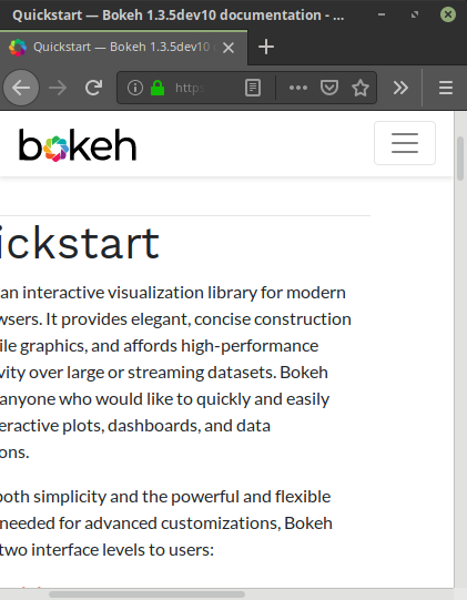
With many thanks to Joris Van de Bossche for sharing the new Bootstrap-based Sphinx theme he has been working , Bokeh 1.4 docs will have a completely new (mobile-friendly) look. The new site is deployed as a dev build: Bokeh 2.3.3rc1 Documentation
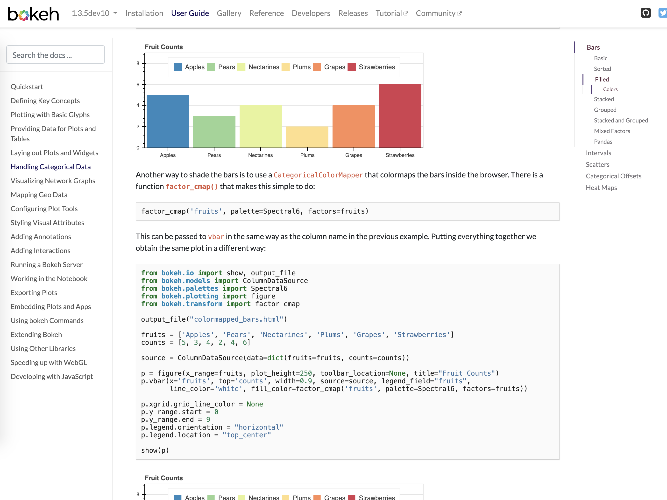
It would be really valuable to get (quick) feedback, and ideally help with implementing the feedback. This will go live later this week and I a not sure now much more work I can personally put in to it this week. Please leave any comments, observations here, and we can triage in to GH issues as appropriate

⌁   Link to post
Bryan
Bryan

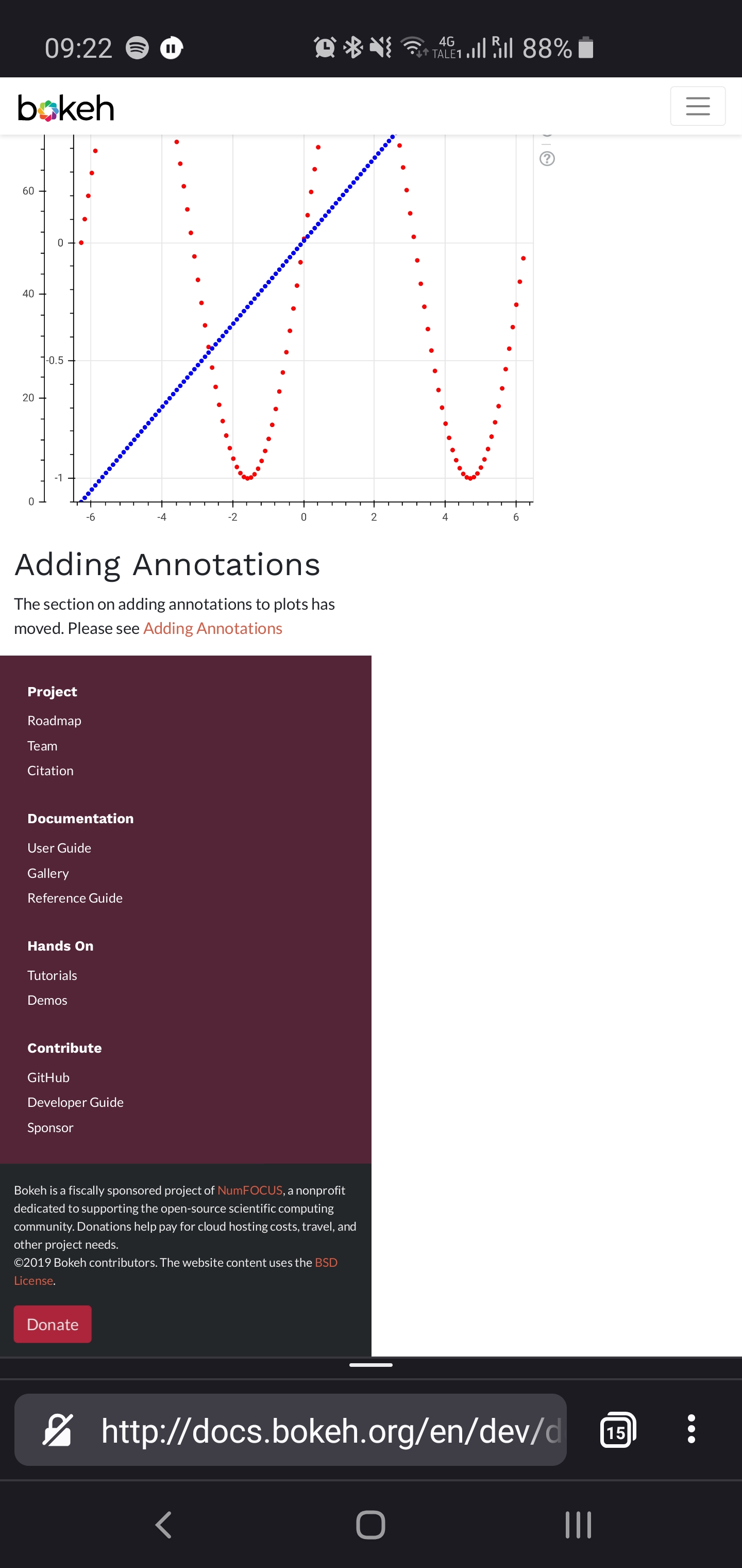
@Jack_Beanland thanks for the kind words. Can you elaborate a bit? In the image you share it looks like the hamburger menu at the top rendered as expected, but that the footer block with the links and (c) notice showed up at half the width it should be?

⌁   Link to post
Jack_Beanland
Jack_Beanland

Apologies for the pretty vague words.

(for reference this is looking at https://docs.bokeh.org/en/dev/docs/user_guide/quickstart.html)

For some pages the graphs are wider than that text width so the page extends rightwards so that you can see everything. The text and footer remain the same width as on the other pages, but the navbar seems to set itself as the new total width of the page, effectively meaning that you have to scroll right or zoom out to see the hamburger menu.

When I go to the same page on my desktop (firefox or chromium) this doesn’t occur, the navbar fixes itself to the page width and the rest of the page remains horizontally scrollable.

In general, of course, its beautiful and works well.

Hope that’s a little more helpful but please bug me for more specifics if needed

Expected behaviour, as it is on desktop, when you scroll across the navbar remains the same:

⌁   Link to post
anthonydouc
anthonydouc

The new theme looks great. Without looking in much detail would we need to implement some changes to the figure scaling options for examples on the web? Although seems in some cases the figures fit nicely and in others they dont so perhaps thats also a html/styling issue.

⌁   Link to post
Bryan
Bryan

@anthonydouc Well I’m not sure if this is your question or not, but I’d first mention that most of the examples in the docs have a fixed sizing mode, and are not responsive at all. This goes way back to a time before there were good options for sizing modes. It would be a reasonable and valuable project for somoene(s) to go through the docs and update examples to use responsive sizing modes in more places. [1] That’s a bit orthogonal to the site theme, I think (i.e. I would expect the same things are at least as bad or worse on the old site theme)


  1. I guess the main question/concern is what to do in cases were squishing a plot down to fit on a phone will just not ever be good, i.e. the periodic table example that is just intrinsically wider than it is tall. But there are many more possible problem cases. Maybe there is a more graceful way for just the plots to overflow without affecting the rest of the page. ↩︎

⌁   Link to post
abroun
abroun

+1 for the search the docs feature! :slight_smile:

I’m not sure if I’m just missing something obvious with the current docs, but not being able to find the search functionality has been a bit of a handicap for me. I’ve mainly been searching via Google which then invariably links back to old versions of the doc. :stuck_out_tongue:

Many thanks for the effort put into maintaining and updating Bokeh.

Regards

Alan

⌁   Link to post
Bryan
Bryan

There was a long-standing issue about re-adding the search. It went away when Google abruptly discontinued their Google Site Search product several years ago. I recently hoped to replace it with an ad-free Google Custom Search engine, but the paperwork based on NumFOCUS non-profit status will not be ready in time for the release. The current search box is powered by the Sphinx client search facility, which is not great, but passable.

⌁   Link to post
Matthias
Matthias

I really like the new Reference pages, well done :slight_smile:

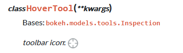
While reading about the HoverTool I figured the icon is actually the Crosshair icon :sweat_smile:

hover_tool_wrong_icon

This is the icon plotted when including the HoverTool:
hover_icon

⌁   Link to post

End of archived discussion · Replies are disabled