Providing data for a multi line from a dataframe? Having trouble figuring out how to restructure the dataframe / use multi_line's syntax

Hey @p-himik might be starting to digress here but tooltips don’t seem to be working, probably because of how we’ve brought in the lines with the for loop and df.groupby. It renders but all the values are ‘???’. I hoped this would work:

ttips = HoverTool(tooltips = [
    ("Peak Change", "@{Peak_change}")])
p = figure(title ='whatever')
p.add_tools(ttips)

But no dice. I’ve tried to enter tooltips within the for loop but that doesn’t seem to work as p.line won’t accept tooltips as an argument.

I’ve had a look around on other posts and stackoverflow but I only found posts that are obsolete or involved workarounds for slightly different things I didn’t understand.

Any ideas?

@Carl cool to see others trying to figure out the same thing!

Hi @tvkyq, I think an area to explore is adding the dataframe to bokehs columndatasource

Carl is correct. By using @{Peak_change} (BTW {} are not necessary here, I think), you’re asking the tooltip to look up this value in the data source of the renderer that you hover over. Your renderers don’t have any data source attached since you just provide the data directly.
Start providing the data via data sources, and make sure they have Peak_change column - the tooltip will work then.

Ah, not shown in the code I’ve supplied is a line I’ve since added, source = ColumnDataSource(dataset). Perhaps I could’ve better explained how I’m stuck. My issue is that I don’t know to assign source to the line renderers.

If I drop source=source into the for loop it throws the error message, ‘Expected x and y to reference fields in the supplied data source’, so I’m now unsure what to do.

An analog of what you do:

x = [1, 2, 3]
y = [2, 3, 4]
source = ColumnDataSource(data=dict(x=x, y=y))
plot.line(x=x, y=y, source=source)

Now compare it what should be done instead:

source=ColumnDataSource(data=dict(x=[1, 2, 3], y=[2, 3, 4]))
plot.line(x='x', y='y', source=source)

Notice how I pass strings that reference columns within the source instead of passing the data directly.

If you think the error message could be improved, let us know.

Hey @p-himik I’m sorry but I’m kinda new to programming and don’t understand how

source=ColumnDataSource(data=dict(x=[1, 2, 3], y=[2, 3, 4]))
plot.line(x='x', y='y', source=source)

could be applied to the dataframe I’m using that’s thousands of rows long with the .groupby('Year') for loop you’ve helped me set up.

Isn’t

x = [1, 2, 3]
y = [2, 3, 4]
source = ColumnDataSource(data=dict(x=x, y=y))

the same as

source=ColumnDataSource(data=dict(x=[1, 2, 3], y=[2, 3, 4]))

this? You’ve just haven’t specified x and y separately, right?

Thanks for being patient with me…

Since none of the glyphs share any data, you have to create a separate data source for each glyph. Just put source = ... in the loop body and use it:

for (name, group), color in zip(dataset.groupby('Year'), Spectral11):
    source = ColumnDataSource(group)
    p.line(x='New_ID', y='Peak_change', source=source, legend_label=str(name), color=color)

I’m sorry man but I still can’t get this to work. I’m still getting the same error message as before. I feel like an idiot. Here’s all the relevant code:

ttips = HoverTool(tooltips=[
    ("Peak Change", "@Peak_change")])
p = figure(title ='whatever')

for (name, group), color in zip(dataset.groupby('Year'), Category20_20):
    source = ColumnDataSource(group)
    p.line(x=group.New_ID, y=group.Peak_change, legend_label=str(name),
           source=source)

p.add_tools(ttips)

Are you sure source = ColumnDataSource(group) is correct? Earlier I had it ahead of the for loop as source = ColunDataSource(dataset), as dataset is the name of the dataframe. I also tried source = ColumnDataSource(dataset.groupby(group)) in the for loop but that didn’t work either.

This is my line:

p.line(x='New_ID', y='Peak_change', source=source, legend_label=str(name), color=color)

And this is yours:

p.line(x=group.New_ID, y=group.Peak_change, legend_label=str(name),
       source=source)

Apart from the order of the arguments (which doesn’t matter), do you see any difference?

1 Like

x=group.New_ID, y=group.Peak_change

1 Like

Hey @p-himik I’m sorry to bring this up again as you’re probably sick of me and I’ve already made enough of a fool of myself. I’m trying to adapt the logic used to create these lines with ColumnDataSource and I can’t figure out where I’m going wrong.

I have a heatmap you might recognize and the values are controlled by a slider, and I’d like this same controlled data to be shown as lines. I think the issue might be caused by source = ColumnDataSource(column) - can CDS be supplied with whatever you’re trying to create a group / subset of in this way?

from pandas import *
from bokeh.io import show
from bokeh.layouts import column
from bokeh.models import LinearColorMapper, CustomJS, Slider, ColumnDataSource
from bokeh.palettes import Viridis256
from bokeh.plotting import figure

df = DataFrame({'attribute': ['Y', 'Y', 'Y', 'Y', 'Z', 'Z', 'Z', 'Z']
                   , 'period': [1, 2, 3, 4, 1, 2, 3, 4]
                   , '1': [1, 37, 44, 13, 41, 51, 18, 14]
                   , '2': [10, 3, 44, 53, 20, 9, 18, 14]
                   , '3': [80, 37, 22, 13, 13, 44, 18, 14]})

df['period'] = df['period'].astype(str)
periods = df.period.unique().tolist()
attributes = df.attribute.unique().tolist()
selectable_columns = ['1', '2', '3']

source=ColumnDataSource(df)

active = 1
values_select = Slider(title="Values", start=1, end=3, step=1, value=active)
color_mapper = LinearColorMapper(palette=Viridis256, low=df[str(active)].min(), high=df[str(active)].max())
heatmap_fig = figure(x_range=periods, y_range=attributes)
renderer = heatmap_fig.rect(x="period", y="attribute", width=1, height=1, line_color=None, source=source, name=str(active),
                            fill_color={'field': str(active), 'transform': color_mapper})

line_fig = figure()

for column in selectable_columns:
    source = ColumnDataSource(column)
    line_fig.line(x='period'
            , y='attribute'
            , legend_label=str(column)
            , source=source)

values_select.js_on_change('value', CustomJS(args=dict(renderer=renderer, heatmap_fig=heatmap_fig, line_fig=line_fig), code="""\
    const active = cb_obj.value.toString();
    const data = renderer.data_source.data[active];
    renderer.name = active;
    const {transform} = renderer.glyph.fill_color;
    renderer.glyph.fill_color = {field: cb_obj.value, transform: transform};
    heatmap_fig.reset.emit()
    line_fig.reset.emit()
"""))

show(column(values_select, heatmap_fig, line_fig))

The error says it expects a dict or pandas.df … but how else could I supply the data?

Hi @tvkyq

In the for-loop, you are iterating over selectable_columns which is a list of integers. The error occurs on the first iteration at first line of that loop because you are attempting to make a ColumnDataSource out of the current iterator value, '1'.

for column in selectable_columns:
    source = ColumnDataSource(column)

Another quick observation is to not reuse the name column for your loop variable as it shadows the bokeh column model that you’ve imported with the same name.

from bokeh.layouts import column

I hope this helps and someone with more context of what you want to actually include in the line plot can answer the actual question you are about.

The error occurs on the first iteration at first line of that loop because you are attempting to make a ColumnDataSource out of the current iterator value, '1 '.

Ok, but this is what I intended, and I don’t understand why this causes an error. The names of columns are strings of numbers, and this is so the selected data can be controlled by the slider. Does this itself cause problems or have I missed something?

Thanks for the tip on naming the column variable. I’ll change that now.

You provide intelligible descriptions and examples, so no need to be sorry. :slight_smile:

Regarding your question - I’m not sure what you want. In the code, you’re plotting a line of attribute by period, which don’t depend upon any of the selectable_columns.
Do you want to end up with 6 lines, Y1, Y2, Y3, Z1, Z2, Z3?

You provide intelligible descriptions and examples

In a sudden twist I’ve realised I’ve provided a terrible example: I’ve provided data that’s easily confused and I haven’t accurately described what I’m trying to do.

The heatmap works as intended, and I’m trying to show this same data on a line graph to be affected by the same slider.

For the line graph:

  • lines: different lines for each attribute
  • y axis: the values of whichever column of ‘1’, ‘2’, and ‘3’ is selected. Note these column names were previously easily confused with period values.
  • x axis: period values.

Updated code which still doesn’t work in the way I hoped it would:

from pandas import *
from bokeh.io import show
from bokeh.layouts import column
from bokeh.models import LinearColorMapper, CustomJS, Slider, ColumnDataSource
from bokeh.palettes import Viridis256
from bokeh.plotting import figure

df = DataFrame({'attribute': ['Y', 'Y', 'Y', 'Y', 'Z', 'Z', 'Z', 'Z']
                   , 'period': [100, 200, 300, 400, 100, 200, 300, 400]
                   , '1': [1, 37, 44, 13, 41, 51, 18, 14]
                   , '2': [10, 3, 44, 53, 20, 9, 18, 14]
                   , '3': [80, 37, 22, 13, 13, 44, 18, 14]})

df['period'] = df['period'].astype(str)
periods = df.period.unique().tolist()
attributes = df.attribute.unique().tolist()
selectable_columns = ['1', '2', '3']

source=ColumnDataSource(df)

active = 1
values_select = Slider(title="Values", start=1, end=3, step=1, value=active)
color_mapper = LinearColorMapper(palette=Viridis256, low=df[str(active)].min(), high=df[str(active)].max())
heatmap_fig = figure(x_range=periods, y_range=attributes)
renderer = heatmap_fig.rect(x="period", y="attribute", width=1, height=1, line_color=None, source=source, name=str(active),
                            fill_color={'field': str(active), 'transform': color_mapper})

line_fig = figure()

for a in attributes:
    source = ColumnDataSource(a)
    line_fig.line(x='period'
            , y=str(a)
            , legend_label=str(a)
            , source=source)

values_select.js_on_change('value', CustomJS(args=dict(renderer=renderer, heatmap_fig=heatmap_fig, line_fig=line_fig), code="""\
    const active = cb_obj.value.toString();
    const data = renderer.data_source.data[active];
    renderer.name = active;
    const {transform} = renderer.glyph.fill_color;
    renderer.glyph.fill_color = {field: cb_obj.value, transform: transform};
    heatmap_fig.reset.emit()
    line_fig.reset.emit()
"""))

show(column(values_select, heatmap_fig, line_fig))

Gotcha. No need to create new data sources, you just have to filter the values. One issue - you will get a warning: “CDSView filters are not compatible with glyphs with connected topology such as Line or Patch”. But in your case, you can just ignore it.

from pandas import *
from bokeh.io import show
from bokeh.layouts import column
from bokeh.models import LinearColorMapper, CustomJS, Slider, ColumnDataSource, CDSView, GroupFilter
from bokeh.palettes import Viridis256
from bokeh.plotting import figure

df = DataFrame({'attribute': ['Y', 'Y', 'Y', 'Y', 'Z', 'Z', 'Z', 'Z']
                   , 'period': [100, 200, 300, 400, 100, 200, 300, 400]
                   , '1': [1, 37, 44, 13, 41, 51, 18, 14]
                   , '2': [10, 3, 44, 53, 20, 9, 18, 14]
                   , '3': [80, 37, 22, 13, 13, 44, 18, 14]})

df['period'] = df['period'].astype(str)
periods = df.period.unique().tolist()
attributes = df.attribute.unique().tolist()
selectable_columns = ['1', '2', '3']

source = ColumnDataSource(df)

active = 1
values_select = Slider(title="Values", start=1, end=3, step=1, value=active)
color_mapper = LinearColorMapper(palette=Viridis256, low=df[str(active)].min(), high=df[str(active)].max())
heatmap_fig = figure(x_range=periods, y_range=attributes)
heatmap_renderer = heatmap_fig.rect(x="period", y="attribute", width=1, height=1, line_color=None, source=source,
                                    name=str(active),
                                    fill_color={'field': str(active), 'transform': color_mapper})

line_fig = figure()

line_renderers = []
for a in attributes:
    r = line_fig.line(x='period'
                      , y=str(active)
                      , legend_label=str(a)
                      , view=CDSView(source=source,
                                     filters=[GroupFilter(column_name='attribute',
                                                          group=a)])
                      , source=source)
    line_renderers.append(r)

values_select.js_on_change('value',
                           CustomJS(args=dict(heatmap_renderer=heatmap_renderer,
                                              line_renderers=line_renderers,
                                              heatmap_fig=heatmap_fig, line_fig=line_fig), code="""\
    const active = cb_obj.value.toString();
    const data = heatmap_renderer.data_source.data[active];
    heatmap_renderer.name = active;
    const {transform} = heatmap_renderer.glyph.fill_color;
    heatmap_renderer.glyph.fill_color = {field: cb_obj.value, transform: transform};
    heatmap_fig.reset.emit();
    
    for (const lr of line_renderers) {
        lr.glyph.y = {field: active};
    }
    line_fig.reset.emit();
"""))

show(column(values_select, heatmap_fig, line_fig))

Alright so I’ve had a good play around trying to figure out what you’ve done and although your example works despite errors I don’t understand I think there are two more issues in implementing this in the file I’m working with:

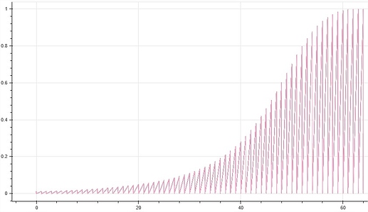
  • the lines aren’t rendering properly and I can’t figure out why. They don’t seem to be showing in separate lines, zig zag together, and instead all show as the line of the last color:

Many of the lines for the line fig have NaN values in higher active values, and these lines usually end in NaN values. This is intentional as these values can’t logically exist. Perhaps this is causing the problem?

  • the data is also filtered by a CustomJSFilter, which so the data is subject to a view, which these warnings you said I can ignore say aren’t compatible with. Have already checked this isn’t causing the immediate problem of lines not rendering properly but is there some way I can get around this?

Can you create a small runnable example with some test data that shows this behavior?

Ah… you know, I’ve since noticed I didn’t set GroupFilter(column_name='cause_label' to the correct ‘cause_label’. But that has uncovered another issue: nothing renders at all in the line graph anymore.

I’ve worked and worked with this thing and can’t work out what I’m doing wrong. I’m going crazy lol. Here’s the file I’m working with cut down as much as I could:

import pandas as pd
from bokeh.models import LinearColorMapper, ColumnDataSource, Slider, Select, CustomJSFilter, CDSView, CustomJS, GroupFilter
from bokeh.layouts import row, column, layout
from bokeh.plotting import figure, output_file, show
from bokeh.palettes import Viridis256, Category20_20

df = pd.read_excel('heatmap_linegraph_datademo.xlsx', index_col=0)
df = df.reset_index()

df = df.rename(columns={n: str(n) for n in range(1,11)})

output_file('heatmap_linegraph.html', title='whatever', mode='inline')

df['period'] = df['period'].astype(str)
periods = df.period.unique().tolist()
causes = df.option.unique().tolist()
df['active_column'] = df['5']

source = ColumnDataSource(data=df)

active = 5
color_mapper = LinearColorMapper(palette=Viridis256,
                                 low=0,
                                 high=0.02)

year_select = Slider(value=active, start=1, end=10, step=1)
ability_select = Select(value='noob', options=['l33t', 'noob'])

ability_filter = CustomJSFilter(args=dict(ability_select=ability_select), code='''
    var indices = []
    for (var i = 0; i < source.get_length(); i++){
        if (source.data['ability'][i] == ability_select.value){
                indices.push(true);
            } else {
                indices.push(false);
            }
        }
        return indices;
''')

view = CDSView(source=source, filters=[ability_filter])
heatmap = figure(x_range=periods, y_range=causes,
                 x_axis_location="above", sizing_mode="stretch_both")

heatmap_renderer = heatmap.rect(x="period", y="option", width=1, height=0.95,
                                source=source, view=view,
                                fill_color={'field': str(active), 'transform': color_mapper},
                                line_color=None, name=str(active))
line_fig = figure(sizing_mode="stretch_both")
line_renderers = []
for cause, color in zip(causes, Category20_20):
    r = line_fig.line(x='period'
                      ,y=str(active)
                      ,source=source
                      ,legend_label=str(cause)
                      ,view=CDSView(source=source,
                                    filters=[GroupFilter(column_name='option',
                                                         group=cause)]))
    line_renderers.append(r)

ability_select.js_on_change('value', CustomJS(args=dict(source=source, year_select=year_select, ability_select=ability_select), code="""
   source.change.emit()
"""))

year_select.js_on_change('value', CustomJS(args=dict(heatmap_renderer=heatmap_renderer, p=heatmap, year_select=year_select, source=source, ability_select=ability_select, line_fig=line_fig, line_renderers=line_renderers), code="""\
    const active = cb_obj.value;
    const data = heatmap_renderer.data_source.data[active];
    heatmap_renderer.name = String(active);
    const {transform} = heatmap_renderer.glyph.fill_color;
    heatmap_renderer.glyph.fill_color = {field: cb_obj.value, transform: transform};
    for (const lr of line_renderers) {
    lr.glyph.y = {field: active};
    }    
    source.data['active_column'] = source.data[year_select.value]
    source.change.emit()
"""))

top_area = row(year_select, ability_select)
show(layout(column([top_area, heatmap, line_fig]), sizing_mode="stretch_both"))

And I can’t upload the demo xlsx so here’s a link to where I’ve put it on AWS.

Any idea what I’m doing wrong? Thanks again for the help dude…

Well, all I can say at this moment is this:

FileNotFoundError: [Errno 2] No such file or directory: 'heatmap_linegraph_datademo.xlsx'

:slight_smile: