Providing data for a multi line from a dataframe? Having trouble figuring out how to restructure the dataframe / use multi_line's syntax

The error occurs on the first iteration at first line of that loop because you are attempting to make a ColumnDataSource out of the current iterator value, '1 '.

Ok, but this is what I intended, and I don’t understand why this causes an error. The names of columns are strings of numbers, and this is so the selected data can be controlled by the slider. Does this itself cause problems or have I missed something?

Thanks for the tip on naming the column variable. I’ll change that now.

You provide intelligible descriptions and examples, so no need to be sorry. :slight_smile:

Regarding your question - I’m not sure what you want. In the code, you’re plotting a line of attribute by period, which don’t depend upon any of the selectable_columns.
Do you want to end up with 6 lines, Y1, Y2, Y3, Z1, Z2, Z3?

You provide intelligible descriptions and examples

In a sudden twist I’ve realised I’ve provided a terrible example: I’ve provided data that’s easily confused and I haven’t accurately described what I’m trying to do.

The heatmap works as intended, and I’m trying to show this same data on a line graph to be affected by the same slider.

For the line graph:

  • lines: different lines for each attribute
  • y axis: the values of whichever column of ‘1’, ‘2’, and ‘3’ is selected. Note these column names were previously easily confused with period values.
  • x axis: period values.

Updated code which still doesn’t work in the way I hoped it would:

from pandas import *
from bokeh.io import show
from bokeh.layouts import column
from bokeh.models import LinearColorMapper, CustomJS, Slider, ColumnDataSource
from bokeh.palettes import Viridis256
from bokeh.plotting import figure

df = DataFrame({'attribute': ['Y', 'Y', 'Y', 'Y', 'Z', 'Z', 'Z', 'Z']
                   , 'period': [100, 200, 300, 400, 100, 200, 300, 400]
                   , '1': [1, 37, 44, 13, 41, 51, 18, 14]
                   , '2': [10, 3, 44, 53, 20, 9, 18, 14]
                   , '3': [80, 37, 22, 13, 13, 44, 18, 14]})

df['period'] = df['period'].astype(str)
periods = df.period.unique().tolist()
attributes = df.attribute.unique().tolist()
selectable_columns = ['1', '2', '3']

source=ColumnDataSource(df)

active = 1
values_select = Slider(title="Values", start=1, end=3, step=1, value=active)
color_mapper = LinearColorMapper(palette=Viridis256, low=df[str(active)].min(), high=df[str(active)].max())
heatmap_fig = figure(x_range=periods, y_range=attributes)
renderer = heatmap_fig.rect(x="period", y="attribute", width=1, height=1, line_color=None, source=source, name=str(active),
                            fill_color={'field': str(active), 'transform': color_mapper})

line_fig = figure()

for a in attributes:
    source = ColumnDataSource(a)
    line_fig.line(x='period'
            , y=str(a)
            , legend_label=str(a)
            , source=source)

values_select.js_on_change('value', CustomJS(args=dict(renderer=renderer, heatmap_fig=heatmap_fig, line_fig=line_fig), code="""\
    const active = cb_obj.value.toString();
    const data = renderer.data_source.data[active];
    renderer.name = active;
    const {transform} = renderer.glyph.fill_color;
    renderer.glyph.fill_color = {field: cb_obj.value, transform: transform};
    heatmap_fig.reset.emit()
    line_fig.reset.emit()
"""))

show(column(values_select, heatmap_fig, line_fig))

Gotcha. No need to create new data sources, you just have to filter the values. One issue - you will get a warning: “CDSView filters are not compatible with glyphs with connected topology such as Line or Patch”. But in your case, you can just ignore it.

from pandas import *
from bokeh.io import show
from bokeh.layouts import column
from bokeh.models import LinearColorMapper, CustomJS, Slider, ColumnDataSource, CDSView, GroupFilter
from bokeh.palettes import Viridis256
from bokeh.plotting import figure

df = DataFrame({'attribute': ['Y', 'Y', 'Y', 'Y', 'Z', 'Z', 'Z', 'Z']
                   , 'period': [100, 200, 300, 400, 100, 200, 300, 400]
                   , '1': [1, 37, 44, 13, 41, 51, 18, 14]
                   , '2': [10, 3, 44, 53, 20, 9, 18, 14]
                   , '3': [80, 37, 22, 13, 13, 44, 18, 14]})

df['period'] = df['period'].astype(str)
periods = df.period.unique().tolist()
attributes = df.attribute.unique().tolist()
selectable_columns = ['1', '2', '3']

source = ColumnDataSource(df)

active = 1
values_select = Slider(title="Values", start=1, end=3, step=1, value=active)
color_mapper = LinearColorMapper(palette=Viridis256, low=df[str(active)].min(), high=df[str(active)].max())
heatmap_fig = figure(x_range=periods, y_range=attributes)
heatmap_renderer = heatmap_fig.rect(x="period", y="attribute", width=1, height=1, line_color=None, source=source,
                                    name=str(active),
                                    fill_color={'field': str(active), 'transform': color_mapper})

line_fig = figure()

line_renderers = []
for a in attributes:
    r = line_fig.line(x='period'
                      , y=str(active)
                      , legend_label=str(a)
                      , view=CDSView(source=source,
                                     filters=[GroupFilter(column_name='attribute',
                                                          group=a)])
                      , source=source)
    line_renderers.append(r)

values_select.js_on_change('value',
                           CustomJS(args=dict(heatmap_renderer=heatmap_renderer,
                                              line_renderers=line_renderers,
                                              heatmap_fig=heatmap_fig, line_fig=line_fig), code="""\
    const active = cb_obj.value.toString();
    const data = heatmap_renderer.data_source.data[active];
    heatmap_renderer.name = active;
    const {transform} = heatmap_renderer.glyph.fill_color;
    heatmap_renderer.glyph.fill_color = {field: cb_obj.value, transform: transform};
    heatmap_fig.reset.emit();
    
    for (const lr of line_renderers) {
        lr.glyph.y = {field: active};
    }
    line_fig.reset.emit();
"""))

show(column(values_select, heatmap_fig, line_fig))

Alright so I’ve had a good play around trying to figure out what you’ve done and although your example works despite errors I don’t understand I think there are two more issues in implementing this in the file I’m working with:

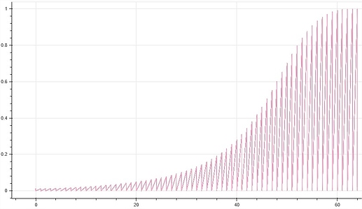
  • the lines aren’t rendering properly and I can’t figure out why. They don’t seem to be showing in separate lines, zig zag together, and instead all show as the line of the last color:

Many of the lines for the line fig have NaN values in higher active values, and these lines usually end in NaN values. This is intentional as these values can’t logically exist. Perhaps this is causing the problem?

  • the data is also filtered by a CustomJSFilter, which so the data is subject to a view, which these warnings you said I can ignore say aren’t compatible with. Have already checked this isn’t causing the immediate problem of lines not rendering properly but is there some way I can get around this?

Can you create a small runnable example with some test data that shows this behavior?

Ah… you know, I’ve since noticed I didn’t set GroupFilter(column_name='cause_label' to the correct ‘cause_label’. But that has uncovered another issue: nothing renders at all in the line graph anymore.

I’ve worked and worked with this thing and can’t work out what I’m doing wrong. I’m going crazy lol. Here’s the file I’m working with cut down as much as I could:

import pandas as pd
from bokeh.models import LinearColorMapper, ColumnDataSource, Slider, Select, CustomJSFilter, CDSView, CustomJS, GroupFilter
from bokeh.layouts import row, column, layout
from bokeh.plotting import figure, output_file, show
from bokeh.palettes import Viridis256, Category20_20

df = pd.read_excel('heatmap_linegraph_datademo.xlsx', index_col=0)
df = df.reset_index()

df = df.rename(columns={n: str(n) for n in range(1,11)})

output_file('heatmap_linegraph.html', title='whatever', mode='inline')

df['period'] = df['period'].astype(str)
periods = df.period.unique().tolist()
causes = df.option.unique().tolist()
df['active_column'] = df['5']

source = ColumnDataSource(data=df)

active = 5
color_mapper = LinearColorMapper(palette=Viridis256,
                                 low=0,
                                 high=0.02)

year_select = Slider(value=active, start=1, end=10, step=1)
ability_select = Select(value='noob', options=['l33t', 'noob'])

ability_filter = CustomJSFilter(args=dict(ability_select=ability_select), code='''
    var indices = []
    for (var i = 0; i < source.get_length(); i++){
        if (source.data['ability'][i] == ability_select.value){
                indices.push(true);
            } else {
                indices.push(false);
            }
        }
        return indices;
''')

view = CDSView(source=source, filters=[ability_filter])
heatmap = figure(x_range=periods, y_range=causes,
                 x_axis_location="above", sizing_mode="stretch_both")

heatmap_renderer = heatmap.rect(x="period", y="option", width=1, height=0.95,
                                source=source, view=view,
                                fill_color={'field': str(active), 'transform': color_mapper},
                                line_color=None, name=str(active))
line_fig = figure(sizing_mode="stretch_both")
line_renderers = []
for cause, color in zip(causes, Category20_20):
    r = line_fig.line(x='period'
                      ,y=str(active)
                      ,source=source
                      ,legend_label=str(cause)
                      ,view=CDSView(source=source,
                                    filters=[GroupFilter(column_name='option',
                                                         group=cause)]))
    line_renderers.append(r)

ability_select.js_on_change('value', CustomJS(args=dict(source=source, year_select=year_select, ability_select=ability_select), code="""
   source.change.emit()
"""))

year_select.js_on_change('value', CustomJS(args=dict(heatmap_renderer=heatmap_renderer, p=heatmap, year_select=year_select, source=source, ability_select=ability_select, line_fig=line_fig, line_renderers=line_renderers), code="""\
    const active = cb_obj.value;
    const data = heatmap_renderer.data_source.data[active];
    heatmap_renderer.name = String(active);
    const {transform} = heatmap_renderer.glyph.fill_color;
    heatmap_renderer.glyph.fill_color = {field: cb_obj.value, transform: transform};
    for (const lr of line_renderers) {
    lr.glyph.y = {field: active};
    }    
    source.data['active_column'] = source.data[year_select.value]
    source.change.emit()
"""))

top_area = row(year_select, ability_select)
show(layout(column([top_area, heatmap, line_fig]), sizing_mode="stretch_both"))

And I can’t upload the demo xlsx so here’s a link to where I’ve put it on AWS.

Any idea what I’m doing wrong? Thanks again for the help dude…

Well, all I can say at this moment is this:

FileNotFoundError: [Errno 2] No such file or directory: 'heatmap_linegraph_datademo.xlsx'

:slight_smile:

That’s strange… Is that the error the link gives? I’ve just tried on another device and it’s accesses it ok. Maybe I didn’t initially set it to public. Could you please try again?

Also, that demo data should have N/A (for excel) or np.NaN (for Python) values for many values that have higher period values, and that’s not shown in the demo data. Probably wouldn’t matter but should mention just in case.

Thanks again

Ah, sorry - I was half asleep there and completely missed the link, so I thought that you just replaced the test data with a real one and forgot to replace it back.
I’ll take a look today. BTW, you can pass links directly to pd.read_excel, I think. At least, it works with pd.read_csv. Of course, it’s only good for examples since Pandas doesn’t cache anything.

1 Like

Oh yeah good point you can pass the url directly into the code! Here’s the code updated with direct url link to xlsx with the NaN values. Thanks again dude

import pandas as pd
from bokeh.models import LinearColorMapper, ColumnDataSource, Slider, Select, CustomJSFilter, CDSView, CustomJS, GroupFilter
from bokeh.layouts import row, column, layout
from bokeh.plotting import figure, output_file, show
from bokeh.palettes import Viridis256, Category20_20

df = pd.read_excel('https://cjdixon.s3-ap-southeast-2.amazonaws.com/bokeh/heatmap_linegraph_datademo.xlsx', index_col=0)
df = df.reset_index()

df = df.rename(columns={n: str(n) for n in range(1,11)})

output_file('heatmap_linegraph.html', title='whatever', mode='inline')

df['period'] = df['period'].astype(str)
periods = df.period.unique().tolist()
causes = df.option.unique().tolist()
df['active_column'] = df['5']

source = ColumnDataSource(data=df)

active = 5
color_mapper = LinearColorMapper(palette=Viridis256,
                                 low=0,
                                 high=0.02)

year_select = Slider(value=active, start=1, end=10, step=1)
ability_select = Select(value='noob', options=['l33t', 'noob'])

ability_filter = CustomJSFilter(args=dict(ability_select=ability_select), code='''
    var indices = []
    for (var i = 0; i < source.get_length(); i++){
        if (source.data['ability'][i] == ability_select.value){
                indices.push(true);
            } else {
                indices.push(false);
            }
        }
        return indices;
''')

view = CDSView(source=source, filters=[ability_filter])
heatmap = figure(x_range=periods, y_range=causes,
                 x_axis_location="above", sizing_mode="stretch_both")

heatmap_renderer = heatmap.rect(x="period", y="option", width=1, height=0.95,
                                source=source, view=view,
                                fill_color={'field': str(active), 'transform': color_mapper},
                                line_color=None, name=str(active))
line_fig = figure(sizing_mode="stretch_both")
line_renderers = []
for cause, color in zip(causes, Category20_20):
    r = line_fig.line(x='period'
                      ,y=str(active)
                      ,source=source
                      ,legend_label=str(cause)
                      ,view=CDSView(source=source,
                                    filters=[GroupFilter(column_name='option',
                                                         group=cause)]))
    line_renderers.append(r)

ability_select.js_on_change('value', CustomJS(args=dict(source=source, year_select=year_select, ability_select=ability_select), code="""
   source.change.emit()
"""))

year_select.js_on_change('value', CustomJS(args=dict(heatmap_renderer=heatmap_renderer, p=heatmap, year_select=year_select, source=source, ability_select=ability_select, line_fig=line_fig, line_renderers=line_renderers), code="""\
    const active = cb_obj.value;
    const data = heatmap_renderer.data_source.data[active];
    heatmap_renderer.name = String(active);
    const {transform} = heatmap_renderer.glyph.fill_color;
    heatmap_renderer.glyph.fill_color = {field: cb_obj.value, transform: transform};
    for (const lr of line_renderers) {
    lr.glyph.y = {field: active};
    }    
    source.data['active_column'] = source.data[year_select.value]
    source.change.emit()
"""))

top_area = row(year_select, ability_select)
show(layout(column([top_area, heatmap, line_fig]), sizing_mode="stretch_both"))

Things you need to change:

  • Instead of using CDSView with line_fig.line just create a data source with a subset of data
  • Actually pass color=color to line_fig.line
  • If you still can’t get the line plot to work, then write a simpler version of the code in a separate file - for example, your callbacks are bloated and you don’t need the heatmap to test out the lines. It will make it much easier for you to figure out

Regarding zigzagging lines - well, that’s what the data is. You’re plotting the numbered columns by the period column. Each single period value contains multiple values within the same numbered column - it is bound to be a zigzag unless the values are all the same (and they’re not).

Instead of using CDSView with line_fig.line just create a data source with a subset of data

I’m unsure how to do this in the same way this was done for df.groupby('Year') for earlier examples in this thread. As the df is now contained in source = ColumnDataSource(data=df) I don’t know how to get .groupby to work. Could you please point me in the right direction?

  • Actually pass color=color to line_fig.line

Ah yes I removed this in effort to simplify the file. I’ve put it back in.

Regarding zigzagging lines - well, that’s what the data is. You’re plotting the numbered columns by the period column. Each single period value contains multiple values within the same numbered column - it is bound to be a zigzag unless the values are all the same (and they’re not).

Did you notice the ability_filter? Values are also separated by another column, ability, so I don’t think there are multiple values for combinations of period, ability, and option columns. However, this isn’t an issue right now as nothing renders in the line graph at all. lol.

You don’t need groupby for this. Just add this to the for loop body:

source = ColumnDataSource(df[df.option=cause])

I did. But it doesn’t affect the lines in any way.

Follow the advice I’ve given you earlier - start small with just the broken part, try to build it up from the ground up till it breaks, figure out what’s wrong, and only then start piling up functionality on top of it.

source = ColumnDataSource(df[df.option=cause])

Ooh I didn’t know you could do this! That makes so much sense! Are you sure this syntax is correct though? I’ve tried this and a few variations and it doesn’t seem to like the equals sign but I don’t know why…

Ah, of course you’re correct - replace = with ==. :slight_smile:

Oh yeah! :smiley: Because the single = is a declaration but == is a test for a condition, right? That works perfectly, thank you!

There’s just one last piece I can’t figure out! The data needs to be filtered by the ability_filter, because this seems like it’s causing the jagged lines. I thought view could be used for this but it seems that’ won’t be compatible with line graphs. I’ve also set up & (df.ability == ability_select.value) in the line source which filters it correctly but I can’t get it to update. I’ve included line_fig.reset.emit() in the js_on_change but that hasn’t worked either… any last ideas?

import pandas as pd
from bokeh.models import LinearColorMapper, ColumnDataSource, Slider, Select, CustomJSFilter, CDSView, CustomJS, GroupFilter
from bokeh.layouts import row, column, layout
from bokeh.plotting import figure, output_file, show
from bokeh.palettes import Viridis256, Category20_20

df = pd.read_excel('https://cjdixon.s3-ap-southeast-2.amazonaws.com/bokeh/heatmap_linegraph_datademo.xlsx', index_col=0)
df = df.reset_index()

df = df.rename(columns={n: str(n) for n in range(1,11)})

output_file('heatmap_linegraph.html', title='whatever', mode='inline')

df['period'] = df['period'].astype(str)
periods = df.period.unique().tolist()
causes = df.option.unique().tolist()
abilities = df.ability.unique().tolist()
df['active_column'] = df['5']

source = ColumnDataSource(data=df)

active = 5
color_mapper = LinearColorMapper(palette=Viridis256,
                                 low=0,
                                 high=0.02)

year_select = Slider(value=active, start=1, end=10, step=1)
ability_select = Select(value='noob', options=['l33t', 'noob'])

ability_filter = CustomJSFilter(args=dict(ability_select=ability_select), code='''
    var indices = []
    for (var i = 0; i < source.get_length(); i++){
        if (source.data['ability'][i] == ability_select.value){
                indices.push(true);
            } else {
                indices.push(false);
            }
        }
        return indices;
''')

view = CDSView(source=source, filters=[ability_filter])
heatmap = figure(x_range=periods, y_range=causes,
                 x_axis_location="above", sizing_mode="stretch_both")

heatmap_renderer = heatmap.rect(x="period", y="option", width=1, height=0.95,
                                source=source, view=view,
                                fill_color={'field': str(active), 'transform': color_mapper},
                                line_color=None, name=str(active))
line_fig = figure(sizing_mode="stretch_both", y_range = (0, .03)
, x_range = (0, 60))
line_renderers = []
for cause, color, ability in zip(causes, Category20_20, abilities):
    r = line_fig.line(x='period'
                      ,y=str(active)
                      ,color=color
                      ,line_width=3
                      ,source= ColumnDataSource(data=df[(df.option==cause) & (df.ability == ability_select.value)])
                      ,legend_label=str(cause))
    line_renderers.append(r)

ability_select.js_on_change('value', CustomJS(args=dict(source=source, year_select=year_select, ability_select=ability_select), code="""
   source.change.emit()
"""))

year_select.js_on_change('value', CustomJS(args=dict(heatmap_renderer=heatmap_renderer, p=heatmap, year_select=year_select, source=source, ability_select=ability_select, line_fig=line_fig, line_renderers=line_renderers), code="""\
    const active = cb_obj.value;
    const data = heatmap_renderer.data_source.data[active];
    heatmap_renderer.name = String(active);
    const {transform} = heatmap_renderer.glyph.fill_color;
    heatmap_renderer.glyph.fill_color = {field: cb_obj.value, transform: transform};
    for (const lr of line_renderers) {
    lr.glyph.y = {field: active};
    }    
    source.data['active_column'] = source.data[year_select.value]
    source.change.emit()
    line_fig.reset.emit()
"""))

top_area = row(year_select, ability_select)
show(layout(column([top_area, heatmap, line_fig]), sizing_mode="stretch_both"))

Thank you so much for your help man. I sincerely appreciate it.

In ability_select.js_on_change, you will need to construct the lines’ data sources again, only this time using JavaScript.

Alright, I’ve tried figuring out how to rebuild the data with JS from something @carolyn kindly helped me with a few months ago, and I think I’ve almost got it, but can’t quite figure out how to implement it.

In the for loop where we’re making the lines I’m unsure how to pass the source as subset_source while also keeping the data=df[df.option==cause] condition:

import pandas as pd
from bokeh.models import LinearColorMapper, ColumnDataSource, Slider, Select, CustomJSFilter, CDSView, CustomJS, GroupFilter
from bokeh.layouts import row, column, layout
from bokeh.plotting import figure, output_file, show
from bokeh.palettes import Viridis256, Category20_20

df = pd.read_excel('https://cjdixon.s3-ap-southeast-2.amazonaws.com/bokeh/heatmap_linegraph_datademo.xlsx', index_col=0)
df = df.reset_index()

df = df.rename(columns={n: str(n) for n in range(1,11)})

output_file('heatmap_linegraph.html', title='whatever', mode='inline')

df['period'] = df['period'].astype(str)
periods = df.period.unique().tolist()
causes = df.option.unique().tolist()
abilities = df.ability.unique().tolist()
df['active_column'] = df['5']

source = ColumnDataSource(data=df)

active = 5
color_mapper = LinearColorMapper(palette=Viridis256,
                                 low=0,
                                 high=0.02)

year_select = Slider(value=active, start=1, end=10, step=1)
ability_select = Select(value='noob', options=['l33t', 'noob'])

ability_filter = CustomJSFilter(args=dict(ability_select=ability_select), code='''
    var indices = []
    for (var i = 0; i < source.get_length(); i++){
        if (source.data['ability'][i] == ability_select.value){
                indices.push(true);
            } else {
                indices.push(false);
            }
        }
        return indices;
''')

subset_source = ColumnDataSource(data=source.data.copy())
fields_to_update = list(df.columns.values)
ability_callback = CustomJS(args=dict(source=source, subset_source=subset_source, ability_select=ability_select, fields_to_update=fields_to_update), code="""
    subset_source.clear();
    for (i = 0; i < source.data.x.length; i++) {
        if (source.data.ability[i] == ability_select.value) {
            for (j=0; j < fields_to_update.length; j++) {
                subset_source.data[fields_to_update[j]].push(source.data[fields_to_update[j]][i]);
            }
        }
    }'
    subset_source.change.emit();
""")

view = CDSView(source=source, filters=[ability_filter])
heatmap = figure(x_range=periods, y_range=causes,
                 x_axis_location="above", sizing_mode="stretch_both")

heatmap_renderer = heatmap.rect(x="period", y="option", width=1, height=0.95,
                                source=source, view=view,
                                fill_color={'field': str(active), 'transform': color_mapper},
                                line_color=None, name=str(active))
line_fig = figure(sizing_mode="stretch_both", y_range = (0, .03)
, x_range = (0, 60))
line_renderers = []
for cause, color in zip(causes, Category20_20):
    r = line_fig.line(x='period'
                      ,y=str(active)
                      ,color=color
                      ,line_width=3
                      ,source= ColumnDataSource(data=df[df.option==cause])
                      ,legend_label=str(cause))
    line_renderers.append(r)

ability_select.js_on_change('value', ability_callback)

year_select.js_on_change('value', CustomJS(args=dict(heatmap_renderer=heatmap_renderer, p=heatmap, year_select=year_select, source=source, ability_select=ability_select, line_fig=line_fig, line_renderers=line_renderers), code="""\
    const active = cb_obj.value;
    const data = heatmap_renderer.data_source.data[active];
    heatmap_renderer.name = String(active);
    const {transform} = heatmap_renderer.glyph.fill_color;
    heatmap_renderer.glyph.fill_color = {field: cb_obj.value, transform: transform};
    for (const lr of line_renderers) {
    lr.glyph.y = {field: active};
    }    
    source.data['active_column'] = source.data[year_select.value]
    source.change.emit()
    line_fig.reset.emit()
"""))

top_area = row(year_select, ability_select)
show(layout(column([top_area, heatmap, line_fig]), sizing_mode="stretch_both"))

Any ideas? We’re so close!

You will have to have a subset_source for each line.