Hi!
I'm trying to graph some prices according to the location where the
prices are taken.
This is the code [0]:
"""
from bokeh.plotting import *
output_file("test.html")
# the data, very simple, a location name and a price
data = [
("A", 10),

("B", 50),

("C", 100),

("A", 12),

("A", 15),

("B", 55),

("B", 52),
]
# a list of all locations, ordered
locations = sorted({x[0] for x in data})
x =
y =
c =
# for each data point, add to three lists: the price, the location (but using a
# number, otherwise scatter doesn't work), and the color according to the price
for locat, price in data:
x.append(price)

y.append(locations.index(locat))

c.append("red" if price > 70 else 'blue')
# plot
scatter(x, y, color=c, fill_alpha=0.7, size=6, y_range=locations,
x_range=[0, 120])
show()
"""
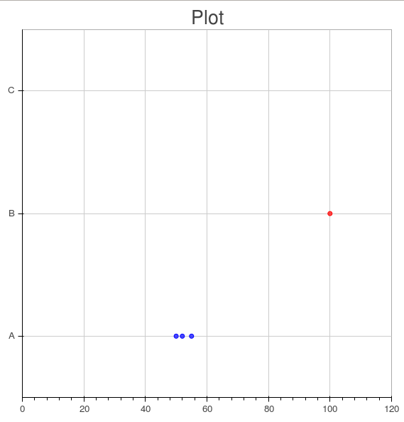
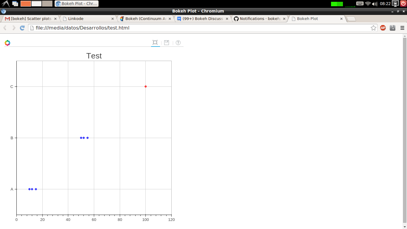
It creates the attached image.
As you can see, there are two problems with it:
1. there is one row without points!
2. the row name doesn't correspond with the data.
Probably I'm using badly the scatter plot, but I couldn't find the problem.
Help? Thanks! 
Regards,
[0] Also in a linkode, just in case: Linkode