☰Read-only archive⌕
Looking for help with Bokeh?

This is a read-only archive. Ask questions and join the conversation on GitHub.

Visit Community Support on GitHub →
Archived discussions · Captured October 28, 2026

Seeing ?s in hover tooltips

Community Supporthover
internshipdeco
internshipdeco

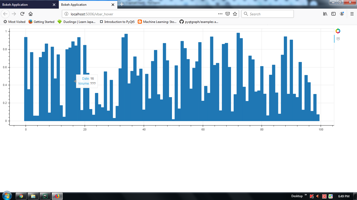
Hover tool is not working properly on vbar graphs. it display only values of x-axis, for y-axis value it show “???”. Below i have given my code, kindly point out me where i am going wrong?

from bokeh.io import show, output_file, curdoc
from bokeh.models import ColumnDataSource, FactorRange
from bokeh.plotting import figure

import numpy as np
x =np.arange(1000)
y =np.random.random(100)
source = ColumnDataSource(data=dict(x=x, y=y))

plots = figure(plot_width = 1300, plot_height = 400,tools ="hover",
               tooltips=[("Date", "@x"), ("Volume", "@y")])
plots.vbar(x, width = 1, bottom = 0, top = y)
curdoc().add_root(plots)
⌁   Link to post
Bryan
Bryan

The @foo fields refer to the name of a column in a ColumnDataSource, e.g. source.data['foo'] However, you are not actually doing anything with the CDS you create above. Instead of passing it to vbar and using column names, you are passing literal arrays/lists to directly vbar. This causes the vbar to create an internal CDS to use, with default column names. In this case, the default column names are "x" and "top", matching the glyph parameters. But in particular, note there is no "y", which is why @y finds nothing to display. So you have two options:

  • change the call to vbar to actually use the source you made, so @y works:

    plots.vbar(x="x", top="y", width=1, bottom=0, source=source)
    
  • Change the tooltips to match the default columns by using @top:

    plots = figure(...,  
                   tooltips=[("Date", "@x"), ("Volume", "@top")])
    
⌁   Link to post
internshipdeco
internshipdeco

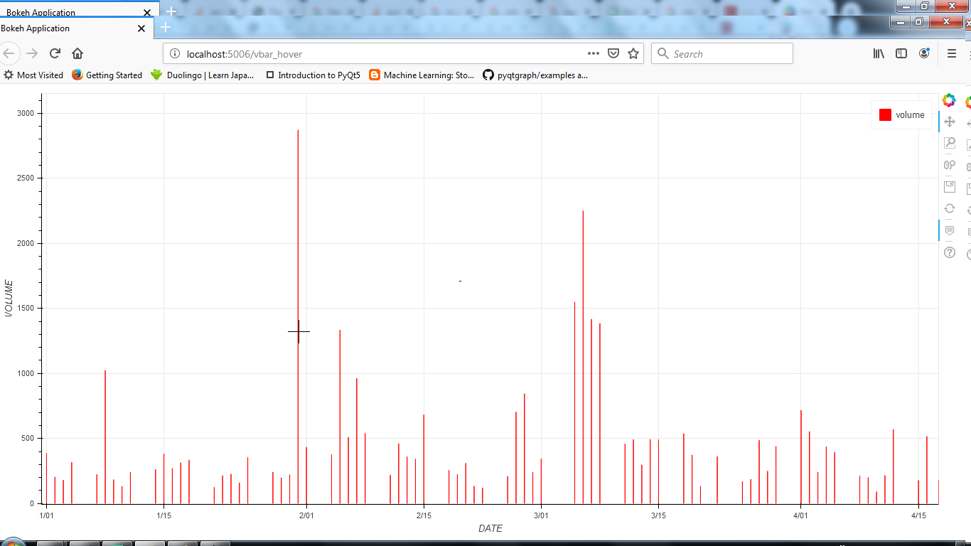
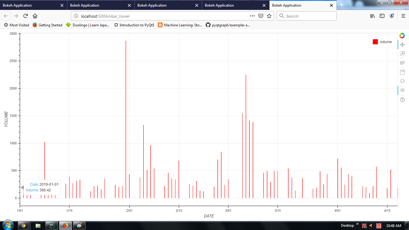
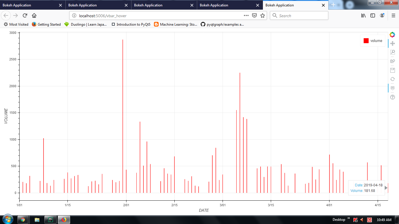
Thank you @Bryan. After doing changes as you mentioned it works for me. But my real issue is with below graph, while applying “hline” mode of Hovertool it works perfectly, but while applying “vline” mode, it doesn’t work on graph rather it display hover on axis for inital and final value.

This is my data format:
     DATE        VOLUME
0  2019-04-18   18168.0 
1  2019-04-16   51630.0
2  2019-04-15   17768.0
3  2019-04-12   57049.0
4  2019-04-11   21701.0

dataframe = pd.DataFrame(data2)
print(dataframe)
if dataframe['VOLUME'].max() >= 100000:
    dataframe["VOLUME"] = dataframe["VOLUME"].__div__(100)
else:
 dataframe["VOLUME"] = dataframe["VOLUME"]
 dataframe['DATE'] = [x.strftime("%Y-%m-%d %H:%M:%S") for x in dataframe['DATE']]

 dataframe['DATE'] = pd.to_datetime(dataframe['DATE'])
 p = ColumnDataSource( data=dict(DATE=[], VOLUME=[]))
 p.data = p.from_df(dataframe)
 print(p.data)
 ts2 = figure(plot_height=200,sizing_mode='stretch_both', x_axis_type='datetime', 
       active_drag="auto", x_axis_label='DATE', y_axis_label='VOLUME')
 t1 = ts2.vbar(x ='DATE', top= 'VOLUME',width = 1, bottom = 0,  legend='volume', 
         color='red', source=p)
 ts2.grid.grid_line_alpha = 0.8
 ts2.add_tools(HoverTool(renderers=[t1],
                    tooltips=[("Date", "@DATE{%F}"), ("Volume", "@VOLUME{0.2f}")],
                    formatters={"DATE": "datetime"},
                    mode='vline'))
 #ts2.add_tools(hover_tool)

  ts2.x_range.start = dataframe.DATE.min().timestamp() * 1000
  ts2.x_range.end = dataframe.DATE.max().timestamp() * 1000
  curdoc().add_root(ts2)

⌁   Link to post

End of archived discussion · Replies are disabled