Shorten extra y axis

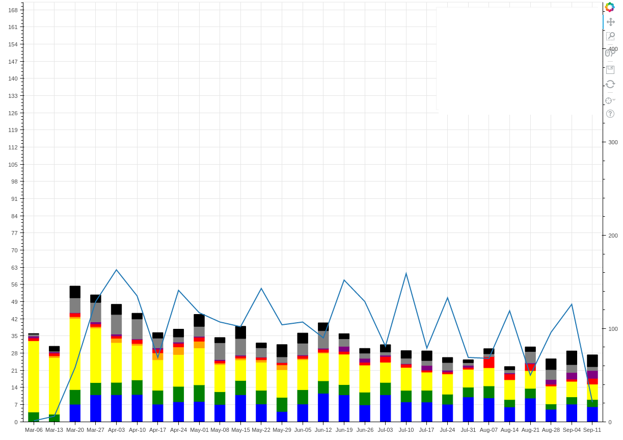
Is there a way I can shorten the extra y axis on the chart below? I am creating the line as follows:

fig = plotting.figure(width=1200, height=900, x_range=list(data[‘week’].unique()), title=“Median Stepwise Profile Turnaround Time for {} Cases”.format(chartType))

fig.extra_y_ranges = {“count”: Range1d(start=0, end=450)} if “All” in chartType else {“count”: DataRange1d(start=0)}

fig.add_layout(LinearAxis(y_range_name=“count”), ‘right’)
countLine = fig.line(x=“week”, y=“count”, source=source, y_range_name=“count”, line_width=2)

``

The bars are all added with vbars

I want the right hand y axis to go higher than the left hand side y axis, but I wan’t it to end early so it doesnt make the bars smaller but adding space to the top of (adding values to the left hand side y axis). If I simply make the y axis range end at a higher number it will move the line down but also add more space to the top of the chart making the bars smaller

Hi,

Please see

  Appearance — Bokeh 3.3.2 Documentation

Thanks,

Bryan

···

On Sep 13, 2016, at 10:56 AM, Reuben Jacobs <[email protected]> wrote:

Is there a way I can shorten the extra y axis on the chart below? I am creating the line as follows:

fig = plotting.figure(width=1200, height=900, x_range=list(data['week'].unique()), title="Median Stepwise Profile Turnaround Time for {} Cases".format(chartType))

fig.extra_y_ranges = {"count": Range1d(start=0, end=450)} if "All" in chartType else {"count": DataRange1d(start=0)}

fig.add_layout(LinearAxis(y_range_name="count"), 'right')
countLine = fig.line(x="week", y="count", source=source, y_range_name="count", line_width=2)
The bars are all added with vbars

I want the right hand y axis to go higher than the left hand side y axis, but I wan't it to end early so it doesnt make the bars smaller but adding space to the top of (adding values to the left hand side y axis). If I simply make the y axis range end at a higher number it will move the line down but also add more space to the top of the chart making the bars smaller

--
You received this message because you are subscribed to the Google Groups "Bokeh Discussion - Public" group.
To unsubscribe from this group and stop receiving emails from it, send an email to [email protected].
To post to this group, send email to [email protected].
To view this discussion on the web visit https://groups.google.com/a/continuum.io/d/msgid/bokeh/8d8548d9-d23f-4bb7-8349-3a9984b7fdf8%40continuum.io\.
For more options, visit https://groups.google.com/a/continuum.io/d/optout\.

Bryan,

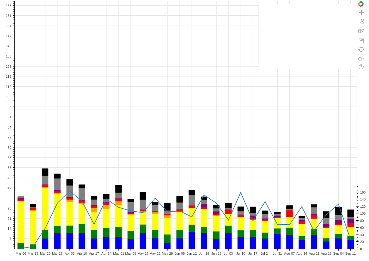
bounds is only proving to be somewhat helpful, but it is not solving my problem. As you can see below, the values of the line now line up well with the bars, but those values are still causing my bars to become smaller, adding padding to the top of the graph and values to the left hand y axis which has an end set to 70.

fig = plotting.figure(width=1200, height=900, x_range=list(data[‘week’].unique()), y_range=Range1d(start=0, end=70))

``

fig.extra_y_ranges = {“count”: Range1d(start=0, end=700)} if “All” in chartType else {“count”: DataRange1d(start=0)}
fig.add_layout(LinearAxis(y_range_name=“count”, bounds=(0, 150)), ‘right’)
countLine = fig.line(x=“week”, y=“count”, source=source, y_range_name=“count”, line_width=2)

``

···

On Tuesday, September 13, 2016 at 12:06:49 PM UTC-4, Bryan Van de ven wrote:

Hi,

Please see

    [http://bokeh.pydata.org/en/latest/docs/user_guide/styling.html#bounds](http://bokeh.pydata.org/en/latest/docs/user_guide/styling.html#bounds)

Thanks,

Bryan

On Sep 13, 2016, at 10:56 AM, Reuben Jacobs [email protected] wrote:

Is there a way I can shorten the extra y axis on the chart below? I am creating the line as follows:

fig = plotting.figure(width=1200, height=900, x_range=list(data[‘week’].unique()), title=“Median Stepwise Profile Turnaround Time for {} Cases”.format(chartType))

fig.extra_y_ranges = {“count”: Range1d(start=0, end=450)} if “All” in chartType else {“count”: DataRange1d(start=0)}

fig.add_layout(LinearAxis(y_range_name=“count”), ‘right’)

countLine = fig.line(x=“week”, y=“count”, source=source, y_range_name=“count”, line_width=2)

The bars are all added with vbars

I want the right hand y axis to go higher than the left hand side y axis, but I wan’t it to end early so it doesnt make the bars smaller but adding space to the top of (adding values to the left hand side y axis). If I simply make the y axis range end at a higher number it will move the line down but also add more space to the top of the chart making the bars smaller


You received this message because you are subscribed to the Google Groups “Bokeh Discussion - Public” group.

To unsubscribe from this group and stop receiving emails from it, send an email to [email protected].

To post to this group, send email to [email protected].

To view this discussion on the web visit https://groups.google.com/a/continuum.io/d/msgid/bokeh/8d8548d9-d23f-4bb7-8349-3a9984b7fdf8%40continuum.io.

For more options, visit https://groups.google.com/a/continuum.io/d/optout.

The image got quoted. here it is with the bounds

···

On Tuesday, September 13, 2016 at 1:06:54 PM UTC-4, Reuben Jacobs wrote:

Bryan,

bounds is only proving to be somewhat helpful, but it is not solving my problem. As you can see below, the values of the line now line up well with the bars, but those values are still causing my bars to become smaller, adding padding to the top of the graph and values to the left hand y axis which has an end set to 70.

fig = plotting.figure(width=1200, height=900, x_range=list(data[‘week’].unique()), y_range=Range1d(start=0, end=70))

``

fig.extra_y_ranges = {“count”: Range1d(start=0, end=700)} if “All” in chartType else {“count”: DataRange1d(start=0)}
fig.add_layout(LinearAxis(y_range_name=“count”, bounds=(0, 150)), ‘right’)
countLine = fig.line(x=“week”, y=“count”, source=source, y_range_name=“count”, line_width=2)

``

On Tuesday, September 13, 2016 at 12:06:49 PM UTC-4, Bryan Van de ven wrote:

Hi,

Please see

    [http://bokeh.pydata.org/en/latest/docs/user_guide/styling.html#bounds](http://bokeh.pydata.org/en/latest/docs/user_guide/styling.html#bounds)

Thanks,

Bryan

On Sep 13, 2016, at 10:56 AM, Reuben Jacobs [email protected] wrote:

Is there a way I can shorten the extra y axis on the chart below? I am creating the line as follows:

fig = plotting.figure(width=1200, height=900, x_range=list(data[‘week’].unique()), title=“Median Stepwise Profile Turnaround Time for {} Cases”.format(chartType))

fig.extra_y_ranges = {“count”: Range1d(start=0, end=450)} if “All” in chartType else {“count”: DataRange1d(start=0)}

fig.add_layout(LinearAxis(y_range_name=“count”), ‘right’)

countLine = fig.line(x=“week”, y=“count”, source=source, y_range_name=“count”, line_width=2)

The bars are all added with vbars

I want the right hand y axis to go higher than the left hand side y axis, but I wan’t it to end early so it doesnt make the bars smaller but adding space to the top of (adding values to the left hand side y axis). If I simply make the y axis range end at a higher number it will move the line down but also add more space to the top of the chart making the bars smaller


You received this message because you are subscribed to the Google Groups “Bokeh Discussion - Public” group.

To unsubscribe from this group and stop receiving emails from it, send an email to [email protected].

To post to this group, send email to [email protected].

To view this discussion on the web visit https://groups.google.com/a/continuum.io/d/msgid/bokeh/8d8548d9-d23f-4bb7-8349-3a9984b7fdf8%40continuum.io.

For more options, visit https://groups.google.com/a/continuum.io/d/optout.

I misunderstood your question. By default DataRange objects use all available renderers to auto-scale. But you can configure the list of renderers explicitly:

  http://bokeh.pydata.org/en/latest/docs/reference/models/ranges.html#bokeh.models.ranges.DataRange.renderers

You'd want make that list only include the glyph renderer for the vbars (i.e. the return value of p.vbar(...)) with something like

  p.y_range.renderers = [vbar_renderer]

There's a wider question of how should dataranges behave in the presence of extra ranges. I can believe this case is not handled particularly well right now, but at least the .renderers property offers some control in these situations.

Bryan

···

On Sep 13, 2016, at 12:15 PM, Reuben Jacobs <[email protected]> wrote:

The image got quoted. here it is with the bounds

On Tuesday, September 13, 2016 at 1:06:54 PM UTC-4, Reuben Jacobs wrote:
Bryan,

bounds is only proving to be somewhat helpful, but it is not solving my problem. As you can see below, the values of the line now line up well with the bars, but those values are still causing my bars to become smaller, adding padding to the top of the graph and values to the left hand y axis which has an end set to 70.

fig = plotting.figure(width=1200, height=900, x_range=list(data['week'].unique()), y_range=Range1d(start=0, end=70))

fig.extra_y_ranges = {"count": Range1d(start=0, end=700)} if "All" in chartType else {"count": DataRange1d(start=0)}
fig.add_layout(LinearAxis(y_range_name="count", bounds=(0, 150)), 'right')
countLine = fig.line(x="week", y="count", source=source, y_range_name="count", line_width=2)

On Tuesday, September 13, 2016 at 12:06:49 PM UTC-4, Bryan Van de ven wrote:
Hi,

Please see

        Appearance — Bokeh 3.3.2 Documentation

Thanks,

Bryan

> On Sep 13, 2016, at 10:56 AM, Reuben Jacobs <[email protected]> wrote:
>
>
> Is there a way I can shorten the extra y axis on the chart below? I am creating the line as follows:
>
> fig = plotting.figure(width=1200, height=900, x_range=list(data['week'].unique()), title="Median Stepwise Profile Turnaround Time for {} Cases".format(chartType))
>
> fig.extra_y_ranges = {"count": Range1d(start=0, end=450)} if "All" in chartType else {"count": DataRange1d(start=0)}
>
> fig.add_layout(LinearAxis(y_range_name="count"), 'right')
> countLine = fig.line(x="week", y="count", source=source, y_range_name="count", line_width=2)
> The bars are all added with vbars
>
> I want the right hand y axis to go higher than the left hand side y axis, but I wan't it to end early so it doesnt make the bars smaller but adding space to the top of (adding values to the left hand side y axis). If I simply make the y axis range end at a higher number it will move the line down but also add more space to the top of the chart making the bars smaller
>
>
>
>
>
> --
> You received this message because you are subscribed to the Google Groups "Bokeh Discussion - Public" group.
> To unsubscribe from this group and stop receiving emails from it, send an email to bokeh+un...@continuum.io.
> To post to this group, send email to bo...@continuum.io.
> To view this discussion on the web visit https://groups.google.com/a/continuum.io/d/msgid/bokeh/8d8548d9-d23f-4bb7-8349-3a9984b7fdf8%40continuum.io\.
> For more options, visit https://groups.google.com/a/continuum.io/d/optout\.

--
You received this message because you are subscribed to the Google Groups "Bokeh Discussion - Public" group.
To unsubscribe from this group and stop receiving emails from it, send an email to [email protected].
To post to this group, send email to [email protected].
To view this discussion on the web visit https://groups.google.com/a/continuum.io/d/msgid/bokeh/de58123a-6d24-451e-84e8-99709168bf8a%40continuum.io\.
For more options, visit https://groups.google.com/a/continuum.io/d/optout\.
Thanks Bryan I should be able to manipulate my ranges as I see fit now.

···

On Tuesday, September 13, 2016 at 1:25:21 PM UTC-4, Bryan Van de ven wrote:

I misunderstood your question. By default DataRange objects use all available renderers to auto-scale. But you can configure the list of renderers explicitly:

    [http://bokeh.pydata.org/en/latest/docs/reference/models/ranges.html#bokeh.models.ranges.DataRange.renderers](http://bokeh.pydata.org/en/latest/docs/reference/models/ranges.html#bokeh.models.ranges.DataRange.renderers)

You’d want make that list only include the glyph renderer for the vbars (i.e. the return value of p.vbar(…)) with something like

    p.y_range.renderers = [vbar_renderer]

There’s a wider question of how should dataranges behave in the presence of extra ranges. I can believe this case is not handled particularly well right now, but at least the .renderers property offers some control in these situations.

Bryan

On Sep 13, 2016, at 12:15 PM, Reuben Jacobs [email protected] wrote:

The image got quoted. here it is with the bounds

On Tuesday, September 13, 2016 at 1:06:54 PM UTC-4, Reuben Jacobs wrote:

Bryan,

bounds is only proving to be somewhat helpful, but it is not solving my problem. As you can see below, the values of the line now line up well with the bars, but those values are still causing my bars to become smaller, adding padding to the top of the graph and values to the left hand y axis which has an end set to 70.

fig = plotting.figure(width=1200, height=900, x_range=list(data[‘week’].unique()), y_range=Range1d(start=0, end=70))

fig.extra_y_ranges = {“count”: Range1d(start=0, end=700)} if “All” in chartType else {“count”: DataRange1d(start=0)}

fig.add_layout(LinearAxis(y_range_name=“count”, bounds=(0, 150)), ‘right’)

countLine = fig.line(x=“week”, y=“count”, source=source, y_range_name=“count”, line_width=2)

On Tuesday, September 13, 2016 at 12:06:49 PM UTC-4, Bryan Van de ven wrote:

Hi,

Please see

    [http://bokeh.pydata.org/en/latest/docs/user_guide/styling.html#bounds](http://bokeh.pydata.org/en/latest/docs/user_guide/styling.html#bounds)

Thanks,

Bryan

On Sep 13, 2016, at 10:56 AM, Reuben Jacobs [email protected] wrote:

Is there a way I can shorten the extra y axis on the chart below? I am creating the line as follows:

fig = plotting.figure(width=1200, height=900, x_range=list(data[‘week’].unique()), title=“Median Stepwise Profile Turnaround Time for {} Cases”.format(chartType))

fig.extra_y_ranges = {“count”: Range1d(start=0, end=450)} if “All” in chartType else {“count”: DataRange1d(start=0)}

fig.add_layout(LinearAxis(y_range_name=“count”), ‘right’)
countLine = fig.line(x=“week”, y=“count”, source=source, y_range_name=“count”, line_width=2)
The bars are all added with vbars

I want the right hand y axis to go higher than the left hand side y axis, but I wan’t it to end early so it doesnt make the bars smaller but adding space to the top of (adding values to the left hand side y axis). If I simply make the y axis range end at a higher number it will move the line down but also add more space to the top of the chart making the bars smaller


You received this message because you are subscribed to the Google Groups “Bokeh Discussion - Public” group.
To unsubscribe from this group and stop receiving emails from it, send an email to [email protected].
To post to this group, send email to [email protected].
To view this discussion on the web visit https://groups.google.com/a/continuum.io/d/msgid/bokeh/8d8548d9-d23f-4bb7-8349-3a9984b7fdf8%40continuum.io.
For more options, visit https://groups.google.com/a/continuum.io/d/optout.


You received this message because you are subscribed to the Google Groups “Bokeh Discussion - Public” group.

To unsubscribe from this group and stop receiving emails from it, send an email to [email protected].

To post to this group, send email to [email protected].

To view this discussion on the web visit https://groups.google.com/a/continuum.io/d/msgid/bokeh/de58123a-6d24-451e-84e8-99709168bf8a%40continuum.io.

For more options, visit https://groups.google.com/a/continuum.io/d/optout.