Hello ![]() ,
,
A high-level function to plot a 3D pie plot.
from bokeh.plotting import figure, show, output_file
from bokeh.models import Label, ColumnDataSource, GlobalInlineStyleSheet
from bokeh.layouts import row
import numpy as np
def get_dark_stylesheet():
"""Create a new dark theme stylesheet instance."""
return GlobalInlineStyleSheet(css="""
html, body, .bk, .bk-root {
background-color: #343838;
margin: 0;
padding: 0;
height: 100%;
color: white;
font-family: 'Consolas', 'Courier New', monospace;
}
.bk { color: white; }
.bk-input, .bk-btn, .bk-select, .bk-slider-title, .bk-headers,
.bk-label, .bk-title, .bk-legend, .bk-axis-label {
color: white !important;
}
.bk-input::placeholder { color: #aaaaaa !important; }
""")
def get_light_stylesheet():
"""Create a new light theme stylesheet instance."""
return GlobalInlineStyleSheet(css="""
html, body, .bk, .bk-root {
background-color: #FDFBD4;
margin: 0;
padding: 0;
height: 100%;
color: black;
font-family: 'Consolas', 'Courier New', monospace;
}
.bk { color: black; }
.bk-input, .bk-btn, .bk-select, .bk-slider-title, .bk-headers,
.bk-label, .bk-title, .bk-legend, .bk-axis-label {
color: black !important;
}
.bk-input::placeholder { color: #555555 !important; }
""")
def darken_color(hex_color, factor=0.7):
"""Darken a hex color by a factor."""
hex_color = hex_color.lstrip('#')
r, g, b = tuple(int(hex_color[i:i+2], 16) for i in (0, 2, 4))
r, g, b = int(r * factor), int(g * factor), int(b * factor)
return f'#{r:02x}{g:02x}{b:02x}'
def plot_3d_pie(values, colors, labels, title='3D Pie Chart',
width=800, height=700, radius=1.5, depth=0.3,
tilt=25, rotation=0, dark_bg=True, explode=None):
"""
Create a PROPERLY WORKING 3D pie chart with correct perspective.
"""
bg_color = '#343838' if dark_bg else '#FDFBD4'
text_color = 'white' if dark_bg else 'black'
# Normalize values
total = sum(values)
percentages = [v / total for v in values]
if explode is None:
explode = [0] * len(values)
p = figure(
width=width,
height=height,
title=title,
toolbar_location=None,
background_fill_color=bg_color,
border_fill_color=bg_color,
match_aspect=True,
)
# Styling
p.title.text_color = text_color
p.title.text_font_size = '16pt'
p.xaxis.visible = False
p.yaxis.visible = False
p.xgrid.visible = False
p.ygrid.visible = False
p.outline_line_color = None
# 3D transformation parameters
tilt_rad = np.radians(tilt)
# Calculate cumulative angles
angles = [p * 360 for p in percentages]
start_angles = [0]
for angle in angles[:-1]:
start_angles.append(start_angles[-1] + angle)
# Determine drawing order: back to front based on mid-angle
slice_order = []
for i in range(len(values)):
mid_angle = start_angles[i] + angles[i]/2 + rotation
# Use negative sin for proper sorting (back to front)
slice_order.append((-np.sin(np.radians(mid_angle)), i))
slice_order.sort()
for _, i in slice_order:
start_deg = start_angles[i] + rotation
end_deg = start_deg + angles[i]
mid_deg = start_deg + angles[i]/2
# Explode offset
explode_offset = explode[i] * radius * 0.15
explode_x = explode_offset * np.cos(np.radians(mid_deg))
explode_y = explode_offset * np.sin(np.radians(mid_deg)) * np.cos(tilt_rad)
# Generate points for the slice
n_points = max(30, int(angles[i] / 360 * 60))
theta = np.linspace(np.radians(start_deg), np.radians(end_deg), n_points)
# Top surface coordinates
top_x = radius * np.cos(theta) + explode_x
top_y = radius * np.sin(theta) * np.cos(tilt_rad) + explode_y
# Bottom surface coordinates
bottom_x = top_x.copy()
bottom_y = top_y - depth
edge_color = darken_color(colors[i], 0.6)
# Draw the OUTER CURVED EDGE (visible from front)
for j in range(len(theta) - 1):
angle_mid = (theta[j] + theta[j+1]) / 2
# Front-facing check: sin(angle) should be NEGATIVE (towards viewer)
if np.sin(angle_mid) < 0:
edge_x = [top_x[j], top_x[j+1], bottom_x[j+1], bottom_x[j], top_x[j]]
edge_y = [top_y[j], top_y[j+1], bottom_y[j+1], bottom_y[j], top_y[j]]
p.patch(edge_x, edge_y, color=edge_color, alpha=1.0,
line_color='#000000', line_width=0.8)
# Add vertical hatching on outer edge
hatch_density = max(8, int(angles[i] / 360 * 50))
hatch_indices = np.linspace(0, len(theta)-1, hatch_density, dtype=int)
for idx in hatch_indices:
if idx < len(theta) and np.sin(theta[idx]) < 0:
hatch_x = [top_x[idx], bottom_x[idx]]
hatch_y = [top_y[idx], bottom_y[idx]]
p.line(hatch_x, hatch_y, color='#000000',
alpha=0.3, line_width=1.0)
# Top surface
top_wedge_x = np.concatenate([[explode_x], top_x, [explode_x]])
top_wedge_y = np.concatenate([[explode_y], top_y, [explode_y]])
source = ColumnDataSource(data=dict(
x=top_wedge_x,
y=top_wedge_y,
label=[labels[i]] * len(top_wedge_x),
value=[values[i]] * len(top_wedge_x),
percentage=[f'{percentages[i]*100:.1f}%'] * len(top_wedge_x)
))
p.patch('x', 'y', source=source, color=colors[i], alpha=1.0,
line_color='#000000', line_width=1.2,
hover_alpha=0.8)
# Add percentage label on top surface
label_radius = radius * 0.65
label_x = label_radius * np.cos(np.radians(mid_deg)) + explode_x
label_y = label_radius * np.sin(np.radians(mid_deg)) * np.cos(tilt_rad) + explode_y
percentage_text = f'{percentages[i]*100:.1f}%'
label_obj = Label(
x=label_x, y=label_y,
text=percentage_text,
text_color='white',
text_font_size='14pt',
text_align='center',
text_baseline='middle',
text_font_style='normal'
)
p.add_layout(label_obj)
# Set ranges
margin = radius * 1.5
p.x_range.start = -margin
p.x_range.end = margin
p.y_range.start = -margin - depth
p.y_range.end = margin
return p
def create_legend(labels, colors, dark_bg=True):
"""Create a separate legend figure."""
text_color = 'white' if dark_bg else 'black'
bg_color = '#343838' if dark_bg else '#FDFBD4'
# Calculate required height
item_height = 40
total_height = len(labels) * item_height + 60
legend_fig = figure(
width=250,
height=total_height,
toolbar_location=None,
background_fill_color=bg_color,
border_fill_color=bg_color,
outline_line_color=None,
x_range=(0, 1),
y_range=(0, len(labels) * item_height + 20)
)
legend_fig.xaxis.visible = False
legend_fig.yaxis.visible = False
legend_fig.xgrid.visible = False
legend_fig.ygrid.visible = False
for i, (label, color) in enumerate(zip(labels, colors)):
y_pos = (len(labels) - i) * item_height - 10
# Draw color circle
legend_fig.circle(x=[0.1], y=[y_pos], size=18, color=color,
alpha=1.0, line_color='#000000', line_width=2)
# Draw text label
label_obj = Label(
x=0.18, y=y_pos - 7,
text=label,
text_color=text_color,
text_font_size='12pt',
text_baseline='middle'
)
legend_fig.add_layout(label_obj)
return legend_fig
# ============================================================================
# EXAMPLES - ALL PIES TOGETHER
# ============================================================================
if __name__ == "__main__":
from bokeh.io import reset_output
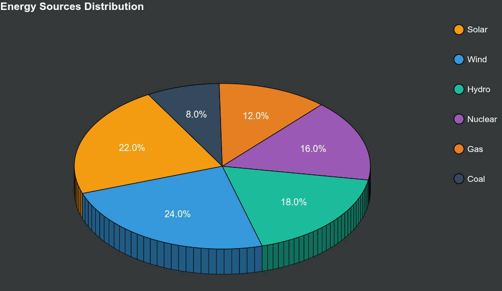
# Example 1: Energy Sources
print("Example 1: Energy Sources Distribution")
reset_output()
sources = ['Solar', 'Wind', 'Hydro', 'Nuclear', 'Gas', 'Coal']
energy = [22, 24, 18, 16, 12, 8]
colors1 = ['#f39c12', '#3498db', '#1abc9c', '#9b59b6', '#e67e22', '#34495e']
pie1 = plot_3d_pie(
values=energy,
colors=colors1,
labels=sources,
title='Energy Sources Distribution',
width=900,
height=700,
radius=1.8,
depth=0.45,
tilt=35,
rotation=120
)
legend1 = create_legend(sources, colors1)
output_file("example1_energy.html")
show(row(pie1, legend1, stylesheets=[get_dark_stylesheet()]))
# Example 2: Market Share
print("\nExample 2: Market Share")
reset_output()
companies = ['Company A', 'Company B', 'Company C', 'Company D', 'Company E']
market_share = [35, 25, 20, 12, 8]
colors2 = ['#3498db', '#e74c3c', '#2ecc71', '#f39c12', '#9b59b6']
pie2 = plot_3d_pie(
values=market_share,
colors=colors2,
labels=companies,
title='Market Share Distribution',
width=900,
height=700,
radius=1.8,
depth=0.5,
tilt=32,
rotation=0,
dark_bg=False
)
legend2 = create_legend(companies, colors2, dark_bg=False)
output_file("example2_market.html")
show(row(pie2, legend2, stylesheets=[get_light_stylesheet()]))
# Example 3: Budget Allocation
print("\nExample 3: Budget Allocation")
reset_output()
categories = ['R&D', 'Marketing', 'Operations', 'Sales', 'Admin']
budget = [30, 25, 20, 15, 10]
colors3 = ['#e74c3c', '#3498db', '#2ecc71', '#f39c12', '#95a5a6']
pie3 = plot_3d_pie(
values=budget,
colors=colors3,
labels=categories,
title='Budget Allocation',
width=900,
height=700,
radius=1.8,
depth=0.42,
tilt=30,
rotation=45
)
legend3 = create_legend(categories, colors3)
output_file("example3_budget.html")
show(row(pie3, legend3, stylesheets=[get_dark_stylesheet()]))
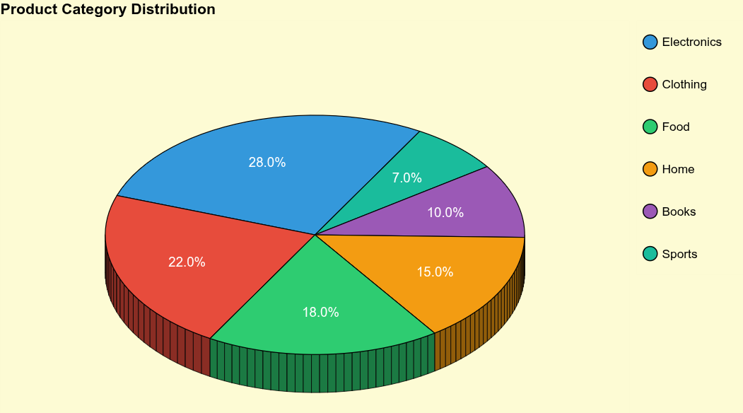
# Example 4: Light Theme Version
print("\nExample 4: Product Categories (Light Theme)")
reset_output()
products = ['Electronics', 'Clothing', 'Food', 'Home', 'Books', 'Sports']
product_sales = [28, 22, 18, 15, 10, 7]
colors4 = ['#3498db', '#e74c3c', '#2ecc71', '#f39c12', '#9b59b6', '#1abc9c']
pie4 = plot_3d_pie(
values=product_sales,
colors=colors4,
labels=products,
title='Product Category Distribution',
width=900,
height=700,
radius=1.8,
depth=0.48,
tilt=33,
rotation=60,
dark_bg=False
)
legend4 = create_legend(products, colors4, dark_bg=False)
output_file("example4_products_light.html")
show(row(pie4, legend4, stylesheets=[get_light_stylesheet()]))
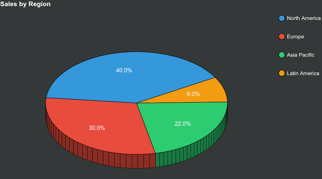
# Example 5: Sales by Region
print("\nExample 5: Sales by Region")
reset_output()
regions = ['North America', 'Europe', 'Asia Pacific', 'Latin America']
sales = [40, 30, 22, 8]
colors5 = ['#3498db', '#e74c3c', '#2ecc71', '#f39c12']
pie5 = plot_3d_pie(
values=sales,
colors=colors5,
labels=regions,
title='Sales by Region',
width=900,
height=700,
radius=1.8,
depth=0.4,
tilt=35,
rotation=30
)
legend5 = create_legend(regions, colors5)
output_file("example5_sales.html")
show(row(pie5, legend5, stylesheets=[get_dark_stylesheet()]))