@Getuem One way to achieve what you want is the following (hacky) way. Use a Div element where you style it with a bottom or top border and the desired width. Use a Panel to position the Div element. Below I have used target='frame' and bottom_right, hence that is the location of the lower right corner of the plot frame (y axis located on this side). anchor='bottom_left' means that the div should be anchored on the left side.
MARKER_WIDTH = 20

label = Panel(
    position = Node(target = 'frame', symbol = 'bottom_right'),
    anchor="bottom_left",
    stylesheets=[f"""
:host {{
  padding: 0px;
  background-color: transparent;
  font-size: 12px;
  z-index: 999;
}}
.marker {{
  background-color: whitesmoke;
  padding: 0px;
  height: 0px;
  line-height: 0px;
  width: {MARKER_WIDTH}px;
  border-bottom: 2px solid red;
}}
"""],
    elements=[
        Div(
            text='',
            css_classes=['marker'],
            margin = 0
            )
    ],
)
I then use a CustomJS callback to calculate a value of padding-bottom to apply to the Div element in order to position it at the desired vertical location on the secondary y-axis. It requires to get the start and end values for the range but also the screen px values for same range. In order to make sure the the marker is always at the correct location horizontally I query the width of the default y-axis and use that for margin-left of the Div element, taking into account the width itself of the marker.
from bokeh.io import curdoc
from bokeh.plotting import figure, show
from bokeh.models import Node
from bokeh.models import Panel, CustomJS, Div, DataRange1d, LinearAxis
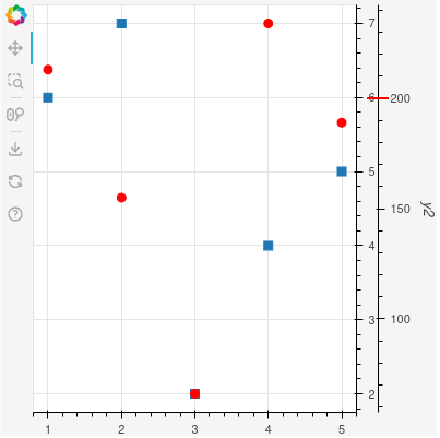
x = [1, 2, 3, 4, 5]
y = [6, 7, 2, 4, 5]
y2 = [213, 155, 66, 234, 189]
p = figure(
width=400,
height=400,
y_axis_location = "right",
toolbar_location = "left"
)
p.border_fill_color = "whitesmoke"
p.min_border_right = 50
r_square = p.scatter(x, y, marker = 'square', size = 8)
p.y_range.renderers = [r_square]
p.yaxis[0].html_id = 'y1'
r_circle = p.scatter(
x, y2, color='red', size=8,
y_range_name="y2",
)
p.extra_y_ranges['y2'] = DataRange1d(renderers = [r_circle])
ax2 = LinearAxis(
axis_label="y2",
y_range_name="y2",
html_id = 'y2'
)
p.add_layout(ax2, 'right')
MARKER_WIDTH = 20
label = Panel(
position = Node(target = 'frame', symbol = 'bottom_right'),
anchor="bottom_left",
stylesheets=[f"""
:host {{
padding: 0px;
background-color: transparent;
font-size: 12px;
z-index: 999;
}}
.marker {{
background-color: whitesmoke;
padding: 0px;
height: 0px;
line-height: 0px;
width: {MARKER_WIDTH}px;
border-bottom: 2px solid red;
}}
"""],
elements=[
Div(
text='',
css_classes=['marker'],
margin = 0
)
],
)
p.elements.append(label)
cb = CustomJS(
args = {
'label': label,
'marker_width': MARKER_WIDTH,
'plot': p,
},
code = '''
const y2_marker = 200;
const host = document.querySelector('.bk-Figure');
if (host == null) {
return;
}
var elm = host;
const classes = ['.bk-Canvas', '.bk-CanvasPanel.bk-right', '#y1'];
for (const cls of classes) {
elm = elm.shadowRoot.querySelector(cls);
}
setTimeout(() => {
const y0_axis_width = elm.offsetWidth;
const {start, end, frames} = plot.extra_y_ranges['y2'];
const frame_set = frames.values().next();
const {y0, y1, x1} = frame_set['value']._bbox;
const marker_y_px = (y2_marker-start)/(end-start)*(y1-y0)-1;
if ((marker_y_px < 0) || (marker_y_px > y1-y0)) {
label.visible = false;
} else {
label.visible = true;
}
const margin_l = y0_axis_width - marker_width/2;
label.styles = {'padding-bottom': `${marker_y_px}px`, 'margin-left': `${margin_l}px`};
}, 0);
'''
)
p.extra_y_ranges['y2'].js_on_change('start', cb)
curdoc().js_on_event("document_ready", cb)
show(p)
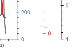
Plot with marker at 200 on the y2 axis.