Hi all, we are attempting to reimplement an old Perl web app called
'CMAP' into modern Javascript/HTML.
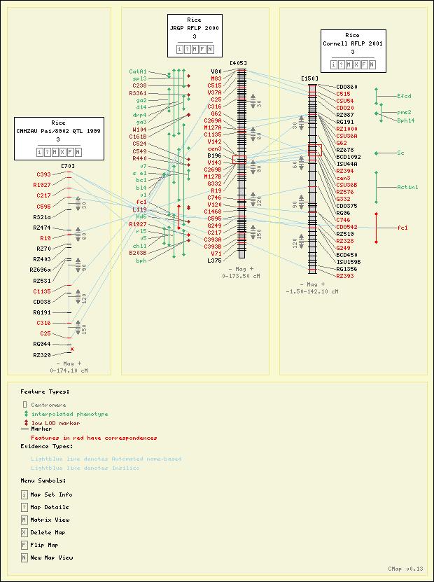
Here is a screenshot of the old 'comparative map' aka CMAP. Sometimes
a picture is worth 1024 words, right?
Bokeh seemed like it would be useful to add a lot of tools and utility
out of the box, and we are biased because we love Python and Conda,
but I am having quite a bit trouble getting started.
As you can see, there are correspondences drawn and features hilited
between each map (each vertical spine thing is a map). So this needs
to be a single plot and not a dom-layouted collection of different
plots, so the correspondences can be drawn. Also note each map has
it's own coordinate system, so the default axes which Figure provides
would not make sense. However we would like to utilize the other
prebuilt tools which are available with Figure class (pan, lasso,
save, undo, etc).
After several days of studying the Bokeh docs, source code, examples,
I can think of several approaches to produce something like this in
Bokeh, but I am not sure which of these are are possible, recommend,
or most bokeh-ish way:
1) Use the existing Figure class, but turn off the default axes, and
then use the Plotting API to draw all the tick marks, rectangles,
labels, correspondences, etc, basically everything you see in that
jpg. i.e. Use the existing Glyph types in the plotting api.
2) Create CustomModels for the entire datastructure, all wrapped in a
single LayoutDOM. From what I have learned, this would involve pretty
much re-implementing most of the Figure class, therefore probably an
inordinate amount of work.
3) Make a subclass of the Figure class and add new types of
GlyphRenderers to make the layouting and rendering more modular and
less procedural.
4) Make a subclass of the Plot class and add new types of
GlyphRenderers, and re-implement some stuff we need from Figure, to
me the rendering more modular and less procedural.
5) Copy what is going on in the Charts API to make a new hi-level
chart, kinda like bokeh.charts.BoxPlot for example.
#1 seems like the simplest way to proceed, but also could rapidly
become a procedural mess- if you look at the jpg there is a lot going
on. Much more complicated than the examples of 'plotting with basic
glyphs' as shown in the users's guide.
#5 is worth mentioning, because this CMAP tool is intended for the
bioinformatics community to re-use, and so the result should be fairly
hi-level and easy to use and configure.
Any advice would be most appreciated! Sorry for the long post.
···
--
Alex Rice <[email protected]>
Software Engineer
National Center for Genome Resources (NCGR)
http://ncgr.org
+1 505-995-4457