On Oct 9, 2015, at 9:48 AM, [email protected] wrote:
Has something changed so that it's not rendering anything now, using 0.10.0 ? I tried to copy paste the code Christine provided and it renders nothing :
basic bokeh Bar chart · GitHub
Same DataFrame format than in this question I asked today : basic bokeh Bar chart - Stack Overflow with the labels as the dataframe index.
any hints ?
thanks
On Friday, July 25, 2014 at 12:00:16 AM UTC+2, Christine Doig wrote:
Hi!
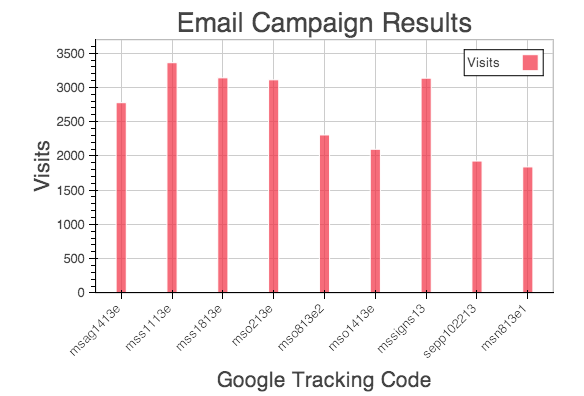
I got your plot working 'Google Tracking Code' vs 'Visits' (attached) with the following code:
import pandas as pd
from bokeh.charts import Bar
import bokeh
bokeh.load_notebook()
campaign = pd.DataFrame({'Delivery date': ['9/11/2013', '9/11/2013', '9/18/2013', '10/2/2013', '10/8/2013', '10/15/2013', '10/17/2013',
'10/22/2013', '11/8/2013'],
'Google Tracking Code': ['msag1413e ', 'mss1113e ', 'mss1813e ', 'mso213e ', 'mso813e2 ', 'mso1413e ', 'mssigns13 ',
'sepp102213 ', 'msn813e1 '],
'Visits': [2777, 3361, 3140, 3111, 2306, 2097, 3135, 1925, 1839],
'Revenue': ['3776', '9606.5', '19269.28', '47121.6', '13271.43', '28417.8', '1285.47', '694.36', '4572'],
'Transactions': ['43', '40', '68', '157', '47', '89', '12', '8', '16']
}, index=['msag1413e ', 'mss1113e ', 'mss1813e ', 'mso213e ', 'mso813e2 ', 'mso1413e ', 'mssigns13 ',
'sepp102213 ', 'msn813e1 '])
bar_columns=campaign[["Visits"]]
bar = Bar(bar_columns)
bar.title("Email Campaign Results").legend(True).ylabel("Visits").xlabel("Google Tracking Code").width(600).height(400).notebook().show()
Solution:
To select a column you should do campaign[["Visits"]] instead of campaign.Visits.
The 'x' categories of your plot should be the index (row_labels) of your DataFrame.
You had your Visits values as strings, they should be integers.
Here is a notebook with some Charts examples: http://nbviewer.ipython.org/github/ContinuumIO/bokeh/blob/master/examples/charts/charts.ipynb
Hope this helps!
Christine
On Thursday, July 17, 2014 5:28:44 PM UTC-5, aschne...@gmail.com wrote:
Sorry, forgot to put it in. Here's the code to reproduce it, which you can paste into an IPython Notebook:
import pandas as pd
from bokeh.charts import Bar
import bokeh
bokeh.load_notebook()
campaign = pd.DataFrame({'Delivery date': ['9/11/2013', '9/11/2013', '9/18/2013', '10/2/2013', '10/8/2013', '10/15/2013', '10/17/2013',
'10/22/2013', '11/8/2013'],
'Google Tracking Code': ['msag1413e ', 'mss1113e ', 'mss1813e ', 'mso213e ', 'mso813e2 ', 'mso1413e ', 'mssigns13 ',
'sepp102213 ', 'msn813e1 '],
'Visits': ['2777', '3361', '3140', '3111', '2306', '2097', '3135', '1925', '1839'],
'Revenue': ['3776', '9606.5', '19269.28', '47121.6', '13271.43', '28417.8', '1285.47', '694.36', '4572'],
'Transactions': ['43', '40', '68', '157', '47', '89', '12', '8', '16']
})
bar = Bar(campaign)
bar.title("Email Campaign Results") \
.legend(True) \
    .ylabel("Transaction").xlabel("Visits") \
    .width(600).height(400) \
    .notebook().show()
if I add Visits as you suggested:
bar = Bar(campaigns.Visits)
I get the error:
NameError: name 'Visits' is not defined
But after seeing your comment, what I realized is that from wherever I copied the example, I got it wrong -- I define the x and y labels, but not x and y.
I went back to the Bokeh documentation, and I'm having trouble figuring out where the documentation for bar charts is; the doc for a number of
the parameters, which aren't unique to bar charts, is in the User's Guide, but not the doc for the basic command itself. If I type
Bar?
It tells me there isn't a doc string. Any suggestions?
Thanks!
Anders
On Thursday, July 17, 2014 5:02:09 PM UTC-4, Damian Avila wrote:
Did you try with:
bar = Bar(campaigns.Visits)
or something like that... I mean passing the column you want to plot
Btw, do you have a minimal example to reproduce, I mean... an IPython notebook or something like that to explore the dataframe and how is structured.
--
You received this message because you are subscribed to the Google Groups "Bokeh Discussion - Public" group.
To unsubscribe from this group and stop receiving emails from it, send an email to [email protected].
To post to this group, send email to [email protected].
To view this discussion on the web visit https://groups.google.com/a/continuum.io/d/msgid/bokeh/7f878058-2726-4731-bfea-82b5b2ea65f6%40continuum.io\.
For more options, visit https://groups.google.com/a/continuum.io/d/optout\.