Dear community,
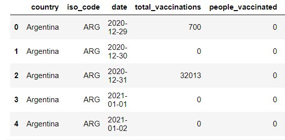
as you can see in the picture (datfarme) I want to plot a time series plot (for total vaccinations per date ) with a check box filter for the countries (i have 60 country in my dataset ) but all i get is a blank plot.
This is my code :
import panel as pn
import altair as alt
from altair import datum
import pandas as pd
from vega_datasets import data
import datetime as dt
alt.renderers.enable(‘default’)
pn.extension(‘vega’)
df2 = df.copy()
create list of company names (tickers) to use as options
tickers = [‘Argentina’, ‘Austria’, ‘Bahrain’, ‘Belgium’ ,‘Brazil’, ‘Bulgaria’ ,‘Canada’,
‘Chile’ ,‘China’ ,‘Costa0Rica’ ,‘Croatia’ ,‘Cyprus’, ‘Czechia’, ‘Denmark’,
‘Ecuador’, ‘England’ ,‘Estonia’ ,‘Finland’, ‘France’ ,‘Germany’, ‘Gibraltar’,
‘Greece’ ,‘Hungary’, ‘Iceland’, ‘India’, ‘Indonesia’ ,‘Ireland’ ,‘Isle0of0Man’,
‘Israel’ ,‘Italy’ ,‘Kuwait’ ,‘Latvia’ ,‘Lithuania’ ,‘Luxembourg’ ,‘Malta’,
‘Mexico’, ‘Netherlands’, ‘Northern0Ireland’ ,‘Norway’ ,‘Oman’ ,‘Panama’,
‘Poland’ ,‘Portugal’, ‘Romania’, ‘Russia’ ,‘Saudi0Arabia’ ,‘Scotland’ ,‘Serbia’,
‘Seychelles’, ‘Singapore’ ,‘Slovakia’, ‘Slovenia’ ,‘Spain’ ,‘Sweden’,
‘Switzerland’ ,‘Turkey’ ,‘United0Arab0Emirates’ ,‘United0Kingdom’,
‘United0States’, ‘Wales’]
this creates the dropdown widget
ticker = pn.widgets.Select(name=‘country’, options=tickers)
this creates the date range slider
date_range_slider = pn.widgets.DateRangeSlider(
name=‘Date Range Slider’,
start=dt.datetime(2020, 12, 13), end=dt.datetime(2021, 1, 25),
value=(dt.datetime(2020, 12, 13), dt.datetime(2021, 1, 25))
)
title = ‘total vaccinations per day’
subtitle = ‘This dashboard allows you to select a country and date range to see total vaccinations per day.’
@pn.depends(ticker.param.value, date_range_slider.param.value)
def get_plot(ticker, date_range):
# Load and format the data
df = df2 # define df
df[‘date’] = pd.to_datetime(df[‘date’])
# create date filter using values from the range slider
# store the first and last date range slider value in a var
start_date = date_range_slider.value[0]
end_date = date_range_slider.value[1]
# create filter mask for the dataframe
mask = (df[‘date’] > start_date) & (df[‘date’] <= end_date)
df = df.loc[mask] # filter the dataframe
# create the Altair chart object
chart = alt.Chart(df).mark_line().encode( alt.X(‘date’),alt.Y(‘total_vaccinations’),
tooltip=alt.Tooltip([‘date’,‘total_vaccinations’])).transform_filter(
(datum.symbol == ticker) # this ties in the filter
)
return chart
dashboard = pn.Row(pn.Column(title, subtitle, ticker, date_range_slider),
get_plot # our draw chart function!
)
dashboard.servable()
any help would be appreciated and thank you in advance