Hi
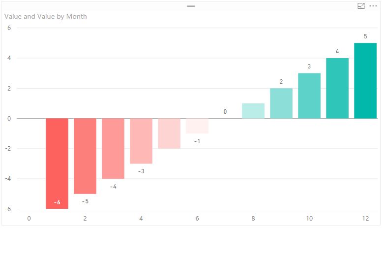
I am trying to create a vertical bar chart in Bokeh (code below), where the bars are conditionally formatted based on value of the Y axis. So red for negative values, and green for positive values, and a color gradient between the lowest and highest values. I have attached a screenshot of an analogous graph created in Microsoft PowerBI to demonstrated what I am trying do.
Is this possible in Bokeh?
New to Bokeh.
Cheers
Steve
Power BI example with conditional formatting
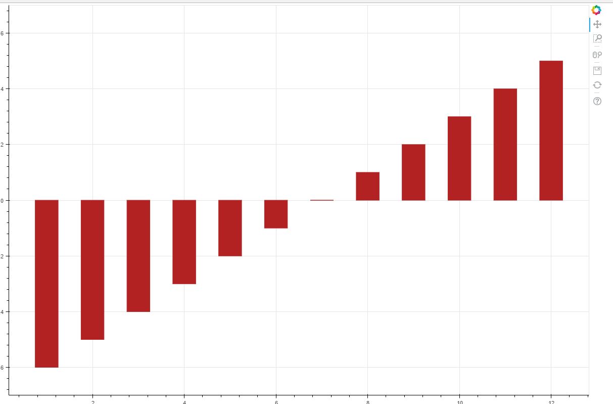
My current Bokeh chart
from bokeh.plotting import figure, show, output_file
from bokeh.models import Range1d
output_file(‘vbar.html’)
p = figure(width=1200, height=800)
p.vbar(x=[1, 2, 3, 4, 5, 6, 7, 8, 9, 10, 11, 12], width=0.5, bottom=0,
top=[-6, -5, -4, -3, -2, -1, 0, 1, 2, 3, 4, 5] , color=“firebrick”)
p.y_range = Range1d(-7, 7)
show(p)