Bokeh bar graph transform axis ticks to absolute value

I want to make a graph like the bar graph on this page (ignore the red arrows):

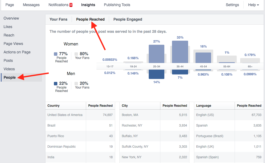
I don’t need the ‘People Reached vs Your Fans’ part, just the age categories and the women top and men bottom. I can actually make this using negative values for men and positive for women, and then just use vbar(). However, now my axis ticks of course still show negative values for the men category (-0.012% -0.149% -14% etc.), as do the hover values and the values below the bars in the men category. I could just do this all manually, but I want to be able to update the data, so it should be dynamic. Therefore, I am looking for something like: yticks = abs(yticks), as well as such a solution for hover values and the values below my bars.

@roundcircle

If I understand the requirement, setting the flipped property of the y_range to True should work.

I modified the bokeh VBar example from here to illustrate the syntax.https://docs.bokeh.org/en/latest/docs/reference/models/glyphs/vbar.html

This is the line I’ve added …

plot.y_range.flipped = True # Flip to make +ve values down

And here’s the full example

#!/usr/bin/env python3
# -*- coding: utf-8 -*-
"""
"""

import numpy as np

from bokeh.io import curdoc, show
from bokeh.models import ColumnDataSource, Grid, LinearAxis, Plot, VBar

N = 9
x = np.linspace(-2, 2, N)
y = x**2

source = ColumnDataSource(dict(x=x,top=y,))

plot = Plot(
    title=None, plot_width=300, plot_height=300,
    min_border=0, toolbar_location=None)

glyph = VBar(x="x", top="top", bottom=0, width=0.5, fill_color="#b3de69")
plot.add_glyph(source, glyph)

xaxis = LinearAxis()
plot.add_layout(xaxis, 'below')

yaxis = LinearAxis()
plot.add_layout(yaxis, 'left')

plot.add_layout(Grid(dimension=0, ticker=xaxis.ticker))
plot.add_layout(Grid(dimension=1, ticker=yaxis.ticker))

plot.y_range.flipped = True # Flip to make +ve values down

curdoc().add_root(plot)

show(plot)

Thanks a lot!!