On Sep 19, 2016, at 8:44 AM, Bryan Van de Ven <[email protected]> wrote:
Hi,
A few comments:
Scatter does not currently support setting size except as a single value. Same for alpha. There is an open pull request to make it possible to add "extra" columns for use by Hover tools, but it is still WIP and not yet merged:
https://github.com/bokeh/bokeh/pull/5037
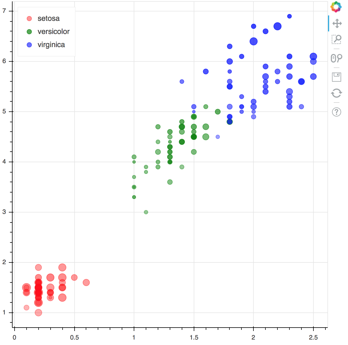
However, some recent work around "computed columns" and legend selection has made this kind of chart much simpler to make from bokeh.plotting, and that is what I recommend. The capabilities are very new, so they need both more and better documentation and examples, as well as some syntax conveniences to make it easier to spell. But here is an example you can emulate
from bokeh.plotting import figure
from bokeh.io import output_file, show
from bokeh.models import CategoricalColorMapper, ColumnDataSource, LinearInterpolator
from bokeh.sampledata.iris import df
source = ColumnDataSource(df)
# There will be some convenience functions to make this simpler sooon
color_mapper = CategoricalColorMapper(factors=list(df.species.unique()),
palette=["red", "green", "blue"])
size_scale = LinearInterpolator(x=[min(df.sepal_width), max(df.sepal_width)],
y=[4, 16])
alpha_scale = LinearInterpolator(x=[min(df.sepal_length), max(df.sepal_length)],
y=[0.3, 0.8])
p = figure()
p.circle('petal_width', 'petal_length', legend="species", source=source,
# compute all these properties in client, based on the data
color=dict(field='species', transform=color_mapper),
size=dict(field='sepal_width', transform=size_scale),
alpha=dict(field='sepal_length', transform=alpha_scale))
p.legend.location = "top_left"
output_file("iris.html")
show(p)
This code generates the following bubble chart with size, color, and alpha all mapped from the data:
<Screen Shot 2016-09-19 at 8.41.27 AM.png>
As mentioned, some of the syntax is a bit clunky, there will be some convenience functions, etc to make it even simpler (but the above version will always be valid as well). For some of the features, you'll need a 0.12.3 dev build (or wait for 0.12.3 this week).
Thanks,
Bryan
On Sep 19, 2016, at 7:29 AM, Ian Stokes Rees <[email protected]> wrote:
Hi,
I started off creating a Scatter plot for a short lesson using a Bokeh plot constructed using bokeh.plotting.circle (plotting module) but realized, as it grew in complexity, that I should try to use bokeh.charts.Scatter instead (charts module). However I then ended up with no alpha, no size, and an inability to figure out how to construct the HoverTool correctly. I’m hoping this is mostly down to my own poor searching/reading of the docs, but at this point I need to ask here how to move forwards. Here’s my current code:
from bokeh.charts import
Scatter
from bokeh.io import
output_notebook, show
from bokeh.models import
ColumnDataSource, HoverTool
output_notebook()
hover = HoverTool(tooltips=[
(
"Make", "@Make"
),
(
"Model", "@Model"
),
(
"$", "@MSRP"
)
])
TOOLS =
'box_zoom,box_select,resize,reset,pan'.split(','
) + [hover]
cars[
'scaledhp'] = cars['Horsepower'] /20
x, y =
'EngineSize', 'MPG_Highway'
p = Scatter(cars, x=
"EngineSize", y="MPG_Highway", color='Type'
,
height=
500, width=700
,
title=
"Cars Data Set: {x} vs. {y}"
.format(x=x, y=y),
tools=TOOLS, legend=
'top_right'
,
background_fill_alpha=
0.1
)
_ = show(p)
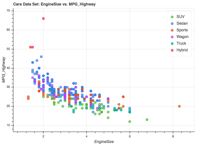
And here is the plot I get:
<Mail Attachment.png>
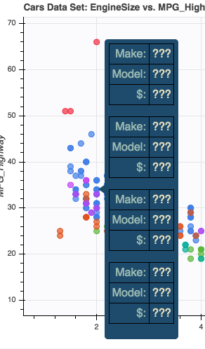
My hover events, however, give me:
<Mail Attachment.png>
So the three things I’m looking to solve:
• Setting marker size based on some dimension of the data set.
• Setting alpha channel — ideally based on some dimension of the data set, but even a scalar value would be OK. I realize that background_fill_alpha is probably for the plot transparency for overlaying on some other background, not for marker transparency: but I was grasping at anything I could find.
• Making the HoverTool work. I did try putting the `cars` DataFrame into a ColumnDataSource but that didn't have any effect.
I’m using Bokeh 0.12.0 — ah, I just updated to 0.12.2 and the hover layout is different but otherwise hover content is ??? and alpha doesn’t appear to be set.
The data file is a SAS format version of the standard “cars” data set and is imported as a Pandas DataFrame. It is accessible here:
https://dl.dropboxusercontent.com/u/1561496/cars.sas7bdat
Regards,
Ian
Ian Stokes-Rees
Computational Scientist
@ijstokes 617.942.0218
--
You received this message because you are subscribed to the Google Groups "Bokeh Discussion - Public" group.
To unsubscribe from this group and stop receiving emails from it, send an email to [email protected].
To post to this group, send email to [email protected].
To view this discussion on the web visit https://groups.google.com/a/continuum.io/d/msgid/bokeh/93fe3941-564d-3770-ddfd-5ffd7e0ef224%40continuum.io\.
For more options, visit https://groups.google.com/a/continuum.io/d/optout\.