Bokeh x-Series

Hello,

can you help me with my problem? I have chart which on X-axis has time based series. This would be correct, but I have 2 values in same day and I would need to display the values with constant distance even with time-based series (can be formatted into text …).

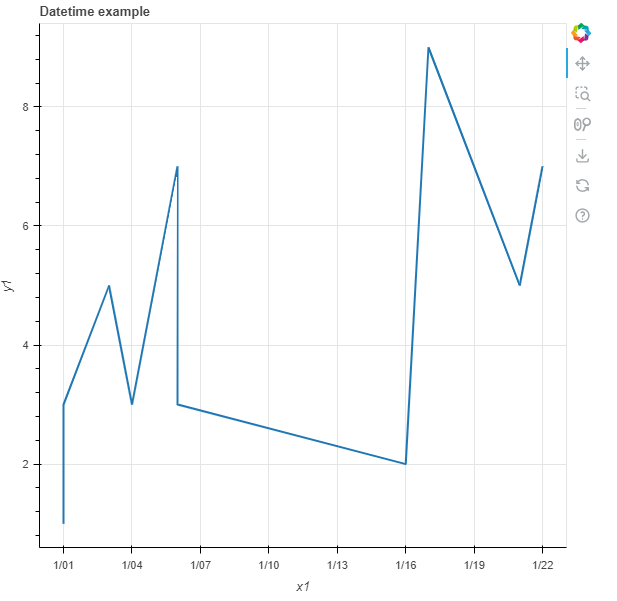
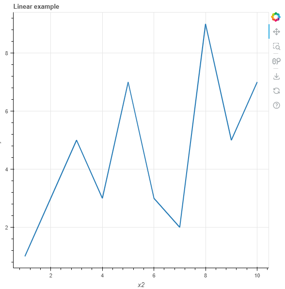
Here is example (one chart, but with different X-Axis series).:
Example of Integer Values in X-Axis:


→ distance between is fixed because X-Axis is continuous numbers (but display internal identification → not for customer)

Example of Time based X-Axis:


→ distance between is not fixed, because X-Axis is datetime

My question is: Is there a way how to format X-Axis series which is DateTime as string to display date instead of ID of record (which is internal information) and have fixed distance on X as it would be “linear”?

Reason:
my data contained multiple records gained during a day several times which should be shown as continuous series of data. Date time format is nice, but squeeze data of one day into almost column.

Thank you

Jan Vaško

Is it possible for example convert date to text and keep X-Axis as text only?

@VASKOTechDesign I am afraid I am not exactly sure what you are asking for. It would really have to have a very small complete Minimal Reproducible Example of what you are starting from to focus discussion and iterate on directly.

Hello Bryan,

first sorry for delay in answering you to this post (I was too busy). Finally, I prepared example on which I want to demonstrate you what is going on:

Here is example:

import pandas
from bokeh.plotting import figure, show
from bokeh.layouts import layout

data_dict = {
    "X_Int": [1,2,3,4,5,6,7,8,9,10],
    "Y_Value": [1,3,5,3,7,3,2,9,5,7],
    "Date": ["1.1.2023","1.1.2023","3.1.2023","4.1.2023","6.1.2023","6.1.2023","16.1.2023","17.1.2023","21.1.2023","22.1.2023"]}
data_df = pandas.DataFrame(data=data_dict)
data_df["Date"] = pandas.to_datetime(data_df["Date"], dayfirst=True).dt.date

X_Seris_Format = "datetime"
p = figure(title="Datetime example", x_axis_label='x1', y_axis_label='y1', x_axis_type=X_Seris_Format)
p.line(x="Date", y="Y_Value", line_width=2, source=data_df)

X2_Seris_Format = "linear"
p2 = figure(title="Linear example", x_axis_label='x2', y_axis_label='y2', x_axis_type=X2_Seris_Format)
p2.line(x="X_Int", y="Y_Value", line_width=2, source=data_df)

Chart_layout = layout(children=[p,p2])

show(Chart_layout)

Data description: this is some dummy data but represents well what I need to solve. I download data from the internet several times per day, but those data are “continuous” data → they rely on each other.

Datetime representation: Unfortunately, when I use “datetime” X_axis_type (and Source is “Date”) data are shown as in first chart “p” (this is wrong representation because x_axis is not fixed continuous), you can see that some day the y_values are below each other

Linear Representation: Better representation is in chart “p2” where I used “linear” X_axis_type (and Source is “X_Int”). So Charts keeps fix distances between values on X Axis → great (because this shows as a reality is), but these values are fictive (like Primary Key of SQL table).

Resoution:
So I would need to define somehow chart which will looks like “p2”, but will have description of X_Axis (labels) from different field of source “Date” (most probably it will be string value).

Datetime result:

Linear Result:

This topic was automatically closed 90 days after the last reply. New replies are no longer allowed.