Hello,
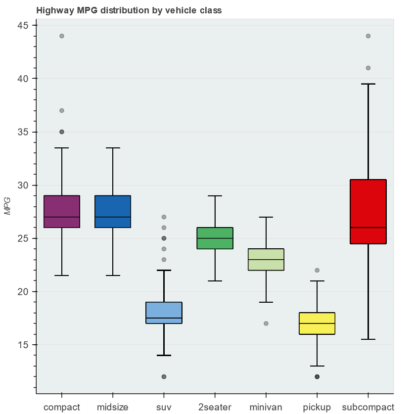
While reading boxplot example the question arose: why some whiskers and vbar are rendered slightly asymmetrically and boldly.
It turned out that the figure displays a lot of whisker and vbar (overlapped), because the source is the original dataframe df with “duplicated” quantiles (q1, q2 and q3), upper and lower.
If you make qs the data source for whisker and vbar, including the calculation of quantiles in qs, then the figure becomes prettier:
| Original example | “Patched” example |
|---|---|

My questions:
-
Is the original example is a generally accepted (idiomatic) way to create a boxplot using bokeh? Or is the “patched” version is really more optimal (the subject for the issue)?
-
Do I understand correctly that inside the bokeh “magic” the memory consumption on
whiskerandvbarfor the original example is higher because of some proxy-objects (wrappers) for each row in thesource? Or does bokeh create raster image only, so no additional memory is consumed on the wrapper? -
Related to question 2. I view the data sources for the displayed data using
for i, r in enumerate(p.renderers):
    print(i, r.name)
    print(r.data_source.data)
This is two
vbarand onescatter(outliers).But I did not understand how to view the data source for
whisker, which are annotations.
import pandas as pd

from bokeh.models import ColumnDataSource, Whisker
from bokeh.plotting import figure, show
from bokeh.sampledata.autompg2 import autompg2
from bokeh.transform import factor_cmap

df = autompg2[["class", "hwy"]].rename(columns={"class": "kind"})

kinds = df.kind.unique()

# compute quantiles
qs = df.groupby("kind").hwy.quantile([0.25, 0.5, 0.75])
qs = qs.unstack().reset_index()
qs.columns = ["kind", "q1", "q2", "q3"]
df = pd.merge(df, qs, on="kind", how="left")

# compute IQR outlier bounds
iqr = df.q3 - df.q1
df["upper"] = df.q3 + 1.5*iqr
df["lower"] = df.q1 - 1.5*iqr

source = ColumnDataSource(df)

p = figure(x_range=kinds, tools="", toolbar_location=None,
           title="Highway MPG distribution by vehicle class",
           background_fill_color="#eaefef", y_axis_label="MPG")

# outlier range
whisker = Whisker(base="kind", upper="upper", lower="lower", source=source)
whisker.upper_head.size = whisker.lower_head.size = 20
p.add_layout(whisker)

# quantile boxes
cmap = factor_cmap("kind", "TolRainbow7", kinds)
p.vbar("kind", 0.7, "q2", "q3", source=source, color=cmap, line_color="black")
p.vbar("kind", 0.7, "q1", "q2", source=source, color=cmap, line_color="black")

# outliers
outliers = df[~df.hwy.between(df.lower, df.upper)]
p.scatter("kind", "hwy", source=outliers, size=6, color="black", alpha=0.3)

p.xgrid.grid_line_color = None
p.axis.major_label_text_font_size="14px"
p.axis.axis_label_text_font_size="12px"

show(p)
“Patched” example
import pandas as pd

from bokeh.models import ColumnDataSource, Whisker
from bokeh.plotting import figure, show
from bokeh.sampledata.autompg2 import autompg2
from bokeh.transform import factor_cmap

df = autompg2[["class", "hwy"]].rename(columns={"class": "kind"})

kinds = df.kind.unique()

# compute quantiles
qs = df.groupby("kind").hwy.quantile([0.25, 0.5, 0.75])
qs = qs.unstack().reset_index()
qs.columns = ["kind", "q1", "q2", "q3"]
# Patch 1
#df = pd.merge(df, qs, on="kind", how="left")

# compute IQR outlier bounds
# Patch 2
#iqr = df.q3 - df.q1
#df["upper"] = df.q3 + 1.5*iqr
#df["lower"] = df.q1 - 1.5*iqr
iqr = qs.q3 - qs.q1
qs["upper"] = qs.q3 + 1.5*iqr
qs["lower"] = qs.q1 - 1.5*iqr
df = pd.merge(df, qs, on="kind", how="left")

# Patch 3
#source = ColumnDataSource(df)
source = ColumnDataSource(qs)

p = figure(x_range=kinds, tools="", toolbar_location=None,
           title="Highway MPG distribution by vehicle class",
           background_fill_color="#eaefef", y_axis_label="MPG")

# outlier range
whisker = Whisker(base="kind", upper="upper", lower="lower", source=source)
whisker.upper_head.size = whisker.lower_head.size = 20
p.add_layout(whisker)

# quantile boxes
cmap = factor_cmap("kind", "TolRainbow7", kinds)
p.vbar("kind", 0.7, "q2", "q3", source=source, color=cmap, line_color="black")
p.vbar("kind", 0.7, "q1", "q2", source=source, color=cmap, line_color="black")

# outliers
outliers = df[~df.hwy.between(df.lower, df.upper)]
p.scatter("kind", "hwy", source=outliers, size=6, color="black", alpha=0.3)

p.xgrid.grid_line_color = None
p.axis.major_label_text_font_size="14px"
p.axis.axis_label_text_font_size="12px"

show(p)