Hello,
I am following the example of outlier detection using a boxplot given on https://bokeh.pydata.org/en/latest/docs/gallery/boxplot.html.
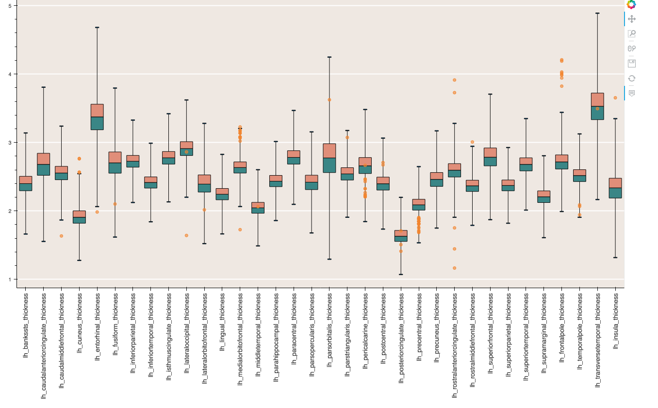
However, I noticed that my plot seems to be showing outliers within the box and whisker which means the points cannot be outliers. On closer inspection I’ve noticed that the x-labels do not match up with the actual data plotted. I have suspicions that the circle glyphs representing the outliers are correctly matched with the x-labels, but the box and whisker plots are wrong.
I am using a rather large dataframe so I’ve made a much smaller example to add on here, but the code is as follows:
lh_thick.head()
Out:
*lh.aparc.thickness lh_b_t *
**0 ID-1 2.260 **
**1 ID-2 2.326 **
**2 ID-3 2.308 **
**3 ID-4 2.358 **
**4 ID-5 2.250 **
*lh_ca_t lh_c_t *
**0 2.372 2.611 **
**1 2.328 2.352 **
**2 2.549 2.223 **
**3 2.669 2.479 **
**4 2.834 2.261 **
**lh_Mean Seg eTIV **
**0 2.49249 1206677.0 1.563280e+06 **
**1 2.44066 1138828.0 1.526734e+06 **
**2 2.33357 924653.0 1.254291e+06 **
**3 2.31100 1110536.0 1.554306e+06 **
**4 2.35763 1197868.0 1.560119e+06 **
Bokeh code
from bokeh.plotting import figure
from bokeh.io import output_file, show
from bokeh.models import HoverTool
Remove unwanted columns
lh_thick2 = lh_thick.loc[:, lh_thick.columns != ‘Seg’]
lh_thick2 = lh_thick2.loc[:, lh_thick2.columns != ‘eTIV’]
lh_thick2 = lh_thick2.loc[:, lh_thick2.columns != ‘lh_Mean’]
Make a list of all columns
lh_thick3 = lh_thick2.loc[:, lh_thick2.columns != ‘lh.aparc.thickness’]
cats = list(lh_thick3.columns)
Melt df keeping ID as a separate column
lh_thick_melt = pd.melt(lh_thick, id_vars=‘lh.aparc.thickness’, value_vars=[‘lh_b_t’, ‘lh_ct’, ‘lh_ca_t’'])
find the quartiles and IQR for each category
groups = lh_thick_melt.groupby(‘variable’)
q1 = groups.quantile(q=0.25)
q2 = groups.quantile(q=0.5)
q3 = groups.quantile(q=0.75)
iqr = q3 - q1
upper = q3 + 3*iqr
lower = q1 - 3*iqr
find the outliers for each category
def outliers(variable):
cat = variable.name
return variable[(variable.value > upper.loc[cat][‘value’]) | (variable.value < lower.loc[cat][‘value’])][‘value’]
out = groups.apply(outliers).dropna()
prepare outlier data for plotting, we need coordinates for every outlier.
if not out.empty:
outx =
outy =
for cat in cats:
only add outliers if they exist
if not out.loc[cat].empty:
for value in out[cat]:
outx.append(cat)
outy.append(value)
p = figure(tools=“save, pan, wheel_zoom, box_zoom, reset”, background_fill_color=“#EFE8E2”, title=“”, x_range=cats, plot_width=1300, plot_height=850)
if no outliers, shrink lengths of stems to be no longer than the minimums or maximums
qmin = groups.quantile(q=0.00)
qmax = groups.quantile(q=1.00)
upper.score = [min([x,y]) for (x,y) in zip(list(qmax.loc[:,‘value’]),upper.value)]
lower.score = [max([x,y]) for (x,y) in zip(list(qmin.loc[:,‘value’]),lower.value)]
stems
p.segment(cats, lower.value, cats, q1.value, line_color=“black”)
p.segment(cats, upper.value, cats, q3.value, line_color=“black”)
boxes
p.vbar(cats, 0.7, q1.value, q2.value, fill_color=“#3B8686”, line_color=“black”)
p.vbar(cats, 0.7, q2.value, q3.value, fill_color=“#E08E79”, line_color=“black”)
whiskers (almost-0 height rects simpler than segments)
p.rect(cats, upper.value, 0.2, 0.01, line_color=“black”)
p.rect(cats, lower.value, 0.2, 0.01, line_color=“black”)
outliers
if not out.empty:
p.circle(outx, outy, size=6, color=“#F38630”, fill_alpha=0.6)
p.xgrid.grid_line_color = None
p.ygrid.grid_line_color = “white”
p.grid.grid_line_width = 2
p.xaxis.major_label_text_font_size=“10pt”
p.xaxis.major_label_orientation = math.pi/2
hover = HoverTool(
tooltips=[(“lh.aparc.thickness”, “@lh.aparc.thickness”)]
)
p.add_tools(hover)
output_file(“boxplot.html”, title=“boxplot.py example”, mode=‘inline’)
show(p)
···
##-------------------
This gives me a nice boxplot, but the labels do not match up with the data. Having a look at the q1, q2 and q3 variables it seems that the ordering of “variables” is changed here, but I have no idea why!
Does anyone have any idea?
Also, the hover tool doesn’t work. It shows an index as default but this index also doesn’t appear to match any of my dataframes.
Thanks in advance for any help.
Amanda