Hi Guys
Not sure if this is the appropriate forum to ask this type of question… But I thought I start here.
I produced a bar chart in Bokeh 0.11 w/ the following code:
from bokeh.palettes import Spectral10
from bokeh.charts import Bar, output_notebook, show
from bokeh.charts.attributes import AttrSpec, ColorAttr, MarkerAttr, CatAttr
pddf = sf2.to_dataframe()
#p = Bar(pddf, label=‘PdDistrict’, values=‘PdId’)
p = Bar(pddf, values = ‘PdId’,
agg=‘count’,
stack=‘Category’,
tools=“resize,hover,save”,
label=CatAttr(columns=[‘PdDistrict’], sort=True))
output_notebook()
show(p)
By and large, it looks like what I have in mind, but it’s far from release quality. But can’t figure out a few key issues. Hopefully you can give me some pointers.
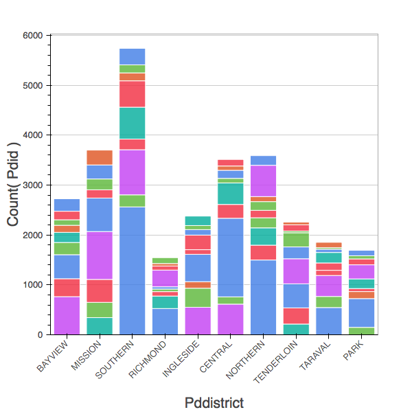
Q1. How do you sort the plot? There are discussion threads #2924 and #2935, but it looks like nothing got resolved. The label=CatAttr(columns=[‘labels’], sort=True) approach only works w/ simple bar charts. It does not work for either stacked or grouped bar charts. Any suggestions?
Q2. How do you specify a different palette, eg. Spectral10 into ColorAttr for a chart? All a user wants is to have a color array longer than 6 elements, does he really have to go through all the steps just to get a deeper palette?
Q3. The size. How can I control the size of the plot as with figures? Right now, I enabled tools=“resize”, but I prefer the chart to come out a prespecified dimension without user intervention. It’s a simple operation, but I can’t find information anywhere.
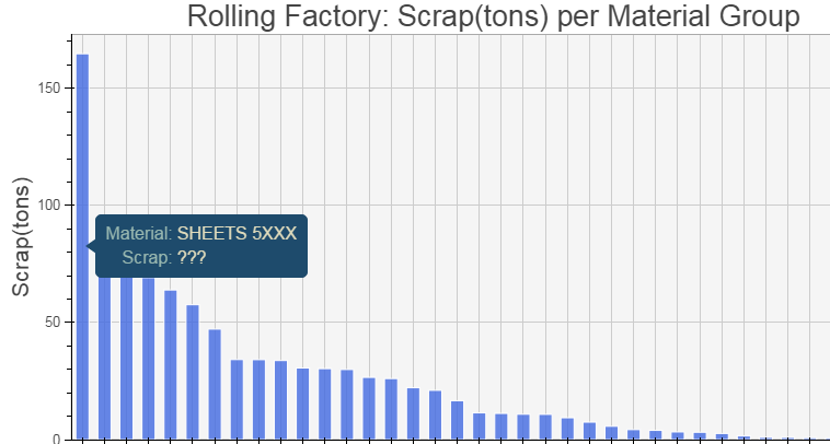
Q4. Hover… I am sure this involves some JS programming… When I hover over a stack on a bar, I would like the tool tip to display the name of category, the count, and the percentage. How do I go about doing that?
Q5. How do display the total on top of each bar?
Thank you for your support. Your support will help build a complete example that will be released back to the community.
regards,
SH