'm trying to plot the following simple heatmap:
data = {
    'value': [1, 2, 3, 4, 5, 6],
    'x': [datetime(2016, 10, 25, 0, 0),
          datetime(2016, 10, 25, 8, 0),
          datetime(2016, 10, 25, 16, 0),
          datetime(2016, 10, 25, 0, 0),
          datetime(2016, 10, 25, 8, 0),
          datetime(2016, 10, 25, 16, 0)],
    'y': ['param1', 'param1', 'param1', 'param2', 'param2', 'param2']
}
hm = HeatMap(data, x='x', y='y', values='value', stat=None)
output_file('heatmap.html')
show(hm)
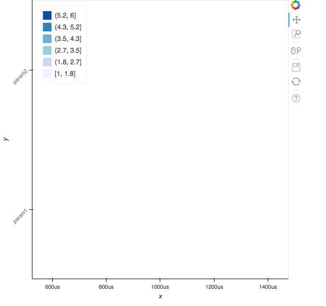
Unfortunately it doesn’t render properly:
I’ve tried setting x_range but nothing seems to work.
I’ve managed to get something working with the following code:
d1 = data['x'][0]
d2 = data['x'][-1]

p = figure(
    x_axis_type="datetime", x_range=(d1, d2), y_range=data['y'],
    tools='xpan, xwheel_zoom, reset, save, resize,'
)

p.rect(
    source=ColumnDataSource(data), x='x', y='y', width=12000000, height=1,
)
However as soon as I try to use the zoom tool, I get the following errors in console:
Uncaught Error: Number property 'start' given invalid value:
Uncaught TypeError: Cannot read property 'indexOf' of null