All,
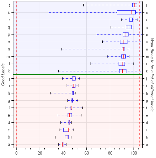
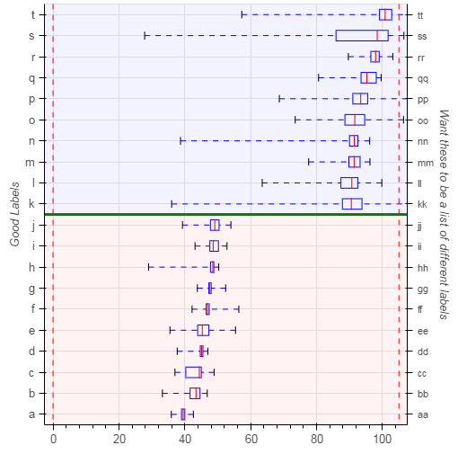
I am having an issue with trying to apply a text label to the right axis that aligns with the horizontal boxes. I need to add an additional label to the right in text with a further description of the box details.
I would like help in trying to get the “right_axis_labels” on the right axis. I have no issue with the numerical axis but for this the picture is as close as I have been able to get.
I have provided all code minus the box plot data because I am still new to python and am not sure how to efficiently generate fake data. I would also appreciate any tips you may have on improving the code.
Thanks for your time.
import pandas as pd
from bokeh.plotting import figure, show
from bokeh.models import plots, Span, BoxAnnotation, Range1d, CategoricalAxis
cats = [‘a’, ‘b’, ‘c’, ‘d’, ‘e’, ‘f’, ‘g’, ‘h’, ‘i’, ‘j’, ‘k’, ‘l’, ‘m’, ‘n’, ‘o’, ‘p’, ‘q’, ‘r’, ‘s’, ‘t’]
plotting
inputs
units = ‘defF’
lim_min = 0
lim_max = 105
space = (lim_max - lim_min) * 0.025
val_max = df[‘max’]
val_min = df[‘min’]
q1 = df[‘q1’]
med = df[‘med’]
q3 = df[‘q3’]
customer = df[‘customer’].values
p = figure(width=500, height=500, y_range=cats, x_range=Range1d(lim_min-space, lim_max+space))
p.xaxis.axis_label = ‘Units: %s’ %units
p.xaxis.axis_label_text_font_size = ‘10pt’
p.xaxis.major_label_text_font_size = ‘10pt’
p.yaxis.major_label_text_font_size = ‘10pt’
p.yaxis.axis_label = ‘Good Labels’
p.yaxis.axis_label_text_font_size = ‘10pt’
p.toolbar_location = None
box_height = .5
wiskers
p.segment(val_max, cats, q3, cats, line_dash=‘dashed’, line_color=“blue”)
p.segment(val_min, cats, q1, cats, line_dash=‘dashed’, line_color=“blue”)
boxes
p.hbar(cats, box_height, q1, q3, fill_color=“white”, line_color=“blue”)
caps (almost-0 height rects simpler than segments)
p.rect(val_min, cats, 0.01, box_height*0.6, line_color=“black”)
p.rect(val_max, cats, 0.01, box_height*0.6, line_color=“black”)
median line
p.rect(med, cats, 0.01, box_height, line_width=1, line_color=“red”)
limit lines
limit_min_line = Span(location=lim_min,
dimension=‘height’, line_color=‘red’,
line_dash=‘dashed’, line_width=1)
limit_max_line = Span(location=lim_max,
dimension=‘height’, line_color=‘red’,
line_dash=‘dashed’, line_width=1)
p.add_layout(limit_min_line)
p.add_layout(limit_max_line)
add top and bottom areas
low_box = BoxAnnotation(top=split[0]+.5, fill_alpha=0.05, fill_color=‘red’)
high_box = BoxAnnotation(bottom=split[0]+.5, fill_alpha=0.05, fill_color=‘blue’)
p.add_layout(low_box)
p.add_layout(high_box)
add horizontal divider line
top_2_bot_split = Span(location=split[0]+.5, dimension=‘width’, line_color=‘green’, line_width=3)
p.add_layout(top_2_bot_split)
add second axis
p.extra_y_ranges={‘right’:p.y_range}
p.add_layout(CategoricalAxis(y_range_name=‘right’, axis_label=“Want these to be a list of different labels”), ‘right’)
right_axis_labels = [‘aa’, ‘bb’, ‘cc’, ‘dd’, ‘ee’, ‘ff’ ,‘gg’, ‘hh’, ‘ii’, ‘jj’, ‘kk’, ‘ll’, ‘mm’, ‘nn’, ‘oo’, ‘pp’, ‘qq’, ‘rr’, ‘ss’, ‘tt’]
show(p)