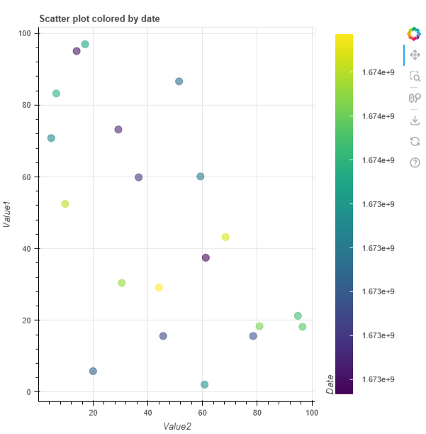
Hi. I’m trying to create a scatterplot with colorbar. Colors of my dots are determined by dates. Currently in my code the ticks labels of the colorbar are in unix format. I would like to have these labels in the human readable date format, for instance “%Y-%m-%d”.
Here is the demo code:
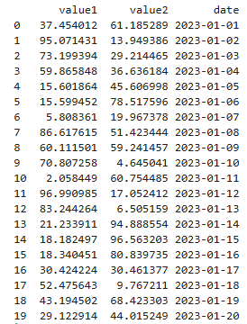
import pandas as pd
import numpy as np
from datetime import datetime, timedelta
from bokeh.plotting import figure, show
from bokeh.models import ColumnDataSource, LinearColorMapper, ColorBar, DatetimeTicker, DatetimeTickFormatter
from bokeh.transform import transform
from bokeh.io import output_notebook

# Generate sample data
np.random.seed(42)
num_points = 20
dates = [datetime(2023, 1, 1) + timedelta(days=i) for i in range(num_points)]
value1 = np.random.rand(num_points) * 100
value2 = np.random.rand(num_points) * 100

# print(dates)

data = pd.DataFrame({'value1': value1, 'value2': value2, 'date': dates})
data["date"] = data["date"].apply(lambda x: x.timestamp())

# Create a ColumnDataSource
source = ColumnDataSource(data)

# Define the color mapper
color_mapper = LinearColorMapper(palette="Viridis256", low=data["date"].min(), high=data["date"].max())

# Create the figure
p = figure(title="Scatter plot colored by date", x_axis_label='Value2', y_axis_label='Value1')

# Add scatter plot
p.scatter(x='value2', y='value1', color=transform('date', color_mapper), size=10, alpha=0.6, source=source)

# Add color bar
color_bar = ColorBar(color_mapper=color_mapper, label_standoff=12, location=(0,0), title='Date')
p.add_layout(color_bar, 'right')

# Show the plot
output_notebook()
show(p)
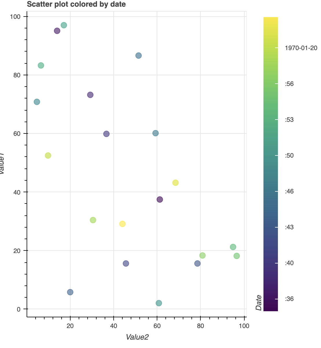
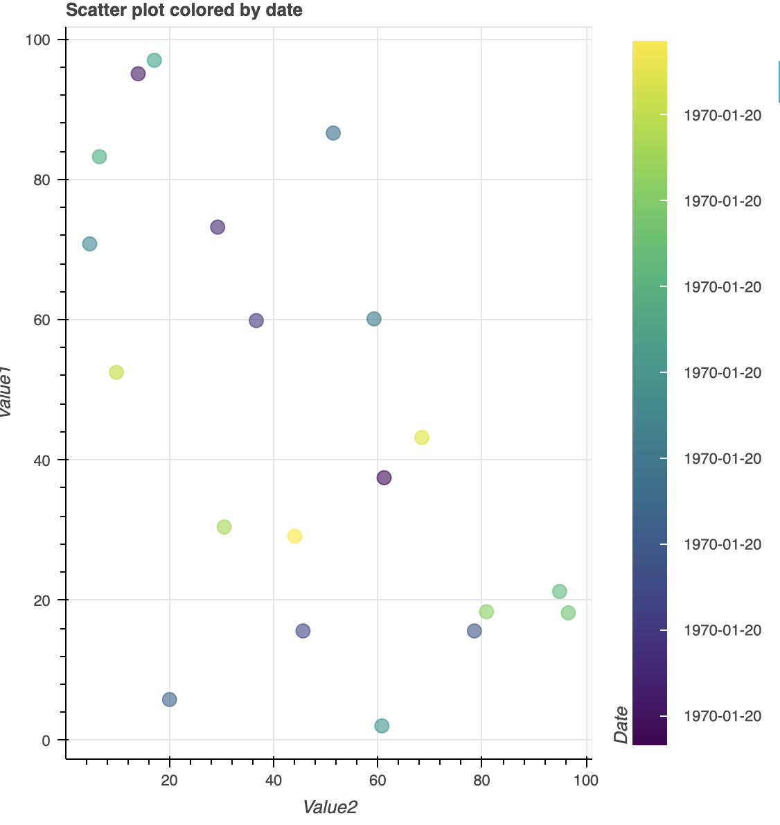
I have tried to use ticker=DateTicker() and formatter=DatetimeTickerFormatter(days=“%Y-%m-%d”) in colorBar object, but they are not giving the results I’m looking for. Here are picture of my plot using the code I have provided:
I’m using jupyterlab notebook to create these plots. Help hihgly appreciated, thank you!