Dear All,
Bokeh/Holoviews suite of visualisation tools is great – once you get the hang of the structures!
I wanted to share a simple visualisation of a time series of two dataseries that I created for a specific use-case (details further below), after which I would like to know if anyone has suggestions to build the chart in a more straight forward way.
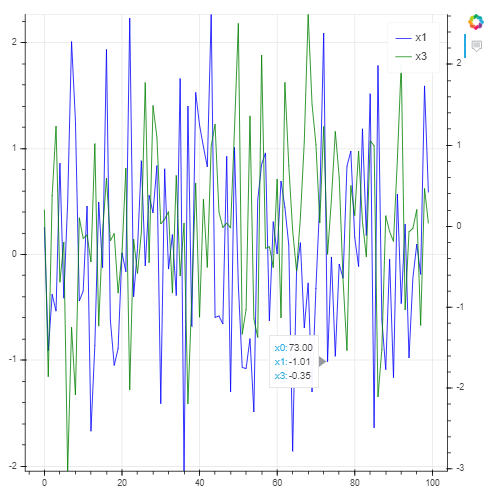
Base Case Example
First of all, I will show you a self-contained example of a simple graph with the following properties:
- Two y-axis graph
- Hover tooltips
- Legend
This can serve as a basecase comparison against the graph that I eventually want to create. This basecase figure was inspired by the following post by Roman Orac: https://romanorac.github.io/machine/learning/2019/02/10/interactive-plotting-with-bokeh.html
NB: I use Jupytper Notes for my analysis then Spyder IDE for reproducible analysis once the analysis is good enough to be used on a frequent basis. Feel free to comment any Jupyter references if they are not relevant for you.
import numpy as np
import pandas as pd
import bokeh
from bokeh.models import Circle, ColumnDataSource, Line, LinearAxis, Range1d
from bokeh.plotting import figure, output_notebook, show
from bokeh.core.properties import value

output_notebook()  # output bokeh plots to jupyter notebook
np.random.seed(42)
print("bokeh", bokeh.__version__)
print("numpy", np.__version__)

output_notebook() #output bokeh plots to jupyter notebook
np.random.seed(43)

#line plot with two axes and tooltips
N = 100

randdict = {
    "x0": np.arange(N),
    "x1": np.random.standard_normal(size=N),
    "x2": np.arange(10, N + 10),
    "x3": np.random.standard_normal(size=N),
}

data_source = ColumnDataSource(randdict)

p=figure(tools="")
column1="x1"
column2="x3"
#First axis
p.line("x0", column1, legend=value(column1),
color="blue", source=data_source)
p.y_range=Range1d(data_source.data[column1].min(),
data_source.data[column1].max())
#Second axis
column2_range=column2+"_range"
p.extra_y_ranges = {
    column2_range: Range1d(
        data_source.data[column2].min(),
data_source.data[column2].max()
    )
}
p.add_layout(LinearAxis(y_range_name=column2_range),"right")
p.line("x0",column2,legend=value(column2),
y_range_name=column2_range,color="green",source=data_source)

p.add_tools(HoverTool(
    tooltips=[
        ('x0', '@x0{0.00 a}'),
        ('x1', '@x1{0.00 a}'),
        ('x3', '@x3{0.00 a}')
    ]
))
show(p)
Augmented Case Example
Using a different dataset, I now want to create a figure with similar requirements:
- Two y-axes to display: a)column1 as VBar on mapped to the left axis, column2 as Line mapped to the right axis
- Hover tooltips to display only when hovering above a particular plot i.e. when hovering over the bar plot, only see the tooltips for the bar plot, not that the tooltip for the bar plot and the line plot display dataseries at the same time
- Display a legend
This appears to be a special use-case for Bokeh, because, when using the typical way of two-axes graph creation Bokeh (see basecase example above), the tooltip for all plots are displayed in the same pop-up box. Of course, depending on individual user preference, this may be exactly what the user wants, while at other times, this may not be what the user wants. I therefore had to go via the method of creating individual glyphs with individually defined tooltips, in order to achieve what I wanted. It also looks like it is not possible to attach a legend to glyphs, while it is possible to attach a legend to the typical ‘vbar’ and ‘line’ plots.
import bokeh
import numpy as np
import math
from bokeh.models import Circle, ColumnDataSource, Line, LinearAxis, Range1d, HoverTool
from bokeh.plotting import figure, output_notebook, show
from bokeh.core.properties import value
from bokeh.models.glyphs import VBar, Line

dict = {
'year'  :  [2005,2006,2007,2008,2009,2010,2011,2012,2013,2014,2015,2016,2017,2018],
'optimised_volume' :  [1,-2.8,0.6,3,2.2,4.1,-0.7,-0.9,3.7,-3.2,-3.4,-4.7,-3.9,3.9],
'bank'  :  [1,-1.9,-1.2,1.7,4,8,7.3,6.4,10.1,6.9,3.6,-1.1,-5.1,-1.2]
}

df=pd.DataFrame(dict)
df = df.apply(pd.to_numeric)
source = ColumnDataSource(df)
column1 = "optimised_volume"
column2 = "bank"
#instantiate the min/max for both axes; will later be used to set the min/max of the left & right axes to be the same
axis_min = math.floor(min(source.data[column1].min(),source.data[column2].min()))
axis_max = math.ceil(max(source.data[column1].max(),source.data[column2].max()))

#create hovertools individually for each line
p = figure(plot_width=800, plot_height=300, title="Optimised Volume & Accumulated Bank", tools="",y_range=(axis_min,axis_max))

g1 = VBar(x="year", top="optimised_volume",fill_color="green",fill_alpha=0.75,width=1)
g1_r = p.add_glyph(source_or_glyph=source,glyph=g1)
g1_hover = HoverTool(renderers=[g1_r],tooltips=[('year','@year'),('optimised_volume','@optimised_volume{0.0 a}')])
p.add_tools(g1_hover)
p.yaxis.axis_label = 'Optimised Volume'

#Second axis
column2_range=column2+"_range"
p.extra_y_ranges = {column2_range: Range1d(axis_min,axis_max)}
p.xaxis.axis_label = 'Year'

p.add_layout(LinearAxis(y_range_name=column2_range, axis_label="Accumulated Bank"),"right")
g2 = Line(x="year", y="bank",line_color="blue",line_width=3)
g2_r = p.add_glyph(source_or_glyph=source,glyph=g2,y_range_name=column2_range)
g2_hover = HoverTool(renderers=[g2_r],tooltips=[('year','@year'),('accum_bank','@bank{0.0 a}')])
p.add_tools(g2_hover)

p1 = p.vbar(x=df.year, top=df.optimised_volume,width=1,fill_color="green",legend="Optimised Volume")
p1.visible = False
p2 = p.line(x=df.year, y=df.bank,color='blue',line_width=3,legend="Accumulated Bank",y_range_name=column2_range)
p2.visible = False

show(p)
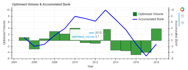
As you can see: the method that I have taken appears to be quite convoluted v.s. the simpler standard use-case given in the first figure (NB: creating replica plots using the vbar and line objects, creating a legend with those plots and then setting those plots to be invisible using p1.visible = False & p2.visible = False), but it does the job.
My question to the Discourse Community: is this the best solution to the problem, and if not, what suggestions can you make/which Bokeh features can you introduce to make the coding/graphical plot creation better?
Cheers!