@Bryan Thanks for the feedback.
it’s not clear from your post—are you wanting to implement something for a plot you are making with Bokeh, or are you wanting to implement a new feature in Bokeh itself?
I’m solving my current task, so it’s more about customizing my plot.
Although, perhaps this feature would be useful for other users, so it would be cool to have it in the library’s functionality. Is this discussion is subject for sending a request for a new feature to Issues · bokeh/bokeh · GitHub?
It’s also not clear what exactly you want to accomplish from the description. Do you have an image or a link to something that shows what you want to be able to do?
I’m sorry that I didn’t provide an illustrative example right away.
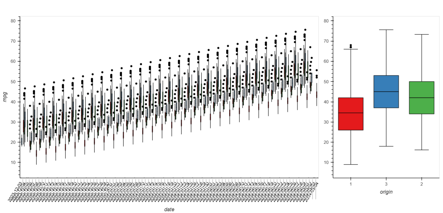
See the following figures. date axis on the left subplot on the figure is group-level. Because of a lot of boxes groups the tick labels are overlapped (compare axis labels at original and zoomed figures).
| Original figure |
Zoomed figure |
|
|
The Jupyter sheet with plot procedure is here Attachment for https://discourse.bokeh.org/t/context-for-categoricalaxis-levels/11132 · GitHub. I use Holoviews Boxwhisker, however Holoviews itself uses Bokeh as a plotting backend, so the question can be extended to any Bokeh entity uses CategoricalAxis. And I use dataset based on bokeh.sampledata.autompg.
I want to have the same behavior on rescaling (zooming/unzooming) along the date axis as for DatetimeAxis like Styling plot elements — Bokeh 3.3.2 Documentation — the axis view (labels, ticks) is adapted to current rendered data. For example, only years are displayed on the “macro” scale, months on the “middle” scale, and so on with “normal” ticks frequency (the overlapping problem). The ticks label format (and their frequency) should be configurable as is the case with DatatimeAxis.
Originally my plot (library) was implemented with Matplotlib (Seaborn).
The output is static images so date axis generation (overlap calc, ticklabel format) is done before image will show. And the whole image replot (with new axis calc) is need for the new scale.
(I haven’t tried to implement interactive axis reformat on rescale. Perhaps it’s complicated task too.)
However, despite the excellent quality of the generated images by Matplotlib, the rendering speed and the interactivity (e.g., web application) are low. (It’s still a great tool, but for other goals.)
Therefore, I am currently working on adding Bokeh (Holoviews) as a faster and more interactive backend (as more suitable tool). And the axis reformat on rescale in interactive mode will be a pretty useful feature.