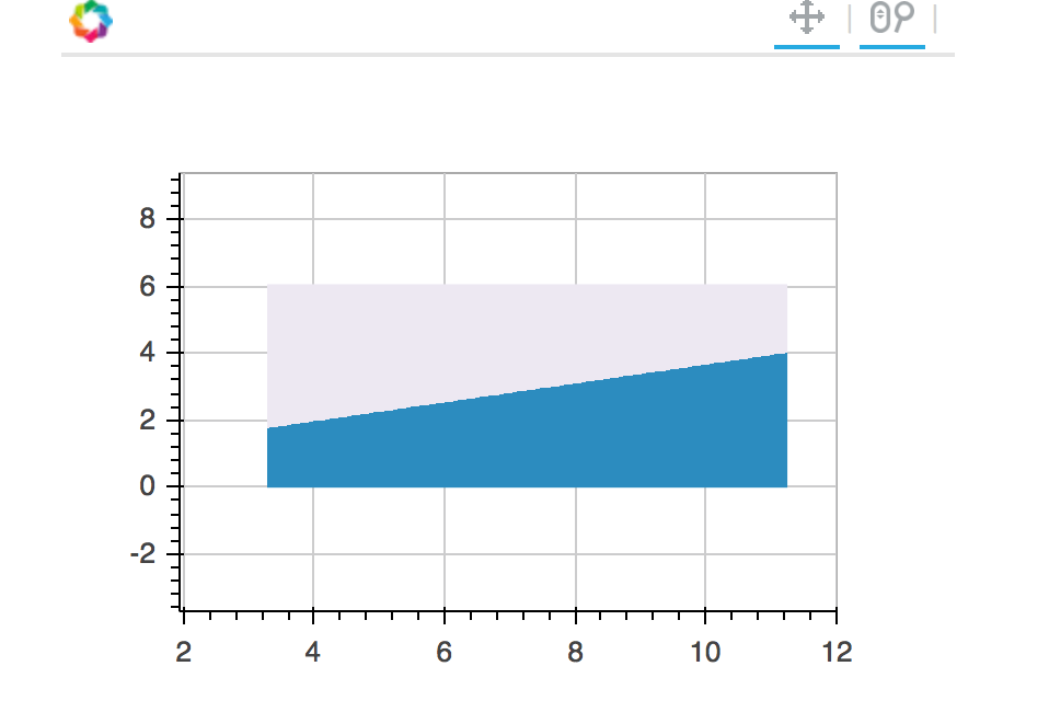
I am trying
to create a Contour Plot to identify regions for simple ML classification
algorithms. The example I was following
was created with Matplotlib, but I believe bokeh images can do the trick (as
you can see in the attached notebook).
Initially,
it looks like both figures are the same, but if you look closer at the
boundaries you see that matplotlib has a steeper slope. As I am using exactly
the same data for both I am wondering if I did something wrong when creating
the bokeh image that result in this difference.
The bounds of the image are evidently not being set correctly. Add a pan and zoom tool to the Bokeh plot and you can see that it is possible to zoom out and see more of the image. In terms of the literal visible slope, it also appears that the aspect ratio of the two plots are not identical.
I am trying to create a Contour Plot to identify regions for simple ML classification algorithms. The example I was following was created with Matplotlib, but I believe bokeh images can do the trick (as you can see in the attached notebook).
Initially, it looks like both figures are the same, but if you look closer at the boundaries you see that matplotlib has a steeper slope. As I am using exactly the same data for both I am wondering if I did something wrong when creating the bokeh image that result in this difference.
looking at your code, I expect this is the problem:
dw=xx1.max()
because dw is the *width* of the image in data units. You probably want dw = (max-min)
Bryan
···
On Apr 12, 2016, at 8:47 AM, Bryan Van de Ven <[email protected]> wrote:
The bounds of the image are evidently not being set correctly. Add a pan and zoom tool to the Bokeh plot and you can see that it is possible to zoom out and see more of the image. In terms of the literal visible slope, it also appears that the aspect ratio of the two plots are not identical.
Bryan
<Screen Shot 2016-04-12 at 8.46.15 AM.png>
On Apr 12, 2016, at 8:15 AM, Oscar Delgado <[email protected]> wrote:
Good morning,
I am trying to create a Contour Plot to identify regions for simple ML classification algorithms. The example I was following was created with Matplotlib, but I believe bokeh images can do the trick (as you can see in the attached notebook).
Initially, it looks like both figures are the same, but if you look closer at the boundaries you see that matplotlib has a steeper slope. As I am using exactly the same data for both I am wondering if I did something wrong when creating the bokeh image that result in this difference.