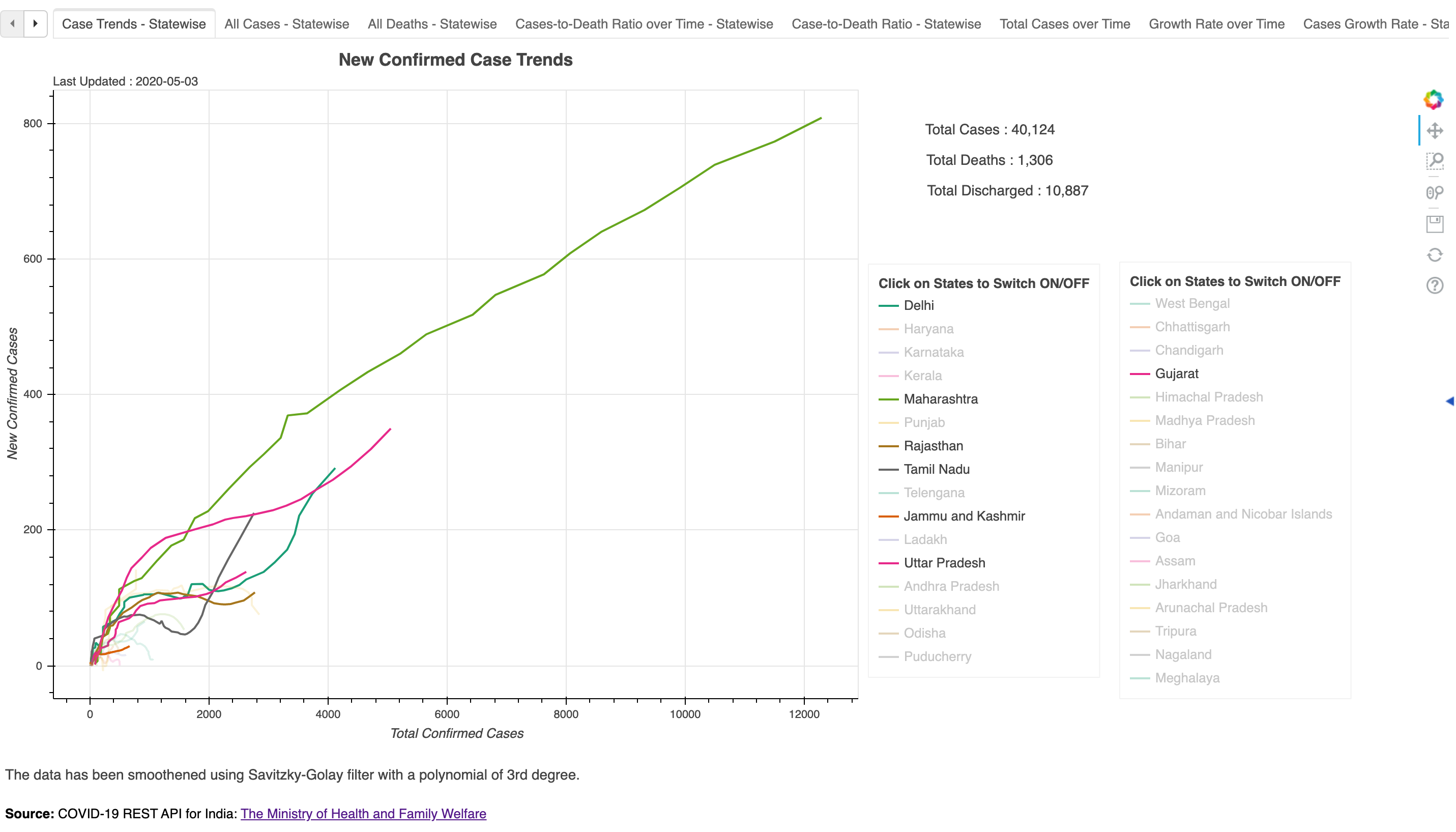
I have learnt Python recently and found out about Bokeh in the process of exploring it. After a week of tinkering, I ended up developing a COVID19 Dashboard that fetches latest data every time the script is run from available open source APIs and runs latest charts using Bokeh with interactive legends to allow comprehensive and interactive comparison between states of India.
One can use multiple charts from the dashboard to understand the trajectory of cases in each state and compare the rate if growth changing over time.
Important metrics such as Cases per deaths (inverse of fatality rate) and Fatality rate with some textual takeaways dynamically getting added from the data for a layman to understand the situation at hand.
The whole project has been made published to a public URL called http://covid19analysis.live for everyone including frontline volunteers and administration to draw further insights, if they find it helpful.