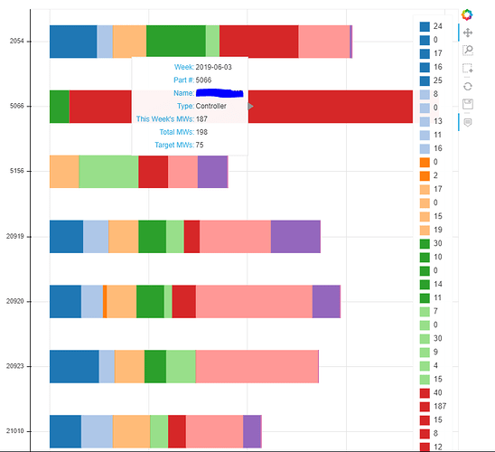
I’m creating a stacked bar plot, where the y axis corresponds to item number and the x axis is quantity shipped. The individual stacks within the plot correlate to the week an item was shipped. I would like a legend that displays the name of the week corresponding to its color.
However, my current legend plots the quantity shipped for each week.
The DataFrame that I’m using has part numbers as the index, and a date (stored as a string) for the column headers. So to restate: I would like one legend of each color, and that legend corresponds to the column names of my dataframe.
Here’s the code that I’m using to create the graph.
def createGraph(data, drf):
    data.index.name="Item Number"
    weeks = [str(w) for w in data.columns]
    part_nums = sorted(data.index, key=lambda x: int(x), reverse=True)

    plt = figure(y_range=part_nums, plot_height=800, plot_width=800,
                tools=[hover, PanTool(), BoxZoomTool(), BoxSelectTool(), ResetTool(), SaveTool()])

    plt.hbar_stack(weeks, y='Item Number', color=Category20[len(weeks)%20], height=.5, source=data, legend=weeks)
    plt.legend.orientation="vertical"
    plt.legend.location="top_right"

    show(plt)
I already access the date through a hover tool - I just can’t get it in the legend how I want it.
Thank you for your time.
