Hello 
With some custom CSS and the InlineStyleSheet, you can easily personalize the look and feel of interactive widgets like sliders, dropdowns, switches, and more.
Feel free to use these snippets, share your own ideas, or remix them for your project.
- Slider
from bokeh.io import show, curdoc
from bokeh.models import Slider, InlineStyleSheet
from bokeh.layouts import column
curdoc().theme = 'dark_minimal'
slider_style = InlineStyleSheet(css="""
/* Host: set the widget's container background */
:host {
background: #16161e !important; /* even darker than black for modern dark UI */
border-radius: 12px !important;
padding: 12px !important;
box-shadow: 0 4px 12px #0006 !important;
}
/* Slider title */
:host .bk-slider-title {
color: #00ffe0 !important; /* bright cyan for the title */
font-size: 1.2em !important;
font-weight: bold !important;
letter-spacing: 1px !important;
font-family: 'Fira Code', 'Consolas', 'Menlo', monospace !important;
margin-bottom: 14px !important;
text-shadow: 0 2px 12px #00ffe099;
}
/* Track (background) */
:host .noUi-base, :host .noUi-target {
background: #23233c !important;
border: 1px solid #2a3132 !important;
}
/* Filled portion */
:host .noUi-connect {
background: linear-gradient(90deg, #00ffe0 10%, #d810f7 90%) !important;
box-shadow: 0 0 12px #00ffe099;
border-radius: 12px !important;
}
/* Handle */
:host .noUi-handle {
background: #343838 !important;
border: 2px solid #00ffe0 !important;
border-radius: 50%;
width: 20px;
height: 20px;
}
/* Handle hover/focus */
:host .noUi-handle:hover, :host .noUi-handle:focus {
border-color: #ff2a68 !important;
box-shadow: 0 0 10px #ff2a6890;
}
/* Tooltip */
:host .noUi-tooltip {
background: #343838 !important;
color: #00ffe0 !important;
font-family: 'Consolas', monospace;
border-radius: 6px;
border: 1px solid #00ffe0;
}
""")
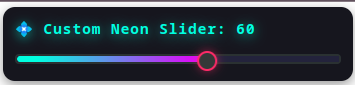
slider = Slider(
start=0, end=100, value=42, step=1,
title="💠 Custom Neon Slider", width=350, stylesheets=[slider_style]
)
show(column(slider))
- Select
from bokeh.io import show, curdoc
from bokeh.models import Select, InlineStyleSheet
from bokeh.layouts import column
select_css = InlineStyleSheet(css="""
/* Widget container */
:host {
background: #181824 !important;
border-radius: 14px !important;
padding: 16px !important;
box-shadow: 0 4px 24px #0007 !important;
}
/* Title styling */
:host .bk-input-group label, :host .bk-select-title {
color: #06f0ff !important;
font-size: 1.18em !important;
font-family: 'Fira Code', monospace;
font-weight: bold !important;
margin-bottom: 12px !important;
letter-spacing: 1px !important;
text-shadow: 0 2px 12px #06f0ff88, 0 1px 6px #111b;
}
/* Dropdown select */
:host select {
background: #23233c !important;
color: #f9fafb !important;
border: 2px solid #06b6d4 !important;
border-radius: 8px !important;
padding: 10px 14px !important;
font-size: 1.07em !important;
transition: border 0.1s, box-shadow 0.1s;
box-shadow: none !important;
}
/* Glow effect on hover/focus */
:host select:hover, :host select:focus {
border-color: #ff3049 !important;
box-shadow: 0 0 0 2px #ff304999, 0 0 18px #ff3049cc !important;
outline: none !important;
}
""")
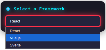
select = Select(
title="💠 Select a Framework",
options=["React", "Vue.js", "Svelte"],
value="React",
width=350,
stylesheets=[select_css]
)
show(column(select))
- Multichoice
from bokeh.io import show, curdoc
from bokeh.models import MultiChoice, InlineStyleSheet
from bokeh.layouts import column
multi_style = InlineStyleSheet(css="""
/* Outer widget container */
:host {
background: #181824 !important;
border-radius: 14px !important;
padding: 16px !important;
box-shadow: 0 4px 20px #0008 !important;
}
/* Title styling */
:host .bk-input-group label, :host .bk-multichoice-title {
color: #00ffe0 !important;
font-size: 1.18em !important;
font-family: 'Fira Code', monospace;
font-weight: bold !important;
margin-bottom: 10px !important;
letter-spacing: 1px !important;
text-shadow: 0 2px 12px #00ffe088, 0 1px 4px #181824;
}
/* The input field when closed */
:host .choices__inner {
background: #23233c !important;
color: #f9fafb !important;
border: 2px solid #06b6d4 !important;
border-radius: 8px !important;
font-size: 1.05em !important;
transition: border 0.1s, box-shadow 0.1s;
box-shadow: none !important;
}
/* Glow on hover/focus of input */
:host .choices__inner:hover, :host .choices__inner:focus-within {
border-color: #ff3049 !important;
box-shadow: 0 0 0 2px #ff304999, 0 0 16px #ff3049cc !important;
outline: none !important;
}
/* Dropdown list */
:host .choices__list--dropdown {
background: #181824 !important;
border: 1.5px solid #06b6d4 !important;
border-radius: 8px !important;
box-shadow: 0 10px 32px #000c !important;
}
/* Items in the dropdown */
:host .choices__item--choice {
color: #f9fafb !important;
padding: 12px 16px !important;
transition: all 0.15s;
border-bottom: 1px solid #28284666 !important;
}
:host .choices__item--choice:hover {
background: #8b5cf6 !important;
color: #1f2937 !important;
}
/* Active selected items in the box */
:host .choices__item--selectable {
background: linear-gradient(90deg, #ffb028 20%, #ff4f4f 100%) !important;
color: #181824 !important;
border-radius: 6px !important;
font-weight: 600 !important;
margin: 2px 4px !important;
padding: 6px 14px !important;
box-shadow: 0 1px 6px #0005;
}
""")
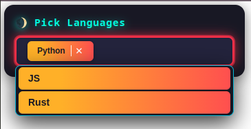
multi = MultiChoice(
title="🌒 Pick Languages",
options=["Python", "JS", "Rust", "FORTRAN", "C++", "C#", "R", "Ruby", "PHP", "Java"],
value=["Python"],
width=350,
stylesheets=[multi_style]
)
show(column(multi))
- Input
from bokeh.io import show, curdoc
from bokeh.models import TextInput, InlineStyleSheet
from bokeh.layouts import column
textinput_css = InlineStyleSheet(css="""
/* Outer container styling */
:host {
background: #181824 !important;
border-radius: 14px !important;
padding: 16px !important;
box-shadow: 0 4px 18px #0006 !important;
}
/* Title label styling */
:host .bk-input-group label, :host .bk-textinput-title {
color: #34ffe0 !important;
font-size: 1.14em !important;
font-family: 'Fira Code', monospace;
font-weight: bold !important;
margin-bottom: 12px !important;
letter-spacing: 0.5px !important;
text-shadow: 0 2px 12px #34ffe077, 0 1px 3px #222;
}
/* The input box */
:host input[type="text"] {
background: #23233c !important;
color: #f9fafb !important;
border: 2px solid #06b6d4 !important;
border-radius: 8px !important;
padding: 11px 15px !important;
font-size: 1.08em !important;
transition: border 0.12s, box-shadow 0.12s;
box-shadow: none !important;
}
/* On hover/focus: red border with glowing effect */
:host input[type="text"]:hover,
:host input[type="text"]:focus {
border-color: #ff3049 !important;
box-shadow: 0 0 0 2px #ff304999, 0 0 15px #ff3049bb !important;
outline: none !important;
}
/* Placeholder text */
:host input[type="text"]::placeholder {
color: #9ca3af !important;
opacity: 0.7 !important;
font-style: italic !important;
}
""")
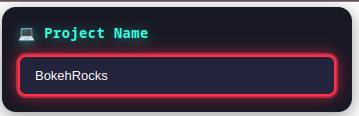
ti = TextInput(
title="💻 Project Name",
placeholder="Type here...",
width=350,
stylesheets=[textinput_css]
)
show(column(ti))
- RangeSlider
from bokeh.io import show
from bokeh.models import RangeSlider, InlineStyleSheet
# Modern dark theme CSS variables
base_variables = """
:host {
--primary-color: #8b5cf6;
--secondary-color: #06b6d4;
--background-color: #181824;
--surface-color: #23233c;
--text-color: #f9fafb;
--accent-color: #f59e0b;
--danger-color: #ff3049;
--border-color: #4b5563;
}
"""
range_slider_style = InlineStyleSheet(css=base_variables + """
:host {
background: var(--background-color) !important;
border-radius: 14px !important;
padding: 18px !important;
box-shadow: 0 4px 18px #0006 !important;
}
/* Title styling */
:host .bk-slider-title {
color: var(--accent-color) !important;
font-size: 1.16em !important;
font-family: 'Fira Code', monospace;
font-weight: bold !important;
margin-bottom: 13px !important;
letter-spacing: 1px;
text-shadow: 0 2px 8px #f59e0b77;
}
/* Slider rail */
:host .noUi-target {
background: var(--surface-color) !important;
border: 2px solid var(--border-color) !important;
border-radius: 7px !important;
box-shadow: none !important;
height: 12px !important;
}
/* Active track with orange gradient */
:host .noUi-connect {
background: linear-gradient(90deg, var(--accent-color), var(--primary-color)) !important;
border-radius: 6px !important;
box-shadow: 0 1px 10px var(--accent-color)44;
}
/* Handles */
:host .noUi-handle {
background: var(--text-color) !important;
border: 3px solid var(--accent-color) !important;
border-radius: 50% !important;
width: 26px !important;
height: 26px !important;
box-shadow: 0 3px 8px rgba(0,0,0,0.3) !important;
cursor: grab !important;
transition: border 0.13s, box-shadow 0.13s;
}
/* Orange glow on hover, red glow on focus/active */
:host .noUi-handle:hover {
border-color: var(--accent-color) !important;
box-shadow: 0 0 0 2px #f59e0b99, 0 0 15px #f59e0bcc !important;
}
:host .noUi-handle:focus, :host .noUi-handle:active {
border-color: var(--danger-color) !important;
box-shadow: 0 0 0 2px #ff304999, 0 0 18px #ff3049cc !important;
outline: none !important;
cursor: grabbing !important;
transform: scale(1.07) !important;
}
/* Tooltip bubble styling */
:host .noUi-tooltip {
background: var(--surface-color) !important;
color: var(--accent-color) !important;
font-family: 'Fira Code', monospace;
border-radius: 8px;
border: 1.5px solid var(--accent-color);
box-shadow: 0 2px 8px #0004;
}
""")
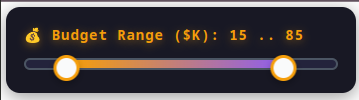
range_slider = RangeSlider(
start=0,
end=100,
value=(20, 80),
step=5,
title="💰 Budget Range ($K)",
width=350,
stylesheets=[range_slider_style]
)
show(range_slider)
- Button
from bokeh.io import show
from bokeh.models import Button, InlineStyleSheet
# Common CSS variables for consistent theming
base_variables = """
:host {
/* CSS Custom Properties for easy theming */
--primary-color: #8b5cf6;
--secondary-color: #06b6d4;
--background-color: #1f2937;
--surface-color: #343838;
--text-color: #f9fafb;
--accent-color: #f59e0b;
--danger-color: #ef4444;
--success-color: #10b981;
--border-color: #4b5563;
--hover-color: #6366f1;
background: none !important;
}
"""
button_style = InlineStyleSheet(css=base_variables + """
:host button {
background: linear-gradient(135deg, var(--primary-color), var(--secondary-color)) !important;
color: white !important;
border: none !important;
border-radius: 6px !important;
padding: 10px 20px !important;
font-size: 14px !important;
font-weight: 600 !important;
cursor: pointer !important;
transition: all 0.2s ease !important;
box-shadow: 0 2px 4px rgba(0,0,0,0.1) !important;
}
:host button:hover {
transform: translateY(-1px) !important;
box-shadow: 0 4px 8px rgba(0,0,0,0.2) !important;
background: linear-gradient(135deg, var(--hover-color), var(--primary-color)) !important;
}
:host button:active {
transform: translateY(0) !important;
box-shadow: 0 2px 4px rgba(0,0,0,0.1) !important;
}
:host button:disabled {
background: #6b7280 !important;
cursor: not-allowed !important;
transform: none !important;
box-shadow: none !important;
}
""")
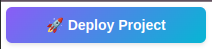
button = Button(
label="🚀 Deploy Project",
button_type="primary",
width=200,
stylesheets=[button_style]
)
show(button)
- Checkbox
from bokeh.io import show
from bokeh.models import CheckboxGroup, InlineStyleSheet
# Common CSS variables for consistent theming
base_variables = """
:host {
/* CSS Custom Properties for easy theming */
--primary-color: #8b5cf6;
--secondary-color: #06b6d4;
--background-color: #1f2937;
--surface-color: #343838;
--text-color: #f9fafb;
--accent-color: #f59e0b;
--danger-color: #ef4444;
--success-color: #10b981;
--border-color: #4b5563;
--hover-color: #6366f1;
background: none !important;
}
"""
checkbox_style = InlineStyleSheet(css=base_variables + """
:host .bk-input-group {
background: var(--surface-color) !important;
border: 1px solid var(--border-color) !important;
border-radius: 6px !important;
padding: 8px !important;
}
:host input[type="checkbox"] {
appearance: none !important;
width: 18px !important;
height: 18px !important;
border: 2px solid var(--border-color) !important;
border-radius: 3px !important;
background: var(--surface-color) !important;
cursor: pointer !important;
position: relative !important;
margin-right: 8px !important;
}
:host input[type="checkbox"]:checked {
background: var(--primary-color) !important;
border-color: var(--primary-color) !important;
}
:host input[type="checkbox"]:checked::after {
content: "✓" !important;
position: absolute !important;
top: -2px !important;
left: 2px !important;
color: white !important;
font-size: 12px !important;
font-weight: bold !important;
}
:host label {
color: var(--text-color) !important;
cursor: pointer !important;
font-size: 14px !important;
display: flex !important;
align-items: center !important;
margin-bottom: 6px !important;
}
""")
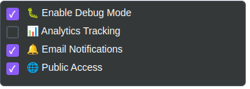
checkbox_group = CheckboxGroup(
labels=["🐛 Enable Debug Mode", "📊 Analytics Tracking", "🔔 Email Notifications", "🌐 Public Access"],
active=[0, 2],
width=350,
stylesheets=[checkbox_style]
)
show(checkbox_group)
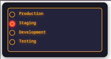
- RadioButtonGroup
from bokeh.io import show
from bokeh.models import RadioButtonGroup, InlineStyleSheet
from bokeh.layouts import column
radio_btn_css = InlineStyleSheet(css="""
/* Outer container */
:host {
background: #181824 !important;
border-radius: 16px !important;
padding: 22px 22px 18px 22px !important;
box-shadow: 0 4px 18px #0008 !important;
max-width: 600px !important;
}
/* Title */
:host .bk-input-group label, :host .bk-radiobuttongroup-title {
color: #f59e0b !important;
font-size: 1.16em !important;
font-family: 'Fira Code', monospace;
font-weight: bold !important;
margin-bottom: 16px !important;
text-shadow: 0 2px 10px #f59e0b99;
letter-spacing: 0.5px;
}
/* Button group: wrap on small screens */
:host .bk-btn-group {
display: flex !important;
gap: 18px !important;
flex-wrap: wrap !important;
justify-content: flex-start;
margin-bottom: 6px;
}
/* Each radio button - pill shape, full text, no ellipsis */
:host button.bk-btn {
background: #23233c !important;
color: #f9fafb !important;
border: 2.5px solid #f59e0b !important;
border-radius: 999px !important;
padding: 0.7em 2.2em !important;
min-width: 120px !important;
font-size: 1.09em !important;
font-family: 'Fira Code', monospace;
font-weight: 600 !important;
transition: border 0.13s, box-shadow 0.14s, color 0.12s, background 0.13s;
box-shadow: 0 2px 10px #0002 !important;
cursor: pointer !important;
outline: none !important;
white-space: nowrap !important;
overflow: visible !important;
text-overflow: unset !important;
}
/* Orange glow on hover */
:host button.bk-btn:hover:not(.bk-active) {
border-color: #ffa733 !important;
color: #ffa733 !important;
box-shadow: 0 0 0 2px #ffa73399, 0 0 13px #ffa73388 !important;
background: #2e2937 !important;
}
/* Red glow on active/focus */
:host button.bk-btn:focus, :host button.bk-btn.bk-active {
border-color: #ff3049 !important;
color: #ff3049 !important;
background: #322d36 !important;
box-shadow: 0 0 0 2px #ff304999, 0 0 19px #ff304988 !important;
}
/* Remove focus outline */
:host button.bk-btn:focus {
outline: none !important;
}
""")
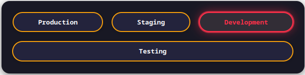
radio_group = RadioButtonGroup(
labels=["Production", "Staging", "Development", "Testing"],
active=0,
width=600,
stylesheets=[radio_btn_css]
)
show(column(radio_group))
- FileInput
from bokeh.io import show
from bokeh.models import FileInput, InlineStyleSheet
base_variables = """
:host {
/* CSS Custom Properties for easy theming */
--primary-color: #8b5cf6;
--secondary-color: #06b6d4;
--background-color: #1f2937;
--surface-color: #343838;
--text-color: #f9fafb;
--accent-color: #f59e0b;
--danger-color: #ef4444;
--success-color: #10b981;
--border-color: #4b5563;
--hover-color: #6366f1;
background: none !important;
}
"""
file_input_style = InlineStyleSheet(css=base_variables + """
:host input[type="file"] {
background: var(--surface-color) !important;
color: var(--text-color) !important;
border: 2px dashed var(--border-color) !important;
border-radius: 6px !important;
padding: 20px !important;
font-size: 14px !important;
cursor: pointer !important;
transition: all 0.2s ease !important;
}
:host input[type="file"]:hover {
border-color: var(--primary-color) !important;
background: rgba(139, 92, 246, 0.05) !important;
}
:host input[type="file"]::file-selector-button {
background: var(--primary-color) !important;
color: white !important;
border: none !important;
border-radius: 4px !important;
padding: 8px 16px !important;
margin-right: 12px !important;
cursor: pointer !important;
font-weight: 600 !important;
}
""")
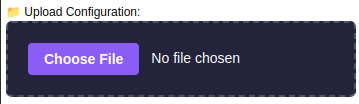
file_input = FileInput(
title="📁 Upload Configuration:",
accept=".json,.yaml,.yml,.config",
width=350,
stylesheets=[file_input_style]
)
show(file_input)
- RadioButton
from bokeh.io import show
from bokeh.models import RadioGroup, InlineStyleSheet
from bokeh.layouts import column

radio_css = InlineStyleSheet(css="""
/* Outer box */
:host {
    background: #181824 !important;
    border-radius: 14px !important;
    padding: 18px !important;
    box-shadow: 0 4px 18px #0007 !important;
}
/* Title (if used) */
:host .bk-input-group label, :host .bk-radiogroup-title {
    color: #f59e0b !important;
    font-size: 1.12em !important;
    font-family: 'Fira Code', monospace;
    font-weight: bold;
    margin-bottom: 11px;
    text-shadow: 0 2px 10px #f59e0b77;
}
/* Radio group styling */
:host .bk-input-group {
    background: #23233c !important;
    border-radius: 8px !important;
    padding: 10px 4px !important;
    border: 2px solid #f59e0b !important;
}
/* Each radio button */
:host input[type="radio"] {
    appearance: none !important;
    background: #23233c !important;
    border: 2px solid #f59e0b !important;
    border-radius: 50% !important;
    width: 19px !important;
    height: 19px !important;
    margin-right: 10px !important;
    vertical-align: middle;
    transition: border 0.12s, box-shadow 0.12s;
    box-shadow: none !important;
}
/* Glow on hover */
:host input[type="radio"]:hover {
    border-color: #ffa733 !important;
    box-shadow: 0 0 0 2px #ffa73399, 0 0 11px #ffa733bb !important;
}
:host input[type="radio"]:focus {
    border-color: #ff3049 !important;
    box-shadow: 0 0 0 2px #ff304999, 0 0 13px #ff3049cc !important;
    outline: none !important;
}
/* Checked state */
:host input[type="radio"]:checked {
    border-color: #ff3049 !important;
    background: #f59e0b !important;
}
:host input[type="radio"]:checked::after {
    content: "";
    display: block;
    width: 9px;
    height: 9px;
    margin: 3px auto;
    border-radius: 50%;
    background: #ff3049 !important;
}
/* Label styling */
:host label {
    color: #f9fafb !important;
    font-family: 'Fira Code', monospace;
    font-size: 1.04em;
    margin-bottom: 4px;
    vertical-align: middle;
    cursor: pointer;
}
""")

radio = RadioGroup(
    labels=["Production", "Staging", "Development", "Testing"],
    active=2,
    width=350,
    stylesheets=[radio_css]
)

show(column(radio))
- Div
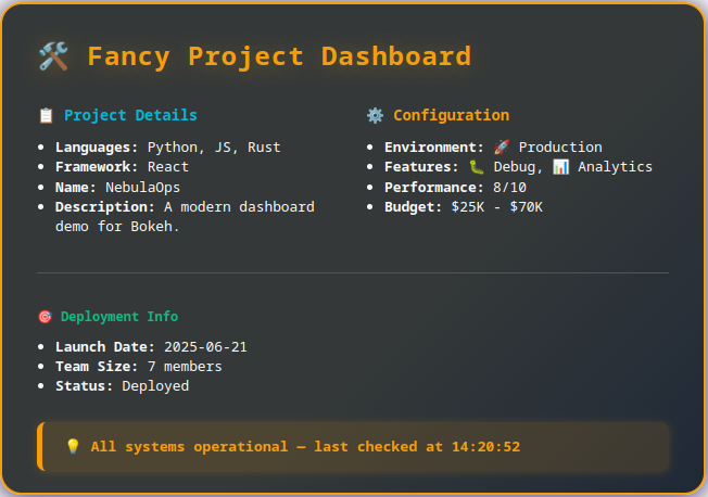
from bokeh.io import show
from bokeh.models import Div

dashboard = Div(
    text="""
    <div style="
        background: linear-gradient(135deg, #343838 60%, #1f2937 100%);
        border: 2.5px solid #f59e0b;
        border-radius: 20px;
        padding: 30px 32px 20px 32px;
        margin: 18px 0;
        min-width: 520px;
        max-width: 720px;
        box-shadow: 0 8px 32px #8b5cf655, 0 2px 24px #000c;
        font-family: 'Fira Code', 'Menlo', 'Consolas', monospace;
    ">
        <h2 style="color: #f59e0b; font-size: 2em; font-weight: bold; margin-top: 0; margin-bottom: 10px; letter-spacing: 1px; text-shadow: 0 2px 20px #f59e0b55;">
            🛠️ Fancy Project Dashboard
        </h2>

        <div style="display: grid; grid-template-columns: 1fr 1fr; gap: 24px; margin-bottom: 20px;">
            <div>
                <h4 style="color: #06b6d4; font-size: 1.14em; margin-bottom: 10px;">📋 Project Details</h4>
                <ul style="color: #f9fafb; font-size: 1.07em; padding-left: 17px; margin-top: 0;">
                    <li><strong>Languages:</strong> Python, JS, Rust</li>
                    <li><strong>Framework:</strong> React</li>
                    <li><strong>Name:</strong> NebulaOps</li>
                    <li><strong>Description:</strong> A modern dashboard demo for Bokeh.</li>
                </ul>
            </div>
            <div>
                <h4 style="color: #f59e0b; font-size: 1.14em; margin-bottom: 10px;">⚙️ Configuration</h4>
                <ul style="color: #f9fafb; font-size: 1.07em; padding-left: 17px; margin-top: 0;">
                    <li><strong>Environment:</strong> 🚀 Production</li>
                    <li><strong>Features:</strong> 🐛 Debug, 📊 Analytics</li>
                    <li><strong>Performance:</strong> 8/10</li>
                    <li><strong>Budget:</strong> $25K - $70K</li>
                </ul>
            </div>
        </div>

        <div style="margin-top: 14px; padding-top: 15px; border-top: 1px solid #4b5563;">
            <h4 style="color: #10b981; margin-bottom: 10px;">🎯 Deployment Info</h4>
            <ul style="color: #f9fafb; font-size: 1.07em; padding-left: 17px; margin-top: 0;">
                <li><strong>Launch Date:</strong> 2025-06-21</li>
                <li><strong>Team Size:</strong> 7 members</li>
                <li><strong>Status:</strong> Deployed</li>
            </ul>
        </div>

        <div style="
            margin-top: 24px;
            padding: 13px 20px;
            background: rgba(245, 158, 11, 0.13);
            border-radius: 8px;
            border-left: 5px solid #f59e0b;
            box-shadow: 0 1px 8px #f59e0b33;
        ">
            <span style="color: #f59e0b; font-weight: 700; font-size: 1.1em;">
                💡 All systems operational — last checked at 14:20:52
            </span>
        </div>
    </div>
    """,
    width=650, height=410
)

show(dashboard)
- Password Input
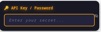
from bokeh.io import show
from bokeh.models import PasswordInput, InlineStyleSheet
from bokeh.layouts import column

password_css = InlineStyleSheet(css="""
/* Container */
:host {
    background: #181824 !important;
    border-radius: 14px !important;
    padding: 16px !important;
    box-shadow: 0 4px 18px #0006 !important;
}
/* Title */
:host .bk-input-group label, :host .bk-passwordinput-title {
    color: #f59e0b !important;
    font-size: 1.13em !important;
    font-family: 'Fira Code', monospace;
    font-weight: bold;
    margin-bottom: 11px;
    text-shadow: 0 2px 10px #f59e0b99;
}
/* Password field */
:host input[type="password"] {
    background: #23233c !important;
    color: #f9fafb !important;
    border: 2px solid #f59e0b !important;
    border-radius: 8px !important;
    padding: 11px 15px !important;
    font-size: 1.08em !important;
    font-family: 'Fira Code', monospace;
    transition: border 0.12s, box-shadow 0.12s;
    box-shadow: none !important;
    letter-spacing: 0.15em !important;
}
/* Orange glow on hover, red glow on focus */
:host input[type="password"]:hover {
    border-color: #ffa733 !important;
    box-shadow: 0 0 0 2px #ffa73399, 0 0 13px #ffa733bb !important;
}
:host input[type="password"]:focus {
    border-color: #ff3049 !important;
    box-shadow: 0 0 0 2px #ff304999, 0 0 15px #ff3049cc !important;
    outline: none !important;
}
/* Placeholder */
:host input[type="password"]::placeholder {
    color: #9ca3af !important;
    opacity: 0.7 !important;
    font-style: italic !important;
}
""")

pw = PasswordInput(
    title="🔑 API Key / Password",
    placeholder="Enter your secret...",
    width=350,
    stylesheets=[password_css]
)

show(column(pw))