Sure ![]() .
.
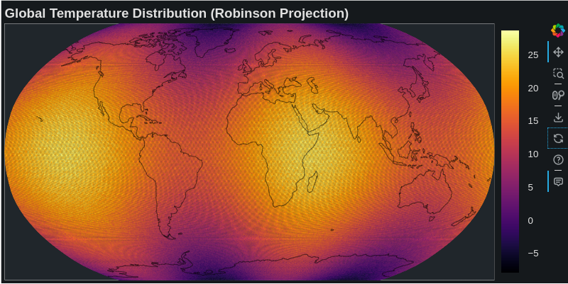
Below is the updated code using the cartopy projections. Now, we simply change this projection = ccrs.Robinson().
I couldn’t write better the code regarding the correct representation of the coastlines. By the way, these kinds of plots are very common and useful in my science (climate). Note also that in this plot they are plotted many grid-cells being equal to 361*576 = 207936. Here patches are plotted but you can also get the same plot using scatter points with custom projection. However, with scatter points, if you zoom-in, gaps start appearing between the scatter points due to the zoom-in.
import numpy as np
import cartopy.crs as ccrs
import cartopy.feature as cfeature
from bokeh.plotting import figure, show
from bokeh.models import ColorBar, LinearColorMapper, BasicTicker, HoverTool, ColumnDataSource
from bokeh.palettes import Inferno256
from shapely.geometry import LineString, MultiLineString

# Generate example data
lon = np.linspace(-180, 180, 576)
lat = np.linspace(-90, 90, 361)
LON, LAT = np.meshgrid(lon, lat)

# Create sample temperature data
temperature = 20 * np.cos(np.radians(LAT)) + \
              5 * np.sin(np.radians(2 * LON)) + \
              np.random.normal(0, 1, LAT.shape)

# Set up Cartopy projection
projection = ccrs.Robinson()

# Convert to projection coordinates
transformed_points = projection.transform_points(ccrs.PlateCarree(), LON, LAT)
x = transformed_points[:, :, 0]
y = transformed_points[:, :, 1]

# Create the figure
p = figure(width=800, height=400,
           title="Global Temperature Distribution (Robinson Projection)",
           x_range=(x.min(), x.max()),
           y_range=(y.min(), y.max()))

# Create color mapper
color_mapper = LinearColorMapper(palette=Inferno256,
                                 low=temperature.min(),
                                 high=temperature.max())

# Create patches for grid cells
xs = []
ys = []
temps = []
for i in range(x.shape[0] - 1):
    for j in range(x.shape[1] - 1):
        # Get cell corners
        cell_x = [x[i,j], x[i,j+1], x[i+1,j+1], x[i+1,j]]
        cell_y = [y[i,j], y[i,j+1], y[i+1,j+1], y[i+1,j]]

        # Add valid cells
        if not np.any(np.isnan(cell_x)) and not np.any(np.isnan(cell_y)):
            xs.append(cell_x)
            ys.append(cell_y)
            temps.append(temperature[i,j])

# Create ColumnDataSource
source = ColumnDataSource(data=dict(
    xs=xs,
    ys=ys,
    temp=temps
))

# Add patches
patches = p.patches('xs', 'ys',
                    fill_color={'field': 'temp', 'transform': color_mapper},
                    line_color=None,
                    source=source)

# Add coastlines
coastlines = cfeature.NaturalEarthFeature('physical', 'coastline', '110m')

def process_line_string(line_string):
    if isinstance(line_string, (LineString, MultiLineString)):
        if isinstance(line_string, LineString):
            lines = [line_string]
        else:
            lines = list(line_string.geoms)

        for line in lines:
            coords = np.array(line.coords)
            if len(coords) > 1:
                # Normalize longitudes to -180 to 180 range
                normalized_coords = coords.copy()
                normalized_coords[:, 0] = np.mod(normalized_coords[:, 0] + 180, 360) - 180

                # Filter out points that are too close together or would create artifacts
                valid_indices = np.where(np.abs(np.diff(normalized_coords[:, 0])) < 180)[0]
                valid_indices = np.concatenate([valid_indices, [valid_indices[-1] + 1]])

                if len(valid_indices) > 1:
                    segment = normalized_coords[valid_indices]

                    # Transform coordinates
                    tt = projection.transform_points(ccrs.PlateCarree(),
                                                    segment[:, 0],
                                                    segment[:, 1])
                    x = tt[:, 0]
                    y = tt[:, 1]

                    # Only draw if we have enough points and they're not all NaN
                    if len(x) > 1 and not np.all(np.isnan(x)):
                        p.line(x, y, line_color='black', line_width=1, line_alpha=0.5)

for geom in coastlines.geometries():
    process_line_string(geom)

# Add hover tool
hover = HoverTool(tooltips=[
    ('Temperature', '@temp{0.1f}°C'),
], renderers=[patches])
p.add_tools(hover)

# Add color bar
color_bar = ColorBar(color_mapper=color_mapper,
                     ticker=BasicTicker(),
                     label_standoff=12,
                     border_line_color=None,
                     location=(0, 0))
p.add_layout(color_bar, 'right')

# Customize the plot
p.grid.visible = False
p.axis.visible = False
p.title.text_font_size = '14pt'

# Output the plot
show(p)
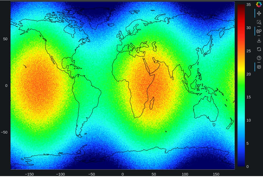
For sure, using the Bokeh image plot along with webGL I can explore really fast and animate smoothly any of my gridded data. That’s so cool and useful for my needs.
import numpy as np
from bokeh.plotting import figure, show
from bokeh.models import LinearColorMapper, BasicTicker, ColorBar
from bokeh.palettes import linear_palette, interp_palette
from bokeh.models import ColumnDataSource, CustomJS,Circle, HoverTool, Div, DatetimeTickFormatter, NumeralTickFormatter, TextAreaInput


# Generate example data
longitudes = np.linspace(-180, 180, 576)
latitudes = np.linspace(-90, 90, 361)
LON, LAT = np.meshgrid(lon, lat)

# Create sample temperature data
temperatures = 20 * np.cos(np.radians(LAT)) + \
              5 * np.sin(np.radians(2 * LON)) + \
              np.random.normal(0, 1, LAT.shape)

mike2=('#000063','#123aff','#00aeff','#26fff4','#00ff95','#19ff19','#ffff00','#ff8a15','#ff2a1b','#db0000','#4b0000')
bo_mike2 = interp_palette(mike2, 255)

lats = np.repeat(latitudes, len(longitudes))
lons = np.tile(longitudes, len(latitudes))
s1 = ColumnDataSource(data={'image': [temperatures], 'latitudes': [lats], 'longitudes': [lons]})

def crd():
  import cartopy.feature as cf,numpy as np
  # create the list of coordinates separated by nan to avoid connecting the lines
  x_coords = []
  y_coords = []
  for coord_seq in cf.COASTLINE.geometries():
      x_coords.extend([k[0] for k in coord_seq.coords] + [np.nan])
      y_coords.extend([k[1] for k in coord_seq.coords] + [np.nan])
  return x_coords,y_coords,#x_coords2,y_coords2
x_coords,y_coords=[i for i in crd()]


color_mapper= LinearColorMapper(palette=bo_mike2, low=0, high=35)

plot = figure(x_range=(-180,180), y_range=(-90,90),active_scroll="wheel_zoom", output_backend="webgl",width=900)
r=plot.image(image='image', color_mapper=color_mapper, x=min(longitudes),
     y=min(latitudes),
     dw=max(longitudes) - min(longitudes),
     dh=max(latitudes) - min(latitudes),source = s1)
color_bar = ColorBar(color_mapper= color_mapper, ticker= BasicTicker(),location=(0,0));     plot.add_layout(color_bar, 'right')

plot.line(x = x_coords,y = y_coords, line_width=1, line_color='black')

plot.add_tools(HoverTool(renderers = [r],tooltips="""<font size="5"><i>Temp:</i> <b>@image</b> <br> <i>lat:</i> <b>@latitudes</b><br> <i>lon:</i> <b>@longitudes</b>"""))

show(plot)