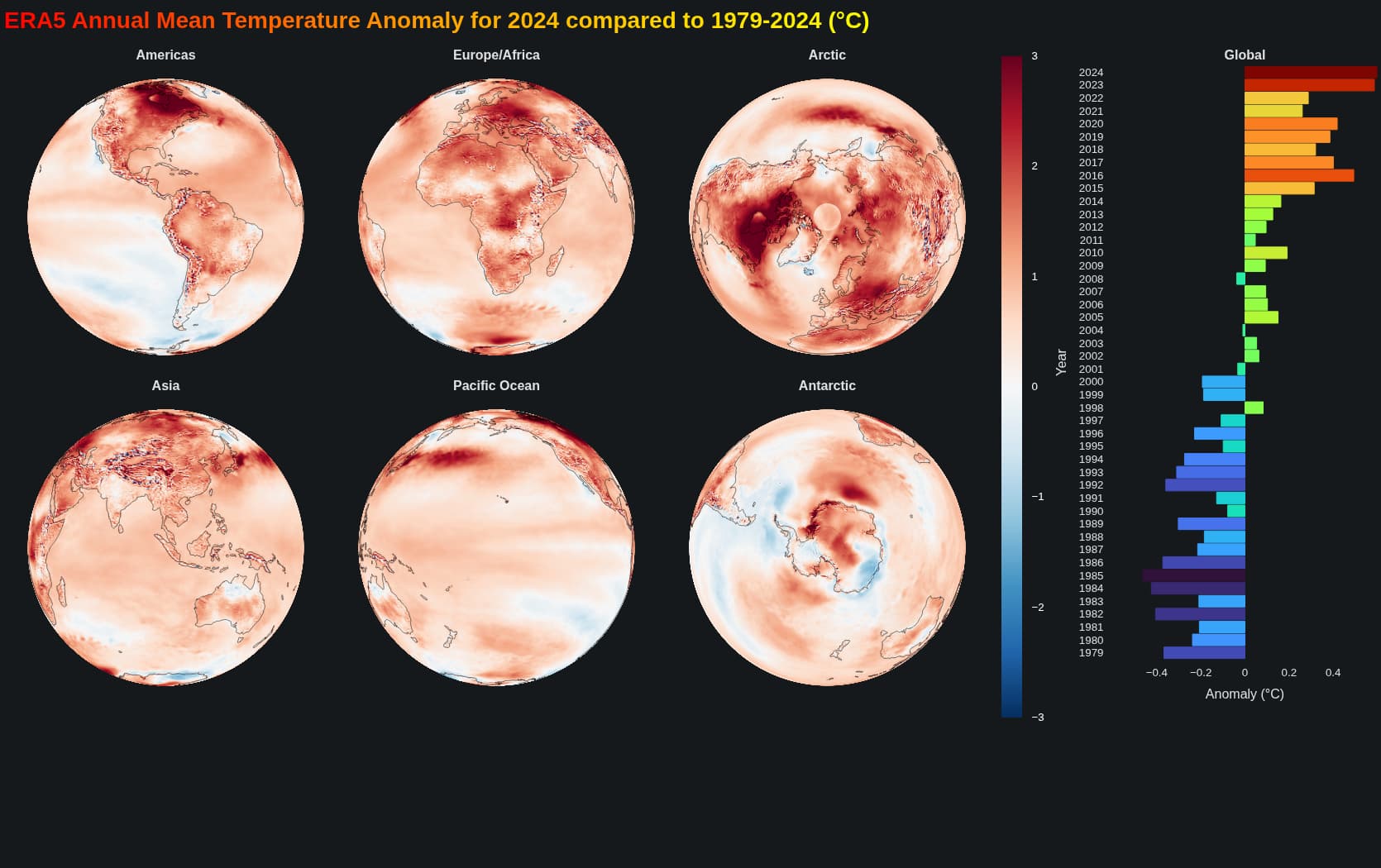
A nice plot to investigate the temperature change during the recent decades. Also provides some improvements for a similar older post with custom projections.
import xarray as xr
import numpy as np
import cartopy.crs as ccrs
import cartopy.feature as cfeature
from bokeh.plotting import figure, show, curdoc, output_file, save
from bokeh.models import ColorBar, LinearColorMapper, BasicTicker, HoverTool, ColumnDataSource,Div, GlobalInlineStyleSheet
from bokeh.palettes import Turbo256
from bokeh.layouts import row, column
from shapely.geometry import LineString, MultiLineString

from matplotlib import cm
from matplotlib.colors import to_hex
curdoc().theme = 'dark_minimal'
gstyle = GlobalInlineStyleSheet(css=""" html, body, .bk, .bk-root {background-color: #15191c; margin: 0; padding: 0; height: 100%; color: white; font-family: 'Consolas', 'Courier New', monospace; } .bk { color: white; } .bk-input, .bk-btn, .bk-select, .bk-slider-title, .bk-headers, .bk-label, .bk-title, .bk-legend, .bk-axis-label { color: white !important; } .bk-input::placeholder { color: #aaaaaa !important; } """)


# === Load and process data ===
ds = xr.open_dataset('/home/michael/Downloads/ee574e584b1f8351c52f63525a06f50d.nc')

yearly = ds.groupby('time.year').mean('time')
anomyearmean = yearly.sel(year=slice(2024,2024)).mean('year')-yearly.mean('year')
spatial_avg = yearly.weighted(np.cos(np.deg2rad(ds.lat))).mean(( 'lat',"lon"))
anoyear = spatial_avg - spatial_avg.mean('year')

lon = yearly.lon.values
lat = yearly.lat.values
LON, LAT = np.meshgrid(lon, lat)
temperature = anomyearmean.values
# temperature = 20 * np.cos(np.radians(LAT)) + 5 * np.sin(np.radians(2 * LON)) + np.random.normal(0, 1, LAT.shape)


# FILL THE EMPTY LATS AT LON=-180
if not np.isclose(LON[0,0], LON[0,-1]):
    # Add a wrapped column at the end
    LON = np.hstack([LON, LON[:,0:1]])
    LAT = np.hstack([LAT, LAT[:,0:1]])
    temperature = np.hstack([temperature, temperature[:,0:1]])

# My color palette
rdblue256 = [to_hex(cm.get_cmap('RdBu_r')(i/255)) for i in range(256)]


# DUMMY FOR UNIQUE COLORBAR
color_mapper = LinearColorMapper(palette=rdblue256,low=-3, high=3) #low=np.nanmin(temperature), high=-np.nanmin(temperature))
colorbar_fig = figure(width=70, height=1000, toolbar_location=None,
                      min_border=0, outline_line_color=None, background_fill_color="#15191c",
                      )
colorbar_fig.grid.visible = False
colorbar_fig.axis.visible = False
colorbar_fig.line([0, 0], [0, 0], line_width=0, line_color="white")
color_bar = ColorBar(color_mapper=color_mapper,
                     ticker=BasicTicker(),
                     label_standoff=12,
                     border_line_color=None,
                     background_fill_color="#15191c",
                     location=(0, 120),    height=800,

                     major_label_text_color="white"
                    )
colorbar_fig.add_layout(color_bar, 'right')

# === Globe projection ===

def visible_mask(lon, lat, center_lon, center_lat):
    lon = np.radians(lon)
    lat = np.radians(lat)
    clon = np.radians(center_lon)
    clat = np.radians(center_lat)
    x = np.cos(lat) * np.cos(lon)
    y = np.cos(lat) * np.sin(lon)
    z = np.sin(lat)
    cx = np.cos(clat) * np.cos(clon)
    cy = np.cos(clat) * np.sin(clon)
    cz = np.sin(clat)
    dot = x * cx + y * cy + z * cz
    return dot > 0


def make_sphere(center_lon, center_lat, title):
    center_lon, center_lat = center_lon, center_lat
    projection = ccrs.Orthographic(central_longitude=center_lon, central_latitude=center_lat)

    mask = visible_mask(LON, LAT, center_lon, center_lat)
    transformed = projection.transform_points(ccrs.PlateCarree(), LON, LAT)
    x = transformed[..., 0]
    y = transformed[..., 1]

    xs, ys, temps = [], [], []
    for i in range(x.shape[0] - 1):
        for j in range(x.shape[1] - 1):
            if mask[i, j] and mask[i+1, j] and mask[i, j+1] and mask[i+1, j+1]:
                cell_x = [x[i, j], x[i, j+1], x[i+1, j+1], x[i+1, j]]
                cell_y = [y[i, j], y[i, j+1], y[i+1, j+1], y[i+1, j]]
                if not np.any(np.isnan(cell_x)) and not np.any(np.isnan(cell_y)):
                    xs.append(cell_x)
                    ys.append(cell_y)
                    temps.append(temperature[i, j])

    source = ColumnDataSource(data=dict(
        xs=xs,
        ys=ys,
        temp=temps
    ))

    p_globe = figure(width=400, height=400,
            title=title,
            x_axis_type=None, y_axis_type=None,
            match_aspect=True,
            toolbar_location=None)
    p_globe.grid.visible = False
    p_globe.axis.visible = False
    p_globe.outline_line_color = '#15191c'
    p_globe.background_fill_color = '#15191c'

    p_globe.title.align = "center"


    patches = p_globe.patches('xs', 'ys',
                        fill_color={'field': 'temp', 'transform': color_mapper},
                        line_color={'field': 'temp', 'transform': color_mapper}, # <--- DOES THE TRICK: REMOVE THE EMPTY SPACE BETWEEN PATCHES == SMOOTHER COLOR TRANSITION
                        source=source)


    hover = HoverTool(tooltips=[
        ('Temperature', '@temp{0.1f}°C'),
    ], renderers=[patches])
    p_globe.add_tools(hover)


    p_globe.title.text_font_size = '12pt'


    coastlines = cfeature.NaturalEarthFeature('physical', 'coastline', '110m')
    def process_line_string(line_string, ):
        if isinstance(line_string, (LineString, MultiLineString)):
            if isinstance(line_string, LineString):
                lines = [line_string]
            else:
                lines = list(line_string.geoms)

            for line in lines:
                coords = np.array(line.coords)
                if len(coords) > 1:
                    # Normalize longitudes to -180 to 180 range
                    normalized_coords = coords.copy()
                    normalized_coords[:, 0] = np.mod(normalized_coords[:, 0] + 180, 360) - 180

                    # Filter out points that are too close together or would create artifacts
                    valid_indices = np.where(np.abs(np.diff(normalized_coords[:, 0])) < 180)[0]
                    valid_indices = np.concatenate([valid_indices, [valid_indices[-1] + 1]])

                    if len(valid_indices) > 1:
                        segment = normalized_coords[valid_indices]

                        # Transform coordinates
                        tt = projection.transform_points(ccrs.PlateCarree(),
                                                        segment[:, 0],
                                                        segment[:, 1])
                        x = tt[:, 0]
                        y = tt[:, 1]

                        # Only draw if we have enough points and they're not all NaN
                        if len(x) > 1 and not np.all(np.isnan(x)):
                            p_globe.line(x, y, line_color='black', line_width=1, line_alpha=0.5)

    for geom in coastlines.geometries():
        process_line_string(geom)

    return p_globe

# === Anomaly per year HBar ===
years = [str(y) for y in anoyear.year.values] # Convert to strings for categorical y
anomalies = anoyear.values
hbar_source = ColumnDataSource(data=dict(
    years=years,
    anomalies=anomalies,
    color=[Turbo256[int(255*(a - anomalies.min())/(anomalies.ptp()+1e-8))] for a in anomalies]
))

p_hbar = figure(y_range=years, height=800, width=400, x_range=(-0.6, 0.6),
                title="Global",
                x_axis_label="Anomaly (°C)", y_axis_label="Year",
                toolbar_location=None)
p_hbar.hbar(y='years', right='anomalies', left=0, height=0.9, color='color', source=hbar_source)
p_hbar.ygrid.grid_line_color = None
# p_hbar.xgrid.grid_line_dash = [6, 4]
p_hbar.grid.visible = False
p_hbar.title.text_font_size = '12pt'
p_hbar.xaxis.axis_label_text_font_size = "12pt"
p_hbar.yaxis.major_label_text_font_size = "10pt"
p_hbar.background_fill_color = '#15191c'
p_hbar.add_tools(HoverTool(
    tooltips=[
        ("Year", "@years"),
        ("Anomaly", "@anomalies{0.2f} °C")
    ]
))
p_hbar.outline_line_color = '#15191c'
p_hbar.title.align = "center"

p1 = make_sphere(-80, 0, 'Americas')
p2 = make_sphere(20, 0, 'Europe/Africa')
p3 = make_sphere(100, 0, 'Asia')
p4 = make_sphere(-160, 0, 'Pacific Ocean')
p5 = make_sphere(0, 90, 'Arctic')
p6 = make_sphere(0, -90, 'Antarctic')

gradient_text = """
<div style="
    font-size: 28px;
    font-weight: bold;
    background: linear-gradient(90deg, red, orange, yellow);
    -webkit-background-clip: text;
    -webkit-text-fill-color: transparent;
    background-clip: text;
    color: transparent;
">
  ERA5 Annual Mean Temperature Anomaly for 2024 compared to 1979-2024 (°C)
</div>
"""
divinfo = Div(text = gradient_text)
# === Layout side by side and show ===
LL = column(divinfo,row(column(row(p1,p2,p5), row(p3,p4,p6)),colorbar_fig, p_hbar), stylesheets = [gstyle])
show(LL)
output_file("/home/michael/ttt.html")
save(LL)
Some improvements:
- does the trick: remove the empty space between patches == smoother color transition
    patches = p_globe.patches('xs', 'ys',
                        fill_color={'field': 'temp', 'transform': color_mapper},
                        line_color={'field': 'temp', 'transform': color_mapper}, # <--- DOES THE TRICK: REMOVE THE EMPTY SPACE BETWEEN PATCHES == SMOOTHIER COLOR TRANSITION
                        source=source)
- fill the empty lats at lon=-180 (empty meridian)
# fill the empty lats at lon=-180 (empty meridian)
if not np.isclose(LON[0,0], LON[0,-1]):
    # Add a wrapped column at the end
    LON = np.hstack([LON, LON[:,0:1]])
    LAT = np.hstack([LAT, LAT[:,0:1]])
    temperature = np.hstack([temperature, temperature[:,0:1]])
- custom continuous color map (from matplotlib)
# Use a custom continuous color map (from matplotlib)
rdblue256 = [to_hex(cm.get_cmap('RdBu_r')(i/255)) for i in range(256)]
- using .rect
    projection = ccrs.Orthographic(central_longitude=center_lon, central_latitude=center_lat)

    mask = visible_mask(LON, LAT, center_lon, center_lat)
    transformed = projection.transform_points(ccrs.PlateCarree(), LON, LAT)
    x = transformed[..., 0]
    y = transformed[..., 1]

    rect_x, rect_y, rect_w, rect_h, temps = [], [], [], [], []
    for i in range(x.shape[0] - 1):
        for j in range(x.shape[1] - 1):
            # Check all 4 corners of this cell are visible and valid
            corners_x = [x[i, j], x[i, j+1], x[i+1, j+1], x[i+1, j]]
            corners_y = [y[i, j], y[i, j+1], y[i+1, j+1], y[i+1, j]]
            corners_mask = [mask[i, j], mask[i+1, j], mask[i, j+1], mask[i+1, j+1]]
            if all(corners_mask) and not np.any(np.isnan(corners_x)) and not np.any(np.isnan(corners_y)):
                # Center is the mean of corners
                x_center = np.mean(corners_x)
                y_center = np.mean(corners_y)
                # Width and height as max-min extents
                width = max(corners_x) - min(corners_x)
                height = max(corners_y) - min(corners_y)
                rect_x.append(x_center)
                rect_y.append(y_center)
                rect_w.append(width)
                rect_h.append(height)
                temps.append(temperature[i, j])

    from bokeh.models import ColumnDataSource
    from bokeh.plotting import figure

    source = ColumnDataSource(data=dict(
        x=rect_x,
        y=rect_y,
        width=rect_w,
        height=rect_h,
        temp=temps
    ))

    p_globe = figure(
        width=400, height=400,
        title=title,
        x_axis_type=None, y_axis_type=None,
        match_aspect=True,
        toolbar_location=None,
        background_fill_color='#15191c', output_backend = 'webgl'
    )
    p_globe.grid.visible = False
    p_globe.axis.visible = False
    p_globe.outline_line_color = '#15191c'
    p_globe.background_fill_color = '#15191c'
    p_globe.title.align = "center"

    # Use rects instead of patches
    patches = p_globe.rect(
        x='x', y='y', width='width', height='height',
        fill_color={'field': 'temp', 'transform': color_mapper},
        line_color={'field': 'temp', 'transform': color_mapper},
        source=source
    )