Custom tick labels for a categorical axis

I’m trying to create a plot with two “categorical” axis:

  • the left-vertical axis is a real categorical axis: each category is unique.
  • the right-vertical axis is a “fake” categorical axis: it represents a subgroup of some kind. Hence, categories might not be unique.

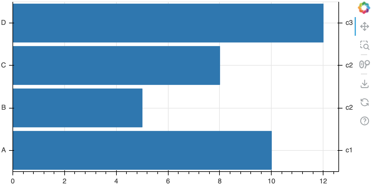
A picture is worth a thousand words, so here is what I’m trying to achieve:

Note the red texts on the right: these are my subgroups, and I painted over my resulting figure. There are 3 subgroups, c1, c2, c3.

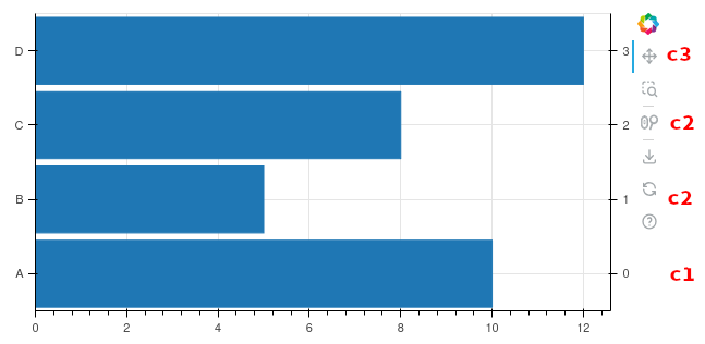
My idea was to create a new categorical axis, with unique categories in the form of numbers, then use the major_label_overrides attribute to provide a mapping with the correct labels. However, as can be seen from the picture above, the mapping doesn’t work.

How can I achieve my goal?

from bokeh.plotting import figure, show
from bokeh.models import ColumnDataSource, FactorRange, CategoricalAxis
from bokeh.io import output_notebook
output_notebook()

data = {
    "categories": ["A", "B", "C", "D"],
    "values": [10, 5, 8, 12],
    "other": ["c1", "c2", "c2", "c3"],
}

fig = figure(height=300, y_range=data["categories"])
fig.hbar(y="categories", right="values", height=0.9, source=ColumnDataSource(data))
fig.x_range.update(start=0)

fig.extra_y_ranges['new_cat'] = FactorRange(
    factors=[str(i) for i in range(len(data["categories"]))]
)
new_y_axis = CategoricalAxis(
    x_range_name="default",
    y_range_name="new_cat",
)
fig.add_layout(new_y_axis, "right")
new_y_axis.major_label_overrides = {
    2: "test 1",
    "2": "test 2",
    "2.0": "test 3",
}
show(fig)

Not sure major label overrides work together with categorical axes, you are actually the first person I can ever recall trying this combination. Suggest submitting a a GitHub Issue since the code seems like it ought to function.

FWIW Bokeh supports grouped categories out of the box:

https://docs.bokeh.org/en/latest/docs/user_guide/basic/bars.html#nested-categories

But if that’s not an option for some reason another workaround possibility would be to position large labels at he right side of the chart.

1 Like

Thanks for pointing it out. I’ve opened the following issue.
Unfortunately, I can’t use grouped categories because of the risk of providing incorrect information. My real data is sorted in such a way that the order of the categories on the left axis is of paramount importance.

@Davide-sd categorical factors are always displayed on an axis in exactly the order provided by the user.

@Davide-sd As a work-around you can actually use grouped categories on the extra y-axis, and hide the group categories. Below I have specified a group_text_font_size = "0px" and group_padding = 0.

from bokeh.plotting import figure, show
from bokeh.models import ColumnDataSource, , CategoricalAxis
#from bokeh.io import output_notebook
#output_notebook()

data = {
    "categories": ["A", "B", "C", "D"],
    "values": [10, 5, 8, 12],
    "other": ["c1", "c2", "c2", "c3"],
}

fig = figure(height=300, y_range=data["categories"])
fig.hbar(y="categories", right="values", height=0.9, source=ColumnDataSource(data))
fig.x_range.update(start=0)

fig.extra_y_ranges['new_cat'] = FactorRange(
    factors = [(str(i), data['other'][i]) for i in range(len(data["categories"]))],
    group_padding = 0,

)
new_y_axis = CategoricalAxis(
    y_range_name="new_cat",
    group_text_font_size = '0px',
    separator_line_color = None
)

fig.add_layout(new_y_axis, "right")

show(fig)
1 Like

Another option here is probably a CustomJSTickFormatter. In fact thinking forward to eventual 4.0 I wonder if we might drop the “tick overrides” (which were a fairly early-days “hack”) for the more general CustomJSTickFormatter approach. I have not had time to try to work up an example of this approach yet though.

1 Like

It worked nicely, thank you very much!