Custom transparency and styling of legends

I have the following setup, where I derive my legends from bunch of renderes:

legend = Legend(items=[
    ("Ask Orders", [ask_start_pts, ask_bars, ask_end_pts]),
    ("Ask Trades", [ask_fill_markers]),
    ("Bid Orders", [bid_start_pts, bid_bars, bid_end_pts]),
    ("Bid Trades", [bid_fill_markers]),
    ], location="center", label_text_font_size='8px', click_policy='hide')

However, there are variable alpha properties, stored within the ColumnDataSource. Some of my glyphs are at alpha 1.0, when some might be at 0.25. For that reason, my legends seem to be inheriting these alpha values, which make them look strange.

Screenshot 2023-07-20 at 11.52.21

As you can see, in one of the legends, there is transparency so we see the circle and the box, where in the other, the box is completely opaque and we don’t see the circle. Is there a way to override the properties of each legend component?

If you don’t like the representative example Bokeh chooses for the legend you can override it by setting the index on the legend item:

https://docs.bokeh.org/en/latest/docs/user_guide/basic/annotations.html#explicit-index

So index will be referring to what exactly, the alpha will still be a problem in cases where my glyphs have variable colours and variable alphas?

The index refers to the “row” in a ColumnDataSource. You would pick a row that has the color/alpha values that are what you want to show up in the legend.

I don’t have any other suggestions at present. There was a proposal for an arbitrary GlyphLegendItem feature, but no-one has yet implemented it:

Thank you! How one would go on and split the alpha and the color? Can both be handled, let’s say I have a column called viz_alpha and viz_color and all rows in that column are set to 0.5 for the alpha and some hex value for the colour. Then:

index=7 is viz_alpha and index=8 is viz_color

How do I specify the legend to get it’s color from index=8 and the alpha from index=7?

This index thing, I don’t understand, I have added an extra column into my data source, when I check it, I get this:

Data columns (total 11 columns):
 #   Column            Non-Null Count  Dtype
---  ------            --------------  -----
 0   order_start_time  186 non-null    datetime64[ns, UTC]
 1   order_end_time    186 non-null    datetime64[ns, UTC]
 2   price             186 non-null    float64
 3   size              186 non-null    int64
 4   volume_traded     186 non-null    int64
 5   id                186 non-null    int64
 6   idx               186 non-null    int64
 7   color             186 non-null    object
 8   alpha             186 non-null    float64
 9   side              186 non-null    object
 10  viz_color         186 non-null    object
dtypes: datetime64[ns, UTC](2), float64(2), int64(4), object(3)
memory usage: 16.1+ KB

So index=10 is the viz_color column?

That’s not currently possible, you can only specify a single index to pick one “representative” row.

This index thing, I don’t understand,

If you have a CDS with a column for color, and a column for alpha, and each column is 20 items long, then if you use a that CDS to drive a glyph (circle, bar, etc) then you will render 20 glyph instances on the plot. The index specifies exactly which one of those 20 glyph instances is rendered in the legend as the representative for that glyph. If source.data["mycolor"][11] is “red” and source.data["myalpha"][11] is 0.25 and you specify index=11 then the legend will have color="red" and alpha=0.25.

This index thing, I don’t understand, I have added an extra column into my data source, when I check it, I get this:

It’s impossible to speculate without actual code to run. Please provide a complete Minimal Reproducible Example that unambiguously demonstrates what approach you are trying.

1 Like

Hi, I understand it a lot better now, however, still a question:

 timedate | y | weight | mycolor | myalpha | avg
0:  ...     .     .        red        0.50    .
1:  ...     .     .       blue        0.50    .
2:  ...     .     .        red        0.50    .
3:  ...     .     .      orange       0.50    .
4:  ...     .     .        red        0.50    .
5:  ...     .     .        red        0.50    .
7:  ...     .     .      yellow       0.75    .

and we select index=7, where do we specify which column on row index 7 has the colour info? So it doesn’t pull it from the weight column or some other place such as avg? Does the column need to be named color and alpha? The goal is to get the legend item render yellow with alpha value of 0.75.

Hello again,

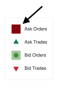
Here is a minimal example, and I expect the result to be orange colored legend with an alpha value of 1.0. But it is not :slight_smile:

from bokeh.plotting import figure, show
from bokeh.io import output_notebook
from bokeh.models import ColumnDataSource, HoverTool, DatetimeTickFormatter, Legend, LegendItem
import pandas as pd

output_notebook()

start_time = [
    '2022-02-06 15:04:54+00:00',
    '2022-02-06 18:27:34+00:00',
    '2022-02-06 18:30:34+00:00',
    '2022-02-07 15:00:24+00:00',
    '2022-02-08 01:34:14+00:00',
    '2022-02-08 02:42:14+00:00']

end_time = [
    '2022-02-07 15:04:54+00:00',
    '2022-02-07 18:27:34+00:00',
    '2022-02-07 18:30:34+00:00',
    '2022-02-08 15:00:24+00:00',
    '2022-02-09 01:34:14+00:00',
    '2022-02-09 02:42:14+00:00']

price = [10, 20, 30, 40, 50, 60]

weight = [0.1, 0.9, 0.7, 0.4, 0.3, 1.0]

mycolor = ["orange", "orange", "orange", "orange", "orange", "orange"]

myalpha = [1.0, 1.0, 1.0, 1.0, 1.0, 1.0]

prep_data = {
    "start_time": start_time,
    "end_time": end_time,
    "price": price,
    "weight": weight,
    "mycolor": mycolor,
    "myalpha": myalpha
}

df = pd.DataFrame(prep_data)
df['start_time'] = pd.to_datetime(df['start_time'])
df['end_time'] = pd.to_datetime(df['end_time'])

source = ColumnDataSource(df)

print(f'DEBUG: {source.data["mycolor"][5]}')
print(df)

my_tooltips = [
    ('start_time', '@start_time{%F %T}'),
    ('end_time', '@end_time{%F %T}')
]

hover_tool = HoverTool(
        tooltips=my_tooltips,
        formatters={
            '@start_time': 'datetime',
            '@end_time': 'datetime'
            }
        )
tools = [hover_tool]

p = figure(
    x_axis_type = 'datetime',
    tools=tools
)

start_circle = p.circle(x='start_time', y='price',
          fill_color='red', fill_alpha=0.6, size=10,
          line_color=None, source=source)

end_circle = p.circle(x='end_time', y='price',
          fill_color='blue', fill_alpha=0.6, size=10,
          line_color=None, source=source)

line = p.segment(
        x0='start_time',
        y0='price',
        x1='end_time',
        y1='price',
        line_width=1,
        line_cap='round',
        line_dash='solid',
        source=source
)

legend = Legend(items=[LegendItem(label="Orders", renderers=[start_circle, line, end_circle], index=4)],
    location="center",
    orientation="horizontal",
    glyph_height=20,
    glyph_width=20,
    label_standoff=2,
    label_text_font_size='8px',
    click_policy='hide',
    border_line_width=2,
    margin=2,
    padding=2,
    spacing=10,
    background_fill_color="#fcf5e3"
)

p.add_layout(legend, "above")

show(p)

It uses whatever the corresponding glyph uses, which is why the legend above is not orange. The idea is for the legend item to be an actual representative, i.e. something that exactly matches some actual rendered glyph inside the plot area (as specified by index). Above you have hard coded all the circles to be red and blue, so therefore the legend will be red and blue as well. You would need to specify the color to be driven by the CDS, e.g. fill_color="mycolor", in order for the legend item to index into the "mycolor" column for the color to use.

However, now that I can see actual code, I can also see that you have specified two circles in the legend item. I don’t think this will be useful. The renderers for a legend item are all always just rendered centered in the legend item area, so those two circles will be rendered directly on top of each other. I am guessing you want a single legend item that has two distinct (separated) circles joined by a segment in the middle? There is not any way to achieve that in the current API.

At this point I think your best bet would be to dispense with Legend altogher and simply draw the guide that you need manually. You can see an example of this at the bottom of this example:

burtin — Bokeh 3.1.1 Documentation

Note that I have purposefully linked to an old version of the example—it was recently updated to use Legend instead.

1 Like

Thank you, I’m ok with them being stacked on top of each other, I’m just trying to get them have a single color and alpha value.

I guess I would add: there are certainly some “hacky” approaches you could consider besides hand-drawing a legend. For example, add a single orange circle way off-screen somewhere (make sure it is removed from any auto-ranging) and then use that for the LegendItem. I am not sure that’s any better or worse than just drawing a legend by hand, though.

Thank you, the index lookup thingy worked.

But I’m curious, how can I create a dummy row, to be plotted outside the current plot without actually disrupting the main plot? Is there an example for that? Just add an index at the end of the actual data, the index will be known, the values will be hardcoded but it will not be visible nor break the plot for the legit values.

Add a glyph with a single instance way away from your actual data, you don’t even need a CDS or an index:

plot.circle(x=1000000, y=1000000, color="orange", alpha=0.5, legend_label="foo")

But now, if you are using auto-ranging (the default) then you will need to explicitly exclude this “dummy” glyph by setting plot.x_range.renderers and plot.y_range.renderers. This example demonstrates setting renderers:

1 Like

This topic was automatically closed 90 days after the last reply. New replies are no longer allowed.