DatetimeTickFormatter for multiple axes

Hi,

I’d like to have a plot with two datetime X axes: one for exact values and the other for approximate ones. Below I include the working example and animated gif with explanation of the problem. The problem arises with formatting of the second axis. It works but not consequently, i.e. some DatetimeTickFormatter units seem to be ignored. Anyone can explain that behavior and hopefully help with fixing that?

import numpy as np
import pandas as pd
from numpy import sqrt
from bokeh.plotting import figure, show, output_file
from bokeh.models import LinearAxis, Range1d, ColumnDataSource, WheelZoomTool, DatetimeTickFormatter, Range1d, DatetimeAxis

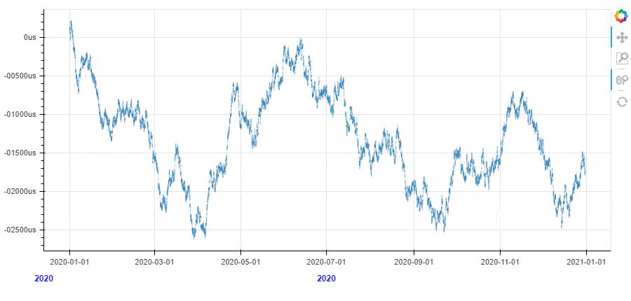
timestamp = pd.date_range(start='1/1/2020', end='31/12/2020', freq='10min')
np.random.seed(0)
value = np.cumsum(np.random.randn(len(timestamp)) * sqrt(.030) * sqrt(1 / 252.))
source = ColumnDataSource({'timestamp': timestamp, 'value': value})


p = figure(x_axis_type='datetime', tools="pan,reset,wheel_zoom,box_zoom", width=900, height=400)
p.line(x = 'timestamp', y = 'value', source=source, line_alpha=0.2)
p.toolbar.active_scroll = p.select_one(WheelZoomTool)
p.axis.formatter = DatetimeTickFormatter(minutes=["%H:%M (minutes)"],
                                         hourmin=["%H:%M (hourmin)"],
                                         hours=["%Y-%m-%d %H:%M (hours)"],
                                         days=["%Y-%m-%d (days)"],
                                         months=["%Y-%m-%d (months)"])

p.extra_x_ranges = {'second_axis': Range1d(start=timestamp[0], end=timestamp[-1])}
p.add_layout(DatetimeAxis(x_range_name='second_axis'), 'below')

# some formatting
p.axis[1].major_tick_line_color = None
p.axis[1].minor_tick_line_color = None
p.axis[1].axis_line_color = None
p.axis[1].major_label_text_font_style = 'bold'
p.axis[1].major_label_text_color = 'blue'
p.axis[1].major_label_text_font_size = '12px'
p.axis[1].ticker.num_minor_ticks = 2
p.axis[1].ticker.desired_num_ticks = 2
p.axis[1].formatter = DatetimeTickFormatter(seconds=['%Ss'],
                                            minsec=['%M:%S (minsec)'],
                                            minutes=["%m-%d (minutes)"],
                                            hourmin=["%m-%d (hourmin)"],
                                            hours=["%B %Y (hours)"],
                                            days=["%B %Y (days)"],
                                            months=["%Y (months)"])

show(p)


edit: better quality of the gif
edit2: improvement in the code

Hi @tmikolajczyk You will need to explain exactly what you want to happen that is is not happening. The gif above already seems to show “two datetime X axes: one for exact values and the other for approximate ones” just fine as it is, so you will have to elaborate on how it differs from your requirements.

Hi @Bryan, thanks for your reply and sorry for being too brief :slight_smile: What I wanted to ask is the reason why on the second axis formatting strings does not apply consequently to consecutive time scales. In details:

  • the attached gif present action of zooming-in (only) on plot axis X;
  • I assume (and that is happening on the first axis) that while zooming to more and more detailed time ranges different formatting strings apply to axis labels (p.axis.formatter = DatetimeTickFormatter(...) from my code is responsible for that)
  • I also assume that in other to pass different rules for another axis I have to put it straightforward so I’m doing it here: p.axis[1].formatter = DatetimeTickFormatter(...)

There is an unexpected behavior on formatting though: while zooming in on second X axis labels appear in different formats but between expected formats the label of single year occurs (i.e. ‘2020’); I changed a little formatters in other to demonstrate the strange behavior more precisely (edited code from my initial post); in this case there is no format '%Y' in formatter but even though year label appears between randomly while zooming-in

@tmikolajczyk I am sorry, I could have been more specific. I don’t understand the use of “consequently” here. I don’t know what “does not apply consequently to consecutive time scales” means. Annotated screen shots are probably helpful here: “I want this label here with text ABC to instead be placed there with text XYZ”

As for the 2020, I can’t say as the code does not match your GIF (all the formats in the code have things like “(months)” but thats not what is shown in the gif).

I should probably also just say that I am a bit skeptical that an approach like this can ever be perfect, because the multiple axis capability was never developed with this usage in mind. Multiple axes (and their tickers and formatters) are completely independent, but I think to do this kind of summarization well there would need to be some coordination. There was an issue opened this sort of thing some time ago.