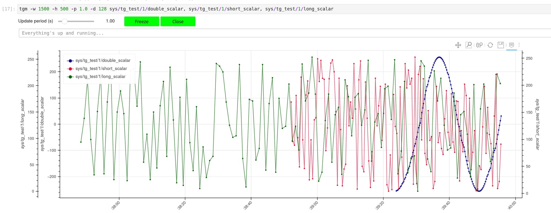
I’m implementing a dynamic (i.e., asynchronous) trend dealing with time series having the same length (due to the ColumnDataSource constraint) but different sampling frequencies. It works nicely. However, its behaviour is a bit weird and surprising for the user. The following screenshot shows what you obtain with 3 data sources respectively sampled at 250ms (blue), 500ms (red) and 1s (green).
This behaviour is expected and related to the fact that we are using the same buffer length to display the “history” of each signal.
The question is, how could I change the implementation so that the 3 signals “spread” over the full plot? In other words, how can I deal with columns having different length?
It seems that MultiLine could be a solution but I don’t see how to keep the individual signal legend and the related show/hide feature. And, what about the hover behaviour?
Bryan, I now have an implementation based on a per line CDS. However, its seems to be much slower than the previous one. Do we have a plot update par CDS? There’s a call to cds.data.update(...) per line.
BTW, I’m using two glyphs per signal to display the data: line & circle. The circle is not rendered anymore since I switched to the new implementation.
I wouldn’t expect that, unless your new version has much, much more data than indicated in the image above. I can’t really speculate without actual code, though, i.e. a complete Minimal Reproducible Example that I can run directly and observe.
The evaluation of the performances is a bit subjective (no real figures to share).
Regarding the circle glyph (not rendered), things work as expected if I switch to the diamond one. Anyway, the diamond is fine and I can’t devote to much time to figure out why the circle doesn’t work. For the record, note that the very first circle point is displayed but disappears at the first call to cds.data.update.
.