Hello I’m trying to make a candlestick plot for different stock price using yahoo financial api.
I use a select widget to download data and I plot it using a cds.
This is the code (I work in a notebook, I use panel but I observe the same behavior with output_notebook of bokeh) :
import json
import datetime
import numpy as np
import panel as pn
import pandas as pd
import yfinance as yf
from math import  pi
from bokeh.plotting import figure
from bokeh.models import CustomJS, ColumnDataSource, Range1d
from pandas_datareader import data as pdr
yf.pdr_override()
pn.extension()
societies = {'Accor SA': 'AC.PA', "L'Air\xa0Liquide\xa0S.A.": 'AI.PA', 'Alstom SA': 'ALO.PA', 'AXA SA': 'CS.PA', 'BNP Paribas SA': 'BNP.PA', 'Bouygues SA': 'EN.PA', 'Capgemini SE': 'CAP.PA', 'Carrefour SA': 'CA.PA', 'Credit Agricole S.A.': 'ACA.PA', 'Danone S.A.': 'BN.PA', 'Electricite de France S.A.': 'EDF.PA', "L'Oreal S.A.": 'OR.PA', 'Legrand SA': 'LR.PA', 'Lagardere SCA': 'MMB.PA', 'LVMH Moet Hennessy - Louis Vuitton, Societe Europeenne': 'MC.PA', 'Compagnie Generale des Etablissements Michelin': 'ML.PA', 'Pernod Ricard SA': 'RI.PA', 'Peugeot S.A.': 'UG.PA', 'Renault SA': 'RNO.PA', 'Compagnie de Saint-Gobain S.A.': 'SGO.PA', 'Sanofi': 'SAN.PA', 'Schneider Electric S.E.': 'SU.PA', 'Societe Generale Societe anonyme': 'GLE.PA', 'STMicroelectronics N.V.': 'STM.PA', 'TOTAL S.A.': 'FP.PA', 'Thales S.A.': 'HO.PA', 'Vallourec S.A.': 'VK.PA', 'Veolia Environnement S.A.': 'VIE.PA', 'VINCI SA': 'DG.PA', 'Vivendi SA': 'VIV.PA', 'Orange S.A.': 'ORA.PA', 'ENGIE SA': 'ENGI.PA', 'Airbus SE': 'AIR.PA', 'Sodexo S.A.': 'SW.PA', 'Kering SA': 'KER.PA', 'Atos SE': 'ATO.PA', 'TechnipFMC plc': 'FTI.PA'}
def query_data(symbol, start=None, end=None, interval="5m", inc_color="#D5E1DD", dec_color="#F2583E"):
    date_types = [datetime.datetime, datetime.date, str, type(None)]
    assert type(start) in date_types, "Wrong date format for end, type must be one of {} and not {}".format(date_types, type(start))
    assert type(end) in date_types, "Wrong date format for end, type must be one of {} and not {}".format(date_types, type(end))
    end = (datetime.datetime.now() if end is None
           else datetime.datetime.fromisoformat(end) if type(end) is str
           else datetime.datetime.combine(end, datetime.time(23,59)) if type(end) is datetime.date
           else end)
    start = (end - datetime.timedelta(days=30) if start is None
             else datetime.datetime.fromisoformat(start) if type(start) is str
             else datetime.datetime.combine(start, datetime.time(23,59)) if type(start) is datetime.date
             else start)
    assert start < end, 'Invalid start end, start should be smaller than end'
    data = pdr.get_data_yahoo(symbol, start=start, end=end, interval=interval, progress=False)
    df = data.reset_index(level=0, inplace=False).rename(columns={"Datetime": "date"}).rename(columns={c: c.lower() for c in data.columns})
    inc = df.close > df.open
    dec = df.open > df.close
    df.loc[inc, 'fill_color'] = inc_color
    df.loc[dec, 'fill_color'] = dec_color
    return df
def compute_x_range(cds):
    x_min = cds.data['date'].min().astype(datetime.datetime)*1e-6 # ns -> ms
    x_max = cds.data['date'].max().astype(datetime.datetime)*1e-6 # ns -> ms
    dx = x_max - x_min
    x_pad = 0.1
    start = x_min - dx*x_pad/2
    end = x_max + dx*x_pad/2
    return start, end

def compute_y_range(cds):
    y_min = cds.data['low'].min()
    y_max = cds.data['high'].max()
    dy = y_max - y_min
    y_pad = 0.1
    start = y_min - dy*y_pad/2
    end = y_max + dy*y_pad/2
    return start, end
options = list(societies.items())
value = options[0][1]
cds = ColumnDataSource(query_data(value))

w = 0.5*5*60*1000 # 80% of 5 minutes in ms

select = pn.widgets.Select(options=societies)

x_range = Range1d(*compute_x_range(cds))
y_range = Range1d(*compute_y_range(cds))

p = figure(x_axis_type="datetime", plot_width=1000, title = "MSFT Candlestick",
          x_range=x_range, y_range=y_range)


p.xaxis.major_label_orientation = pi/4
p.grid.grid_line_alpha=0.3

p.segment(x0='date', y0='high', x1='date', y1='low', color="black", source=cds)
p.vbar(x="date", width=w, top="open", bottom="close", fill_color="fill_color", line_color="black", source=cds)

pan = pn.panel(p)
def update_data(*events):
    cds.data = ColumnDataSource.from_df(query_data(events[0].new))
    p.x_range.start, p.x_range.end = compute_x_range(cds)
    p.x_range.reset_start, p.x_range.reset_end = compute_x_range(cds)
    p.y_range.start, p.y_range.end = compute_y_range(cds)
    p.y_range.reset_start, p.y_range.reset_end = compute_y_range(cds)
    pan.param.trigger('object')

select.param.watch(update_data, ['value'])

pn.Row(pan, select)
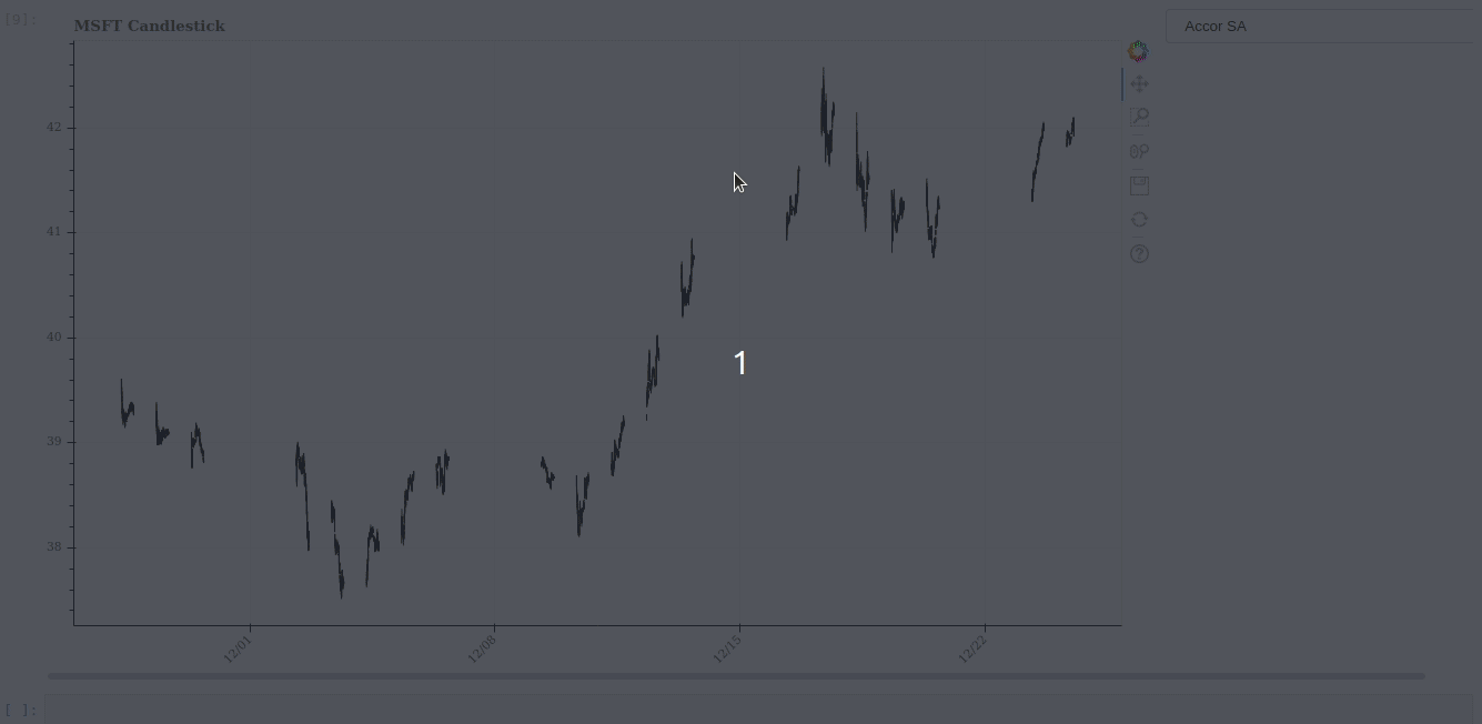
Everything work as expected except for the xaxis, I’d like the same behavior as the yaxis (when I select a new stock price, both axis resets to start and end specified in the update function)
As you can see on the following gif when I zoom on a part of the graph and I select an other value, y_range change whereas the x_range stay at the zoom level.