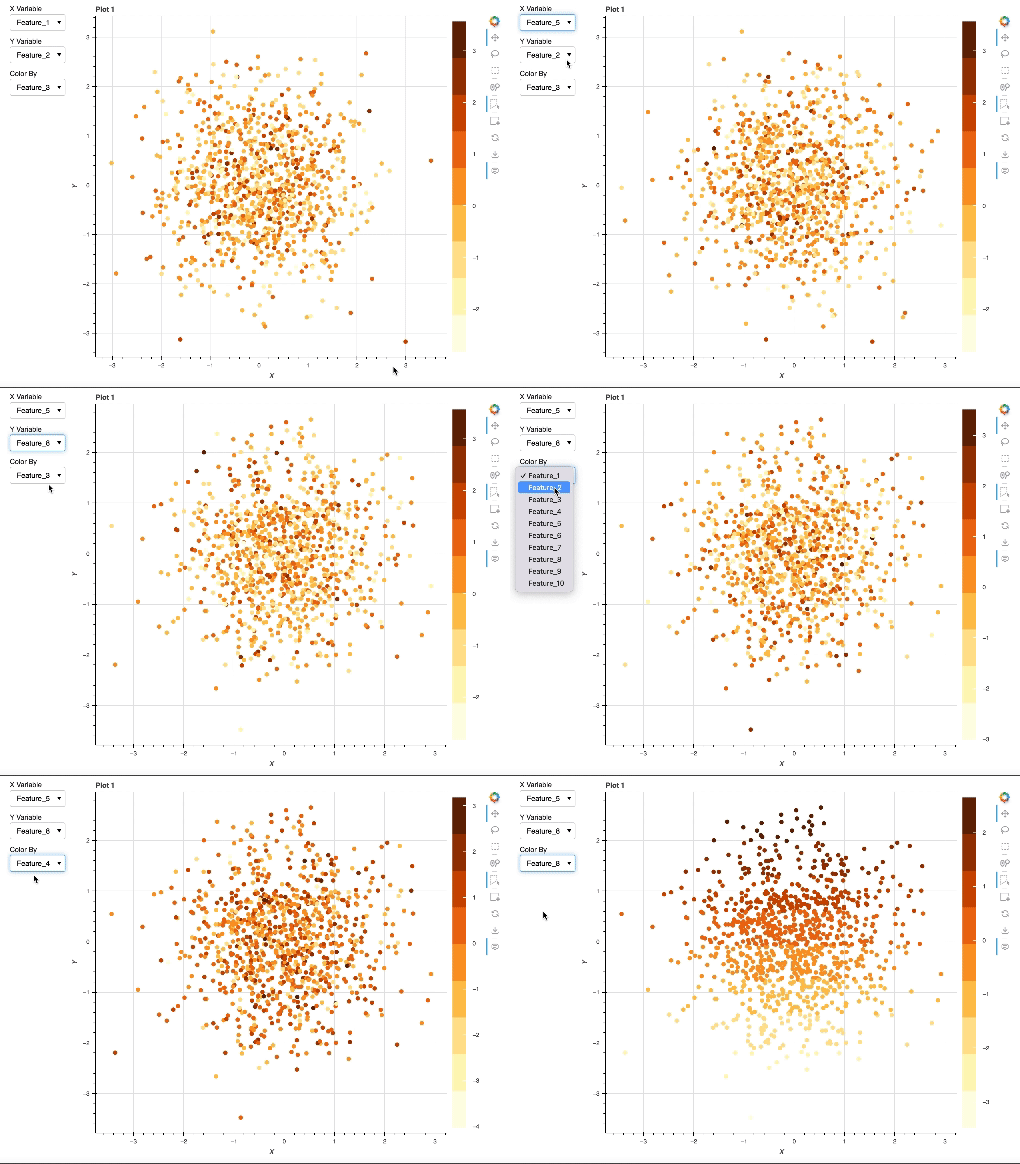
I am working with Python version 3.11.7 and Bokeh version 3.3.4
I am creating a data visualization web app with Bokeh. My web app allows users to load in data from a couple different databases and view their selected data on multiple Bokeh plots. The data is loaded in as a pandas data frame. Each plot has its own independent ColumnDataSource which is a copy of this data frame. This means that each plot has access to the same exact data, but is entirely independent from every other plot. The goal of this web application is to provide users with an intuitive and versatile workflow for data analysis.
Each plot has an X and Y dropdown menu for users to select the data they want to see on each axis, as well as a dropdown menu for them to select a variable to color the plot by. I want to implement a dynamically changing color bar based on the selection made from the color dropdown menu. However, the best I can do right now is add a new color bar to the plot for each successive selection made from the dropdown menu. This causes the color bars to stack next to each other. My main task is that I need to find a way to remove the color bar from the plot entirely and re-add a new one each time the selection from the color dropdown menu changes. I can’t seem to find a way to do that. Since I have multiple plots that will each have their own color bar, I want to develop a generalizable callback function for the color bars; one that is scalable for multiple plots.
So far, I have tried to write an if statement within the callback for the color bar that manually checks to see if there is already a color bar present on the plot, and attempts to remove it if so. I’ve also tried to dynamically change the color map of the color bar rather than redrawing the whole color bar itself, but that didn’t work either, and resulted in the color bar not showing up at all. Also, since this web app that I am developing has several different plots with the same functionality, I typically will write one generalizable callback function for a feature and then use Python’s “partial” function to attach the callback to each individual widget for each plot.
I’ve stripped down my web app to the simple minimum working example that I’ve included in this post. This code shows the problem that I’m explaining of the color bars stacking next to each other. There is one plot that has three dropdown menus that users can interact with. The update_color() function was my attempt at creating a callback function for the color dropdown menu. Does anyone have suggestions about how I can edit my code to achieve the desired functionality?
Generally speaking, I am pretty uninformed about how to dynamically change plot attributes like color bars or axes ranges based on user selections and inputs. I’d appreciate any insight into this!
Note that I typically run my code as a Bokeh server using the bokeh serve --show path/filename.py command.
Here is the minimum working example:
# Imports
from bokeh.io import curdoc
from bokeh.layouts import column, row, Spacer
from bokeh.models import CheckboxGroup, RadioButtonGroup, MultiSelect, PointDrawTool, DataTable, TableColumn, LinearColorMapper, LogColorMapper, ColorBar, Button, TextInput, ColumnDataSource, Select, Div, CustomJS, CDSView, BooleanFilter, IndexFilter, Tooltip, HoverTool, CustomJSTransform, CustomJSFilter
from bokeh.plotting import figure
from bokeh.models.layouts import Tabs, TabPanel
from bokeh.transform import transform, factor_cmap, linear_cmap
from bokeh.palettes import Paired
from functools import partial
import pandas as pd
import numpy as np
import scipy as sp
from datetime import datetime, timedelta
import random

# Initializing sample data
num_rows = 1000
num_cols = 10
start_date = datetime(2020,1,1)
end_date = datetime(2023,1,1)
date_range = [start_date + timedelta(days=random.randint(0, (end_date - start_date).days)) for _ in range(num_rows)]
columns = [f'Feature_{i}' for i in range(1,num_cols + 1)]
data = np.random.randn(num_rows, num_cols)
df = pd.DataFrame(data, index = date_range, columns = columns)

# Creating example plot
options = list(df.columns)
TOOLS = 'pan, wheel_zoom, reset, hover, poly_select, box_select, lasso_select, box_edit, save'
source = ColumnDataSource(df)
x_select = Select(title="X Variable", options=['Select'] + options, value='Select')
y_select = Select(title="Y Variable", options=['Select'] + options, value='Select')
color_select = Select(title = "Color By", options = ['Select'] + options, value = 'Select')
p = figure(title = 'Plot 1', width = 800, height = 700, x_axis_label = 'X', y_axis_label = 'Y', tools = TOOLS)
r = p.circle(x = 'X', y = 'Y', source = source, selection_color = 'red', nonselection_color = 'blue')


# Callback to update plot based on dropdown selections
cbxy = CustomJS(args = dict(r = r, y_select = y_select, x_select = x_select, xaxis = p.xaxis, yaxis = p.yaxis), code = """
                //clearing existing data from the data source
                r.data = {x:[], y:[]};

                //get the values of both selects
                const yf = y_select.value;
                const xf = x_select.value;

                //tell the glyph which fields the source should refer to
                r.glyph.y.field = yf;
                r.glyph.x.field = xf;

                //change axis labels accordingly
                yaxis[0].axis_label = yf;
                xaxis[0].axis_label = xf;

                //manually trigger change event to re-render
                r.glyph.change.emit()
                """)

# Callback to update color bar based on dropdown selection
def update_color(attr, old, new):
    x = x_select.value
    y = y_select.value
    color_by = color_select.value

    if color_by == 'None':
        p.scatter(x=x, y=y, source=source)
        # Remove the color bar if it exists
        for layout in p.layout:
            if isinstance(layout, ColorBar):
                p.remove_layout(layout)
    else:
        mapper = linear_cmap(field_name=color_by, palette=Paired[10], low=min(
            df[color_by]), high=max(df[color_by]))
        p.scatter(x=x, y=y, source=source, color=mapper)
        color_bar = ColorBar(
            color_mapper=mapper['transform'], width=8, location=(0, 0))
        # Following line of code is causing colorbars to stack
        p.add_layout(color_bar, 'right')

# Assigning callbacks to widgets
colorcb1 = partial(update_color, source, color_select, p)
x_select.js_on_change('value', cbxy)
y_select.js_on_change('value', cbxy)
color_select.on_change('value', update_color)

# Formatting
wb1 = row(column(x_select, y_select, color_select), p)
layout = column(wb1)
curdoc().add_root(layout)
