Evenly spacing ticks on CategoricalAxis with groupings

Hello,

I am building a figure for my research project that displays a matrix of 70 elements on both the x and y axes of the figure to display information elemental interactions at the intersections.

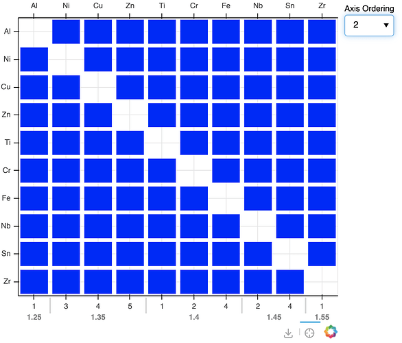
I have previously built functionality to sort the axes based on elemental properties (i.e. ascending atomic radius) via a CustomJS callback. I recently decided that I should also display the values that the elements are being sorted on, so I created an extra x range for this information and added it to the bottom of the figure using add_layout(). The elements are arranged on a CategoricalAxis, so I decided to use a Categorical Axis for the bottom axis that displays elemental properties. This is advantageous because I want to create suborderings, and sometimes the data is non-numerical if it doesn’t exist.

I am now running into an issue where I want to have evenly spaced ticks, but when I update the figure.x_range.factors in the JS callback to have a subordering, the ticks are no longer spaced linearly. I have tried switching to BaseTicker or FixedTicker by passing in an instance in the arguments of the CategoricalAxis constructor, but the figure crashes in both instances. Next, I tried creating a copy of the top x_range ticker using .clone() in the JS portion so that it overwrites any automatic scaling after the factors are updated, but that had no effect on the tick spacing.

Please let me know if there is any way to fix this!

Here is a simplified version of the code:

from bokeh.io import show
from bokeh.layouts import row
from bokeh.models import ColumnDataSource, CategoricalAxis, Select, CustomJS, FactorRange
from bokeh.plotting import figure

tbt = ['Ti', 'Fe', 'Al', 'Ni', 'Cr', 'Cu', 'Zr', 'Nb', 'Zn', 'Sn']
xnames = []
ynames = []

for i in tbt:
    for j in tbt:
        if i == j:
            continue
        xnames.append(i)
        ynames.append(j)
        
dsource = ColumnDataSource(data=dict(
    xname=xnames,
    yname=ynames
))

p = figure(x_axis_location="above", tools=["save", "crosshair"],
           x_range=tbt,
           y_range=list(reversed(tbt)),
           toolbar_location="below", width=500, height=500)
p.rect(x='xname', y='yname', width=0.86, height=0.86, color="blue", line_width=0.06, source=dsource)

axis_orderings = {"1": [['Al', '13'], ['Ti', '22'], ['Cr', '24'], ['Fe', '26'], ['Ni', '28'], ['Cu', '29'],
                        ['Zn', '30'], ['Zr', '40'], ['Nb', '41'], ['Sn', '50']],
                  "2": [['Al', ['1.25', '1']], ['Ni', ['1.35', '3']], ['Cu', ['1.35', '4']],
                        ['Zn', ['1.35', '5']], ['Ti', ['1.4', '1']], ['Cr', ['1.4', '2']], ['Fe', ['1.4', '4']],
                        ['Nb', ['1.45', '2']], ['Sn', ['1.45', '4']], ['Zr', ['1.55', '1']]]
}
p.extra_x_ranges['bottom'] = FactorRange(factors=[data[1] for data in axis_orderings["1"]])
p.add_layout(CategoricalAxis(x_range_name='bottom'), 'below')
axis_select = Select(title="Axis Ordering", value="1", options=list(axis_orderings.keys()))
axis_callback = CustomJS(args=dict(select=axis_select, p=p, orderings=axis_orderings), code="""
        var ordering_name = select.value;
        var element_symbol_order = orderings[ordering_name].map(sub_arr => sub_arr[0]);
        var element_property_labels = orderings[ordering_name].map(sub_arr => sub_arr.slice(1)).flat();
        console.log(element_symbol_order);
        console.log(element_property_labels);
        p.x_range.factors = element_symbol_order.slice();
        p.y_range.factors = element_symbol_order.slice().reverse();
        p.extra_x_ranges['bottom'].factors = element_property_labels.slice();
        """)
axis_select.js_on_change('value', axis_callback)
r = row(p, axis_select)
show(r)

Elemental symbol axis (bottom):

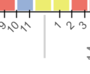
Hi @willwerj unfortunately without a complete Minimal Reproducible Example that we can actually run ourselves, there’s not much we can speculate about. For instance, I am not even sure how an image like the one above, with the ticks not aligned with the glyphs on a categorical scale, could even be obtained, without resorting to “categorical offsets” (which are rare and obscure). So it’s really not at all clear what exactly your code is doing in the first place.

Hi Bryan, I updated the original post with a Minimal Reproducible Example. Thank you for the suggestion.

Thanks for the MRE @willwerj it’s now entirely clear what your situation is. Unfortunately, I do not have any good news for you. The original motivation for nested categorical axes was grouped bar charts, where it’s generally always desired to have separators and spacing between the groups. No one has ever mentioned a use-case like this, and it has never been considered. [1] So, there are not currently any options to turn off the group separation. Even if there were, the computation transformation of categorical coordinates to synthetic coordinates for drawing is rather complicated in the nested cases. I’m not entirely sure I’d expect things to auto-magically line up perfectly with another unrelated non-hierarchical range just by accident only because the separators were removed. (Maybe they would :person_shrugging:)

I’m not sure I have any immediate suggestions except possibly to collapse things down to a single level of factors, e.g. by explicit repetition of the top level in each factor, something like: "1.35 - 3", "1.35 - 4", etc. Assuming there are the same number of these plain string factors as on the other axis, things should “line up”.

To make the longer labels more readable, you’d probably want to angle the tick labels some. Alternatively, it would probably be possible to only display the “top” level in the first tick of each “group” by using a CustomJSTickFormatter


  1. If memory serves, a few people have asked about dendrograms over the years, which I suppose has similar requirements. But no issues were ever opened by anyone, so nothing was ever pursued. ↩︎

@willwerj You can use group_padding argument in FactorRange. If set that to 0 I believe you get the spacing of the ticks as you want.

p.extra_x_ranges['bottom'] = FactorRange(
    factors=[data[1] for data in axis_orderings["1"]],
    group_padding = 0,
    )

That won’t get rid of the separators between groups, which themselves take up “extra” space compared to the non-nested factor range.

Thank you Bryan and Jonas for the suggestions. Changing the group_padding in FactorRange to zero seemed to work just fine for the case with groupings.I also had a 3-level case where adjusting subgroup_padding was necessary as well.

@willwerj are you saying that changing the group_padding to zero gets rid of these separator lines:

Screenshot 2024-09-18 at 07.52.55

If so that is unexpected. If not, I don’t understand how those lines (which are effectively “extra ticks” corresponding to no category) would line up with the axis on top that does no have any such separators. Maybe I have misunderstood what you are after, though.

Here is a screenshot of the MRE with group_padding = 0. I think the separator lines themself do not affect the layout of the ticks, just visual indication of the sub groups.

1 Like

Huh.

That’s not at all what I expected, and I wrote this code (…but almost 10 years ago). I’m glad it’s working, and also that there are lots of users these days to help with questions :slight_smile:

3 Likes