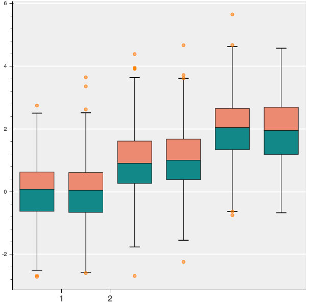
Using p.xaxis.major_label_overrides on the categorical coordinates doesn’t work. The following code
import numpy as np
import pandas as pd
from bokeh.plotting import figure, output_file, show
# generate some synthetic time series for six different categories
cats = list("abcdef")
yy = np.random.randn(2000)
g = np.random.choice(cats, 2000)
for i, l in enumerate(cats):
yy[g == l] += i // 2
df = pd.DataFrame(dict(score=yy, group=g))
# find the quartiles and IQR for each category
groups = df.groupby('group')
q1 = groups.quantile(q=0.25)
q2 = groups.quantile(q=0.5)
q3 = groups.quantile(q=0.75)
iqr = q3 - q1
upper = q3 + 1.5*iqr
lower = q1 - 1.5*iqr
# find the outliers for each category
def outliers(group):
cat = group.name
return group[(group.score > upper.loc[cat]['score']) | (group.score < lower.loc[cat]['score'])]['score']
out = groups.apply(outliers).dropna()
# prepare outlier data for plotting, we need coordinates for every outlier.
if not out.empty:
outx = []
outy = []
for keys in out.index:
outx.append(keys[0])
outy.append(out.loc[keys[0]].loc[keys[1]])
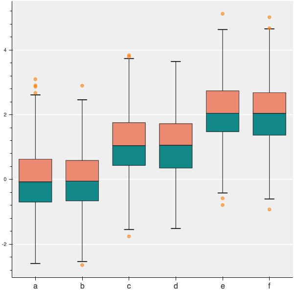
p = figure(tools="", background_fill_color="#efefef", x_range=cats, toolbar_location=None)
# if no outliers, shrink lengths of stems to be no longer than the minimums or maximums
qmin = groups.quantile(q=0.00)
qmax = groups.quantile(q=1.00)
upper.score = [min([x,y]) for (x,y) in zip(list(qmax.loc[:,'score']),upper.score)]
lower.score = [max([x,y]) for (x,y) in zip(list(qmin.loc[:,'score']),lower.score)]
# stems
p.segment(cats, upper.score, cats, q3.score, line_color="black")
p.segment(cats, lower.score, cats, q1.score, line_color="black")
# boxes
p.vbar(cats, 0.7, q2.score, q3.score, fill_color="#E08E79", line_color="black")
p.vbar(cats, 0.7, q1.score, q2.score, fill_color="#3B8686", line_color="black")
# whiskers (almost-0 height rects simpler than segments)
p.rect(cats, lower.score, 0.2, 0.01, line_color="black")
p.rect(cats, upper.score, 0.2, 0.01, line_color="black")
# outliers
if not out.empty:
p.circle(outx, outy, size=6, color="#F38630", fill_alpha=0.6)
p.xgrid.grid_line_color = None
p.ygrid.grid_line_color = "white"
p.grid.grid_line_width = 2
p.xaxis.major_label_text_font_size="12pt"
p.xaxis.major_label_overrides = {"a":"1980"}
show(p)
Gives this result
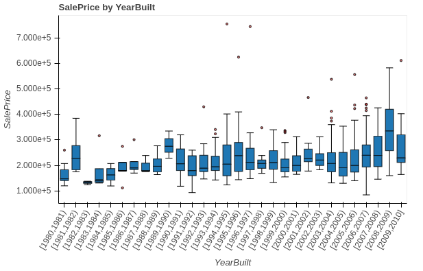
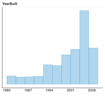
Just to clarify, for a visualization like this
I want to override the xaxis, tick values, and their locations to have an xaxis and tick values like in this plot
I’m sure this is an obscure request, I’m just curious if it’s possible. Thanks