Thanks for this and sorry for the late reply.
Here is an example:
    import numpy as np
    import pandas as pd
    from bokeh.plotting import figure, show, output_file
    from bokeh.sampledata.les_mis import data
    from bokeh.models.axes import LinearAxis,FixedTicker,BasicTicker
    from bokeh.models import Div,ColumnDataSource,FuncTickFormatter,Label,LabelSet
    from bokeh.models.glyphs import Segment
    from bokeh.io import output_notebook
    output_notebook()
    from itertools import product

    row_axis=list(reversed(["row"+str(i) for i in range(10)]))
    col_axis=list(["col"+str(i) for i in range(5)])
    df=pd.DataFrame(np.random.uniform(size=(10,5)),columns=col_axis,index=row_axis)
    values=list(df.values.flatten())
    data=dict(
        xname=[a[1] for a in product(row_axis,col_axis)],
        yname=[a[0] for a in product(row_axis,col_axis)],
        color=['#%02x%02x%02x' % (255,255-int(255*i),0) for i in values]
    )
    p = figure(title="Heatmap",
               x_axis_location="above",
               tools="save",
               y_range=row_axis,
               x_range=col_axis,
              )
    #p.rect('xname', 'yname',.95,.95,source=data,fill_color='black')
    p.plot_width = 300
    p.plot_height = 400
    p.rect(data['xname'], data['yname'], color=['#%02x%02x%02x' % (255,255-int(255*i),0) for i in values], width=1, height=1)
    caterogy_separators=[0,3,5,8,10]
    p.add_layout(LinearAxis(), 'right')
    p.yaxis[1].ticker = FixedTicker(ticks=caterogy_separators)
    #deleting text of separator ticks:
    p.yaxis[1].formatter = FuncTickFormatter(code='data={'+','.join([str(s)+":''" for s in caterogy_separators])+'}\nreturn data[tick]')
    for sep in caterogy_separators:
        glyph = Segment(x0=0, y0=sep, x1=5, y1=sep, line_color="black", line_width=2)
        p.add_glyph( glyph)

    category_centers=[(caterogy_separators[i]+caterogy_separators[i+1])/2 for i in range(len(caterogy_separators)-1)]

    category_data=ColumnDataSource(dict(
        x=[250]*4,
        y=[9,6.5,4,1.5],
    text=['my long data category 1',
        'my long data category 2',
        'my long data category 3',
        'my long data category 4']
    ))

    chapter_text = LabelSet(x='x',
        y='y',x_units='screen', y_units='data',level='overlay',
        text='text', render_mode='css',source=category_data,
        border_line_color=None, border_line_alpha=1.0,text_font_size='10pt',
        background_fill_color='white', background_fill_alpha=1.0, text_baseline = 'middle')
    p.add_layout(chapter_text)
    show(p)
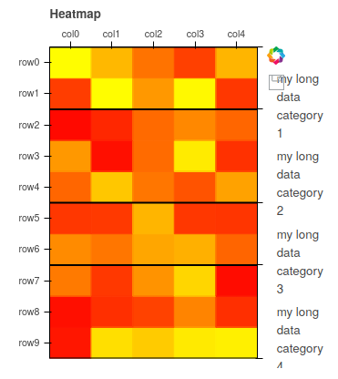
And here is the current result. As you can see, the text of the categories is wrapped into many lines which is not what I want here.
BTW, do you know if bokeh makes it possible to have nested categories in a heatmap chart instead of a bar chart?
Many thanks