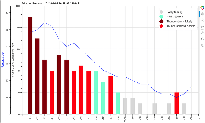
I would like to change the formatting of the time stamp on the x-axis of my graph. Currently, it is being labeled “1h”, “2h”, “3h”, I would like it to display “1:00” “2:00” etc.
sourceDay = ColumnDataSource(dict(x=dayXaxis, y=precipchanceDay, color=condColorDay, label=conditionsDay))
conditionsDay = figure(title="24 Hour Forecast " + str(datetime.now()), width=1000, x_axis_type='datetime')
conditionsDay.extra_y_ranges['tempDay'] = Range1d(min(tempDay)-5, max(tempDay)+5)
conditionsDay.y_range = Range1d(0, 100)
conditionsDay.yaxis.axis_label="Chance of Precipitation/Type"
conditionsDay.vbar(x='x', top='y', color='color', legend_group='label', source=sourceDay, line_width=20)
conditionsDay.line(x=dayXaxis, y=tempDay, y_range_name='tempDay', color='blue')
conditionsDayax2 = LinearAxis(y_range_name='tempDay', axis_label="Temperature")
conditionsDayax2.axis_label_text_color='blue'
conditionsDay.add_layout(conditionsDayax2, 'left')
conditionsDay.xaxis.ticker.desired_num_ticks=24
conditionsDay.xaxis.major_label_orientation = 'vertical'
conditionsDay.legend.glyph_width = 1
conditionsDay.legend.glyph_height = 1
conditionsDay.legend.label_standoff=25
Thank you.
