Is it not possible to have scatter points which is plotted with color ‘red’ f.ex and have the line be plotted in the same color. Assuming it gets the color from a data source. F.eks this doesnt work:
Circle is able to read the color from source but line is not. Would really like to plot 10+ graphs with different colors. Anyone know how to work around it?
For future reference - when you say “does not work” please provide the details.
For the above code, assuming you’re running the latest Bokeh version, you should’ve received this error (truncated for brevity):
ValueError: expected an element of either Enum(…), Regex(…), Tuple(…) or RGB, got ‘color’
The docstring of the Line class says:
The Line glyph is different from most other glyphs in that the vector
of values only produces one glyph on the Plot.
Lines don’t support vectors for anything other than x and y. That’s because it’s unclear what to do when different points have different values for such fields. Let’s continue looking at the color property, assume we want the following code to work:
p.line(x=[0, 1], y=[0, 1], color=['red', 'blue'])
There are two dots and the line connects them. But how should the line be colored? Full red, full blue, purple, half red and half blue length-wise, half red and half blue width-wise, striped,…? Of course, there could be another property for that, but IMO that would drastically overcomplicate a relatively simple glyph for a very rare use-case that’s often covered by the MultiLine glyph.
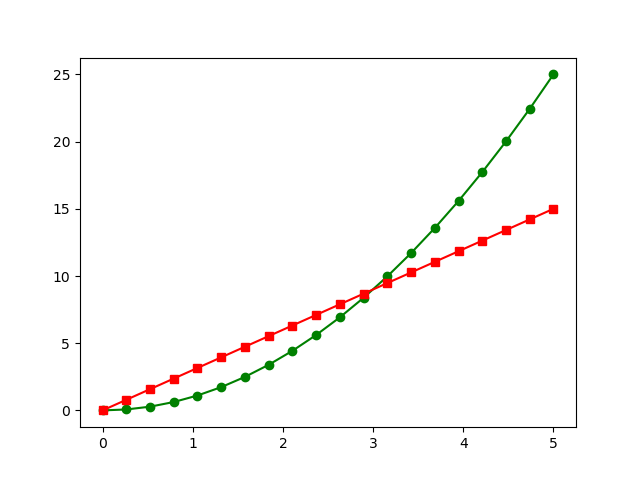
It makes sense when you explain it like that. Not sure how to solve it if I have a source that is selected by the users through a bunch of CDSView filters and colors is added to the Pandas Dataframe. I see the dots (p.circle) is given the correct color. But not sure how to have a line connecting the dots in the same color is possible (see plot below). Should I instead write to a new source the selected data?
Do you have an example code where the user selects a multiselect value and the data is filtered and the filtered data is saved to another Columndatasource?
The filters, views, and widgets have nothing to do with colors.
Just write a small example that uses circle and multi_line and a data source with the shape you want and you’ll see how to implement it in a larger project.